10 Back-to-School Décor Trends That Were Overdone and Impractical

The back-to-school season often makes people want to completely change their study areas, bedrooms, and communal spaces, but not all of the new styles make life better. Many setups in the last few years looked great but didn’t work well when real life started. Overplanned decor sometimes puts looks ahead of comfort, adaptability, and usability, which can rapidly transform excitement into anger. A room that is created for learning, creativity, and rest should help people stay focused instead of needing constant care. When you look back at these patterns, you can see how easy it is to go from well-thought-out design to excessive complexity, especially when looks are more important than real-world demands.
1. Color-Coded Everything Zones
At first, color-coding materials, furniture, and storage containers looked great, but it was hard to keep them that way. It was hard to use notebooks, folders, and containers every day when they all had to be the same color. The whole system was messed up when things were lost or replaced with a different color. Instead of saving time, students typically spent extra time rearranging things to retain the visual order. Learning spaces should change to meet new requirements, not punish those who are flexible. A little bit of color coordination can help, but strict methods don’t always take into account how often materials change during the school year.
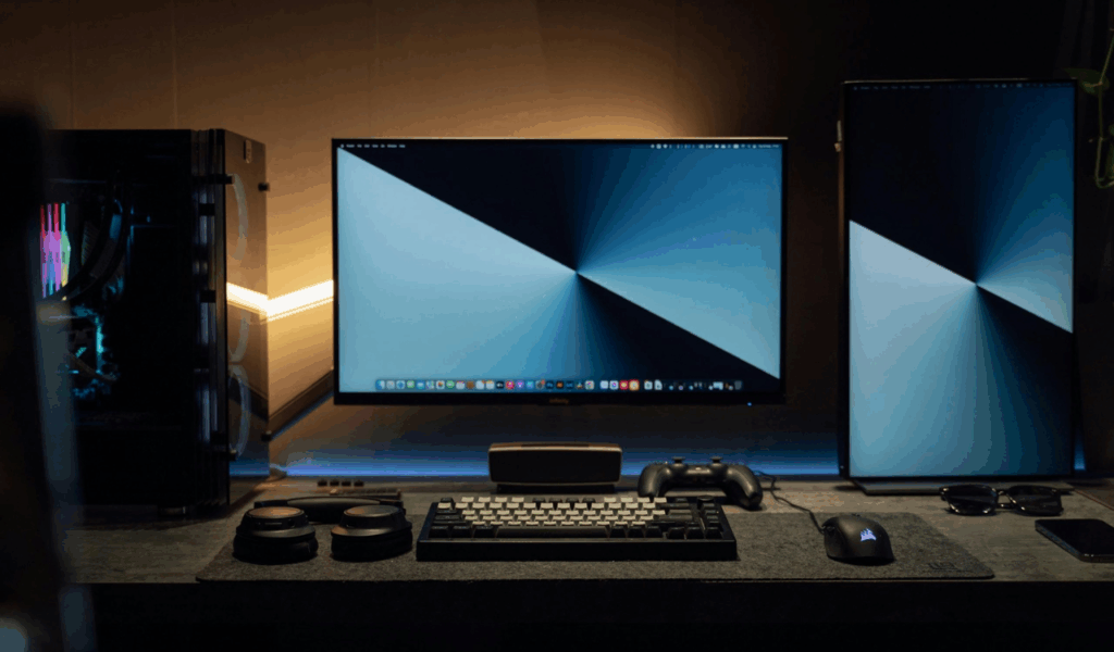
2. Overstyled Homework Corners
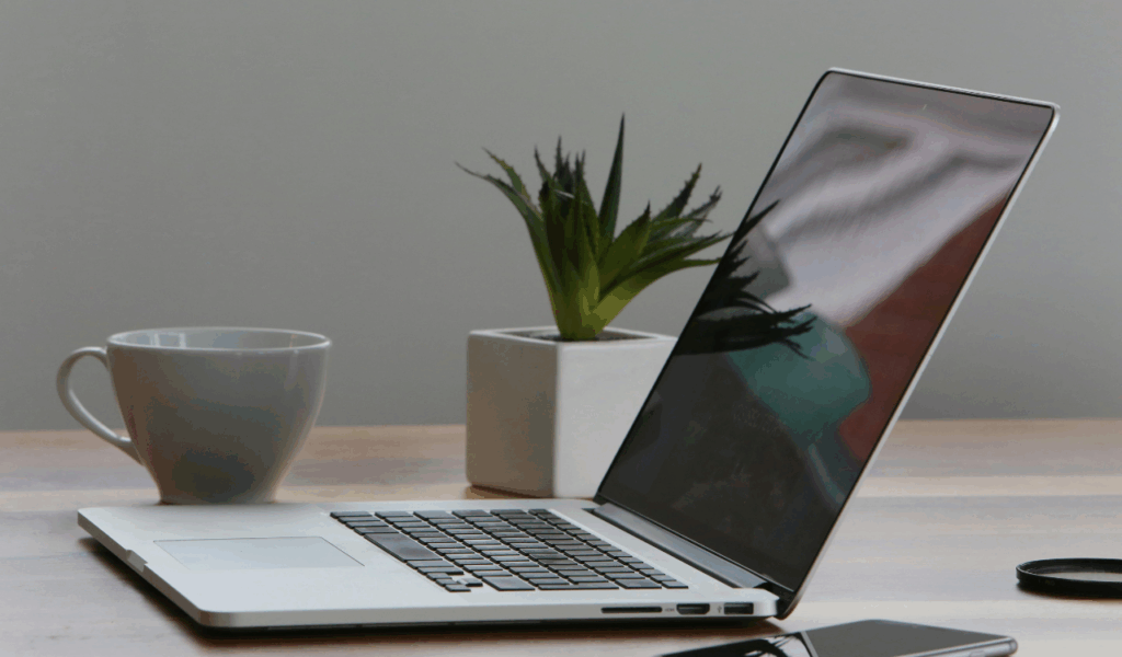
Decorative lighting, framed quotes, and designed shelving made homework nooks appear beautiful in images, but they didn’t work well for protracted study sessions. A lot of these setups gave up desk space for accessories, which meant there wasn’t much area to do real work. A lot of decorative lights weren’t bright enough, which made people’s eyes hurt. Chairs that were picked for style instead of support made people uncomfortable after a long time. First and foremost, ergonomics and function should be important in a study area. When there is too much decoration in the office, it becomes more about showing off than learning, and productivity goes down.
3. Themed Study Spaces
It was fun to design a study place around a particular subject, like space, the jungle, or an old library, but it quickly got confining. People’s interests change over time, especially students’, and specialized decor often made the place look too specific. When the theme changed or got too big, you had to replace a lot of things at once. Strong themes also made it hard to stay focused by drawing attention away from work and toward visual elements. Flexible, neutral bases make it possible to customize without having to completely redesign. A learning area works best when it can change and evolve with the student’s interests and academic needs.
4. Excessive Wall Labeling
Labels for drawers, shelves, and even individual items on the walls looked neat, but they frequently made things too busy to look at. There were too many labels in the study area, which made it less relaxing than it should have been. After routines were set, most labels were no longer needed, but taking them off felt like redoing work. When storage demands changed in shared spaces, they had to be relabeled all the time. When it comes to simple organization, it’s best to rely on habits and reasoning instead than continual visual reminders that fight for your attention.
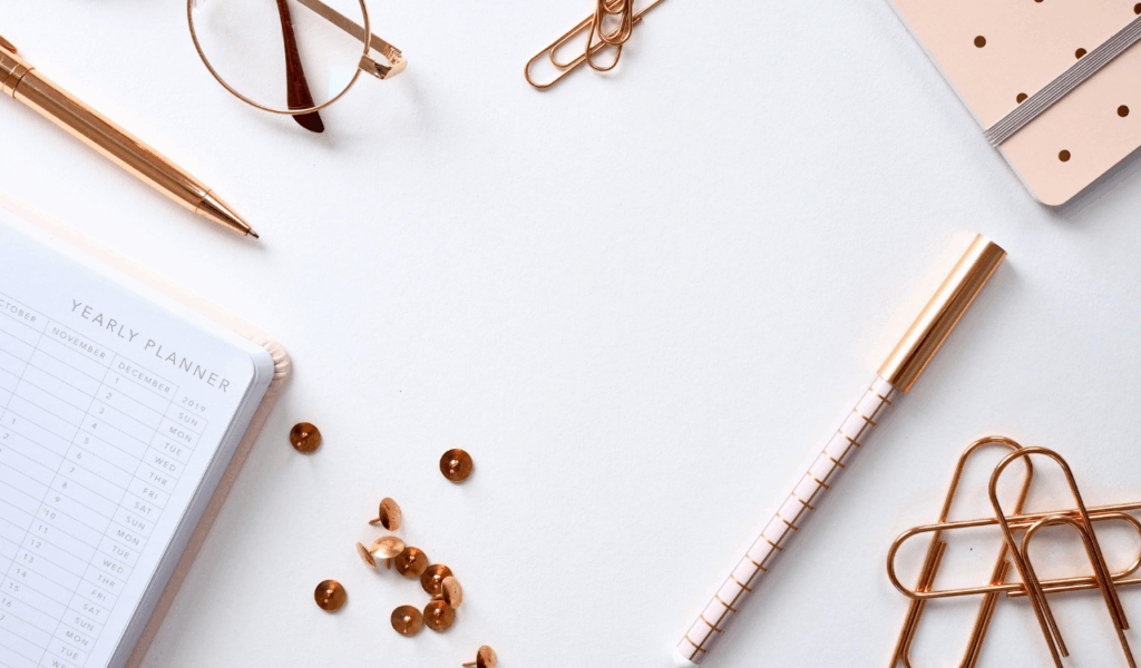
5. Pinterest-Perfect Bulletin Boards
Highly curated bulletin boards with matching pins, ornate borders, and layered textures looked great but didn’t work very well. A lot of boards were too packed to hold notes or schedules. It was difficult to have to move things around without messing up the design, which made it hard to keep up with improvements. Over time, vital reminders became lost in the beautiful parts. A bulletin board should make it easy to get to information quicklyWhen fashion takes precedence over function, it ceases to be a helpful planning tool and instead becomes merely another surface that needs to be cleaned rather than becoming a source of assistance.
6. Matching Storage Sets

Buying whole sets of matching storage items made everything appear good together, but they didn’t always fit the needs of the space. Uniform containers don’t usually work for different kinds of products, including books, electronics, or art supplies. As demands changed, mismatched add-ons ruined the visual uniformity, which was the initial intent. Sets that matched also made it hard to move things about, which made areas feel stiff. Storage should change based on what it holds, not the other way around. In most cases, combining different sizes and shapes according to how they are utilized makes items simpler to locate and use for an extended period of time.
7. Decorative Open Shelving
At first, open shelves with baskets, books, and ornamental items looked tidy, but they needed to be cleaned all the time. You could see everyday messes right away, which made you feel like you had to maintain everything precisely in order. When school was hectic, things were typically put away quickly instead of neatly, which made the room feel messy right away. Dust buildup also become a problem. Only in modest quantities may open shelving be effective; however, if it is used extensively in dynamic learning environments, it may actually make things more stressful rather than less stressful.
8. Coordinated Desk Accessories
Sets of matching desk accessories like trays, containers, and organizers made everything seem nice, but they didn’t give you much freedom. Each piece was made for a certain item, so there wasn’t much room for alterations. The system broke down when the number or type of supply changed. Changing one broken or missing piece changed the whole look. As you use it, your functional desk organization should change. Real productivity can be increased by prioritizing flexible bits over matching sets, rather than attempting to make supplies conform to a predetermined visual plan.
9. Seasonal Layering Overload
Adding layers of decorations for each school season was fun at first, but it rapidly got out of hand. Many homes didn’t have the time or space to store things while they were being swapped every few weeks. Seasonal items typically made desks and shelves look messy without providing any value. Instead of making the area look better, the constant modifications made it look busy. A few little, easy-to-remove embellishments can indicate the seasons without getting in the way of daily life. When things are kept simple, it is easier for learning settings to maintain their tranquility and consistency throughout the year.
10. Copying Influencer Setups Exactly

Many people were unhappy when they tried to recreate influencer study arrangements without making them fit their own needs. These areas were made for taking pictures, not for everyday use. It was hard to make precise reproductions because the size of the rooms, the lighting, and the routines didn’t always match. The need to copy details took over careful preparation. A good learning place takes into account the habits and limits of each person. Inspiration functions most effectively as a guide. Creating concepts that are tailored to your requirements ensures that the space is suitable for actual living rather than an unattainable standard.