11 Accent Pieces We Regretted Buying Almost Immediately

Holiday accent pieces are meant to bring warmth and celebration into a home, but when they ignore the colors, scale, and materials already in the space, they can feel more disruptive than festive. Many seasonal items are designed to stand out on their own, which makes them hard to blend into rooms that already have a clear style. Instead of enhancing everyday décor, these accents compete with it, making spaces feel temporarily staged rather than comfortably decorated. The best seasonal updates build on what is already there, using familiar tones and textures so the transition feels natural and easy on the eyes.
1. Multi-Colored Lights That Interrupted Calm Color Schemes

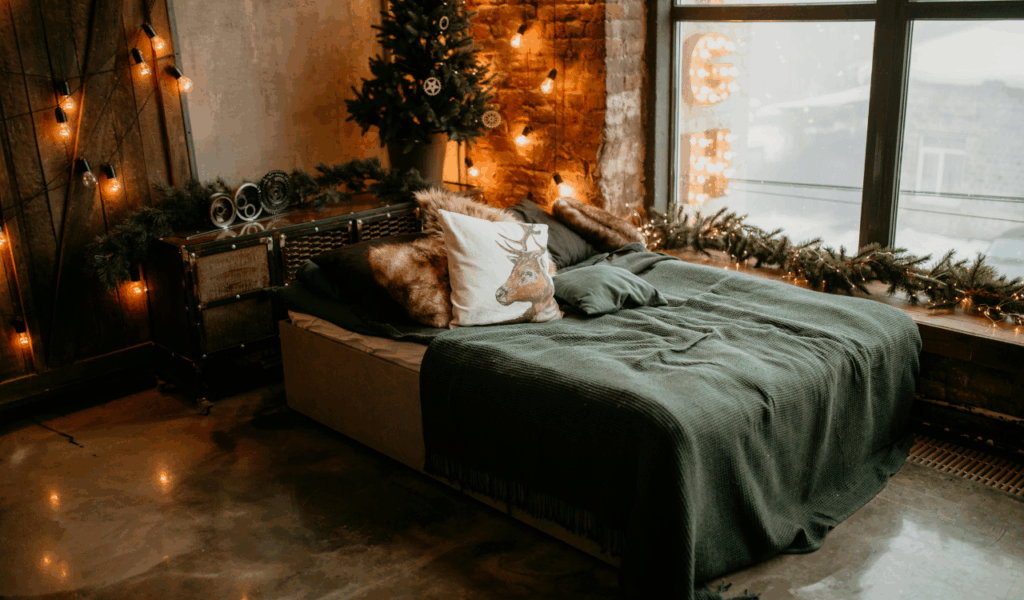
Rainbow holiday lights bring instant cheer, but indoors they often fight with a home’s existing palette. Most living spaces rely on layered neutrals, wood tones, and soft lighting to create comfort. When bright primary colors flash across walls and ceilings, the room’s mood shifts from cozy to chaotic. These lights also reflect off windows, mirrors, and screens, multiplying their visual impact. Instead of highlighting décor, they overpower it. Many people find that once the novelty wears off, the lights feel distracting rather than festive. Subtle white or warm toned lighting tends to blend better with everyday interiors and allows holiday touches to feel like part of the room instead of an interruption.
2. Oversized Indoor Inflatables That Took Over the Room

Large animated decorations are designed for outdoor visibility, not for indoor balance. When placed in living rooms or entryways, they block walkways, hide furniture, and disrupt natural focal points like fireplaces or windows. Their scale rarely relates to the proportions of sofas, tables, or shelving. Instead of adding charm, they dominate the entire space and reduce usable floor area. Because they are lightweight, they also shift and collapse slightly, which makes them look messy over time. Homes feel more inviting when seasonal décor respects existing layout rather than competing with it for attention.
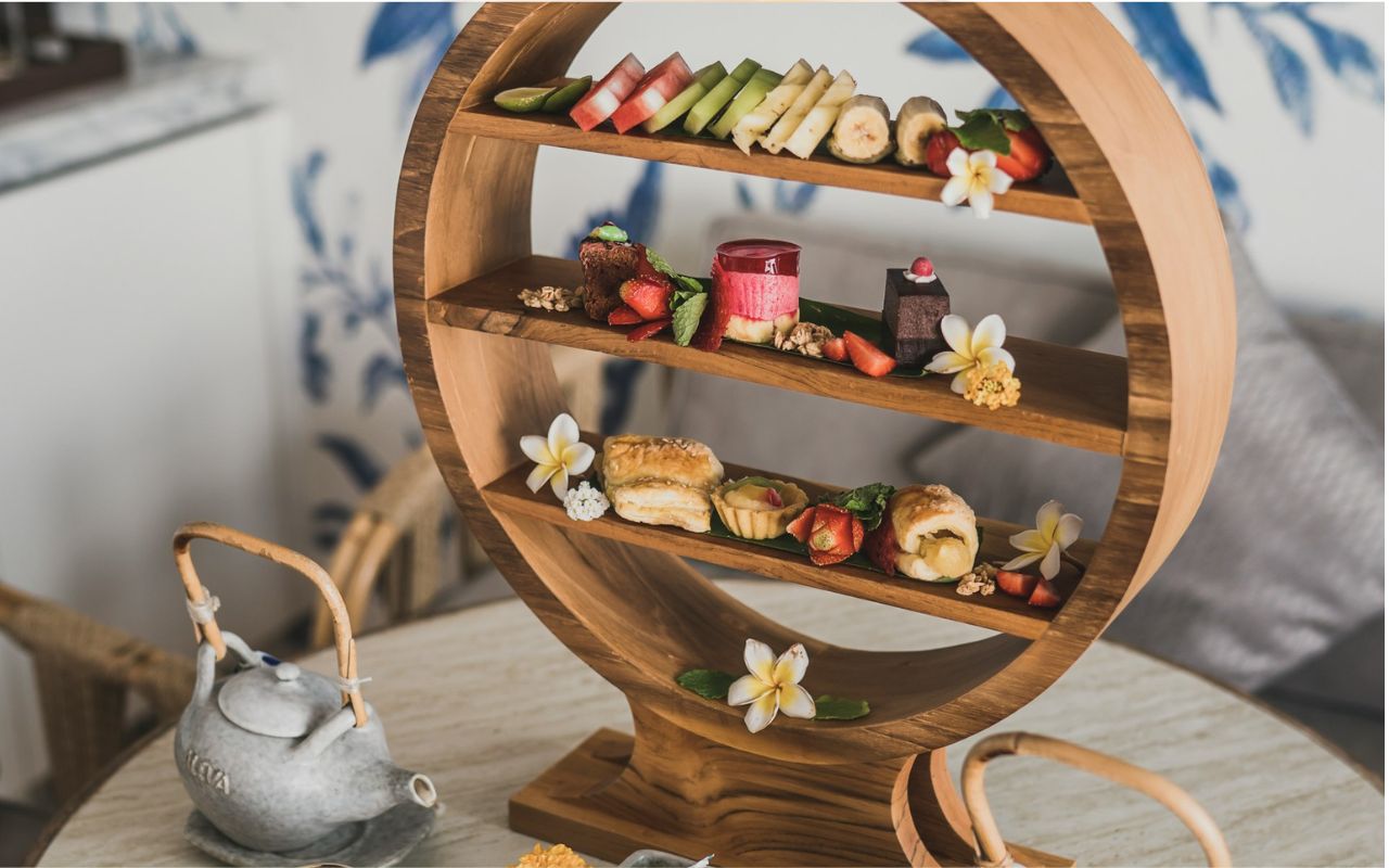
3. Crowded Villages That Turned Surfaces Into Clutter

Miniature villages can be charming when curated carefully, but full collections spread across mantels and tables quickly overwhelm the space. Each building, figurine, and light cord adds visual noise. When displays grow too large, they replace everyday décor rather than layering with it. Dusting and cleaning also become difficult, making the area feel neglected. In homes where surfaces are usually simple and functional, these elaborate scenes feel like temporary installations rather than part of the design. Smaller groupings or a few statement pieces usually integrate more naturally than full themed setups.
4. Busy Seasonal Textiles That Clashed With Upholstery
Plaid throws, novelty blankets, and patterned runners add color fast, but they often conflict with permanent fabrics on sofas and chairs. When textures and prints do not coordinate, seating areas feel visually crowded. Instead of looking styled, the room feels layered by accident. Seasonal textiles also shift the tone of the space dramatically, which can feel jarring when the rest of the décor stays neutral. Homes with consistent fabric palettes usually benefit more from subtle seasonal accents in matching tones rather than bold prints that dominate furniture.
5. Quote-Heavy Throw Pillows That Felt Out of Place
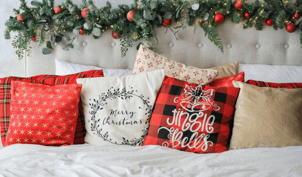
Pillows with sayings or large holiday graphics tend to read more like signage than soft furnishings. When placed among solid or subtly textured cushions, they draw attention in a way that feels disconnected from the rest of the room. Text-based décor also limits how long pieces can stay out, since once the holiday passes, they feel awkward and out of context. Swapping pillows every few weeks becomes inconvenient and adds storage needs. Homes feel more cohesive when seasonal pillows rely on color and texture rather than slogans to signal the season.
6. Giant Themed Wall Art That Overpowered Existing Decor

Holiday wall art that features oversized figures or bold scenes can interrupt gallery walls or carefully spaced artwork. Because walls are major visual anchors, anything placed there must align with scale, frame style, and color story. Large themed prints often ignore those rules, making rooms feel unbalanced. When everyday art is removed to make room for holiday pieces, the personal character of the space gets lost. Seasonal wall décor works best when it layers into existing frames or shelves instead of replacing what is already there.
7. Holiday Rugs That Fought With Floor and Furniture Tones

Rugs influence the entire mood of a room. When holiday rugs introduce loud colors or novelty patterns, they clash with flooring, wood tones, and upholstery. Because rugs cover large surface areas, even small mismatches become obvious. Furniture that once felt coordinated suddenly looks misplaced. After the season ends, the rug must be removed, disrupting the visual continuity of the space. Homes benefit from keeping foundational pieces consistent and using smaller accents for seasonal shifts rather than swapping major design elements.
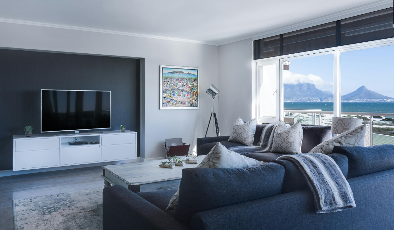
8. Traditional Red and Green Accents in Cool-Toned Rooms

Classic holiday colors do not always work with modern interiors that rely on grays, blues, or earthy neutrals. When bright red and green are introduced without connection to existing shades, they appear dropped in rather than blended. The contrast can make both the décor and the room feel less refined. Instead of enhancing warmth, the colors feel loud and separate. Successful seasonal décor usually echoes at least one tone already present in the space so the update feels intentional rather than random.
9. Large Free-Standing Figurines That Ignored Room Proportion
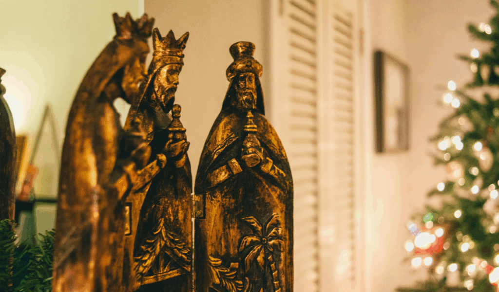
Decorative statues and tall figures may look festive in store displays, but in homes they often disrupt scale. When a single piece is taller or bulkier than nearby furniture, it draws attention away from seating and conversation areas. Traffic flow becomes awkward, and the piece feels like an obstacle rather than an accent. Over time, it becomes something people step around instead of enjoy. Seasonal décor should support how spaces are used, not interfere with movement or function.
10. Outdoor Props Used Indoors That Felt Out of Context
Items designed for lawns and porches rely on distance and open space to look appealing. When moved indoors, their size and materials feel mismatched with soft furnishings and finished surfaces. Plastic textures and exaggerated shapes do not relate well to wood, fabric, and ceramics. Instead of adding charm, they make rooms feel like staging areas. Indoor décor works best when materials and finishes align with existing home textures, not when outdoor pieces are forced into living spaces.
11. Oversized Centerpieces That Took Over Dining Tables
Large holiday centerpieces may look impressive, but they often interfere with actual table use. When décor blocks sightlines and serving dishes, meals become less comfortable. Guests struggle to reach food or see one another, which affects how the space functions socially. Visually, oversized centerpieces dominate the table and disconnect from the surrounding furniture and lighting. Dining rooms benefit from low, simple arrangements that leave room for plates and conversation while still signaling the season.