8 Decorative Accent Pieces That Don’t Match Any Style
Decorative accents are meant to pull a room together, but some pieces do the opposite. Instead of enhancing a space, they hover awkwardly between styles, scales, and purposes. These items often look interesting on their own or in a store display, yet once brought home, they feel disconnected from everything around them. Homeowners frequently realize that the problem isn’t boldness or creativity, but a lack of cohesion. When accent pieces don’t relate to the room’s architecture, materials, or overall mood, they create visual confusion rather than character. Over time, these mismatched items quietly undermine even well-designed spaces.
1. Novelty Figurines With No Architectural Ties

Here’s the thing about novelty figurines: they’re often bought for a quick emotional hit, not because they belong anywhere specific. Bright animal sculptures, cartoonish characters, or abstract novelty pieces rarely connect to a room’s architecture, color palette, or materials. They don’t echo the lines of nearby furniture or the finishes already in the space. As a result, they sit awkwardly on shelves or consoles, visually disconnected from everything around them. Over time, homeowners realize these figurines don’t elevate the room or tell a broader story. They simply take up space. What felt playful at first quickly reads as clutter because the object has no design “home” to anchor it.
2. Seasonal Décor Left Out Year-Round
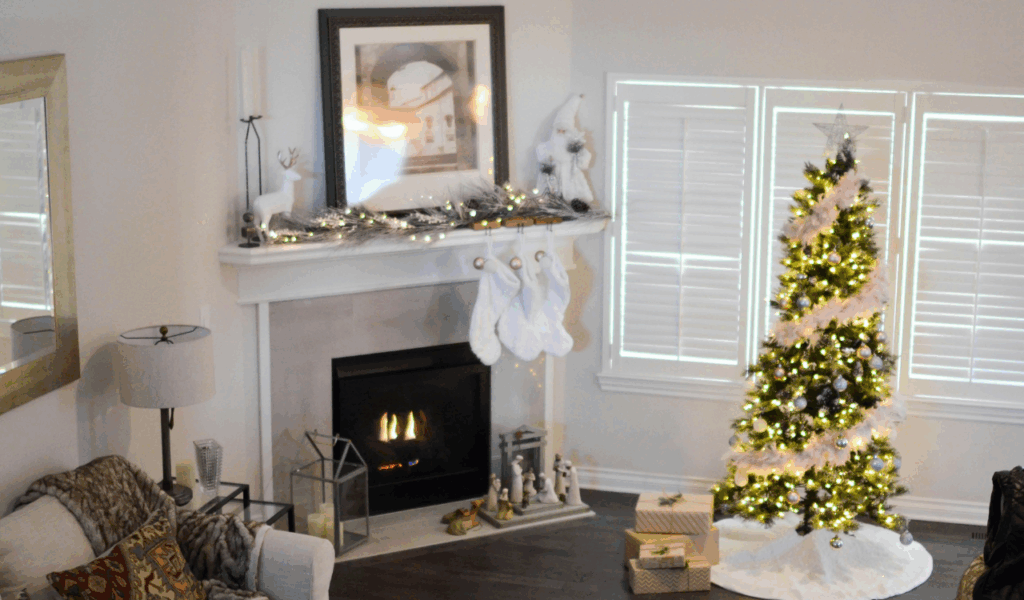
Seasonal accents are meant to be temporary by design. When pumpkin figurines, holiday-themed sculptures, or novelty signs stay out long after their season passes, they lose context and purpose. Without that seasonal framing, these pieces feel confusing rather than festive. They don’t match everyday color schemes or design goals, which makes the space feel unfinished. Many homeowners admit they stop seeing these items entirely until guests point them out. Instead of adding charm, year-round seasonal décor creates visual noise. It becomes a reminder of a decorating decision that was never fully resolved, leaving rooms feeling stuck between moments rather than intentionally styled.
3. Oversized Faux Florals in Loud Colors

Artificial florals can work when they’re subtle and realistic, but oversized faux arrangements in bold or unnatural colors often overwhelm a room. Their scale draws attention immediately, yet the materials don’t hold up under close inspection. Plastic petals, stiff stems, and unnatural finishes clash with real wood, fabric, or stone. Because these florals dominate sightlines, they force the rest of the décor to compete. Homeowners often discover they can’t move them elsewhere because the same issues follow. Instead of adding life, these arrangements freeze a space visually, making it feel staged rather than lived in.
4. Word Art and Slogan Décor
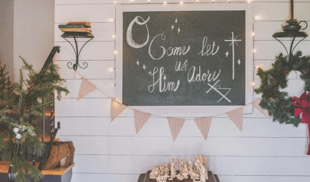
Decor with phrases or sayings tends to age faster than almost anything else in a home. What once felt relatable or witty quickly becomes dated as trends and tastes shift. The fonts are often highly stylized, making them difficult to integrate with other design elements. These pieces also remove interpretation from the space, telling visitors exactly how to feel instead of letting the room speak for itself. Over time, homeowners notice that slogan décor rarely blends with changing furniture or color updates. It locks the room into a specific moment that no longer reflects how people live or think.
5. Plastic “Designer Look” Sculptures
Many mass-produced decorative sculptures aim to mimic high-end design but fall short in material quality and proportion. They’re often lightweight, hollow, or oddly scaled, which becomes obvious once placed in a room. Because they imitate multiple styles at once, they don’t fully commit to modern, classic, or eclectic design. This in-between quality makes them hard to pair with anything else. Homeowners frequently move these pieces from room to room without finding a place that feels right. The problem isn’t boldness. It’s the lack of authenticity and craftsmanship that keeps them from fitting anywhere.
6. Clashing Cultural Trinkets Without a Theme
Collecting objects from travel or different cultures can be meaningful, but without a unifying approach, these items can feel scattered. When pieces from different regions, eras, and styles are displayed together without intention, they compete instead of complementing each other. The issue isn’t diversity; it’s the absence of a visual thread tying them together. Materials, scale, and color often clash, creating confusion rather than character. Homeowners later realize that meaningful objects still need thoughtful placement. Without it, personal items can unintentionally read as random décor rather than a curated reflection of experience.
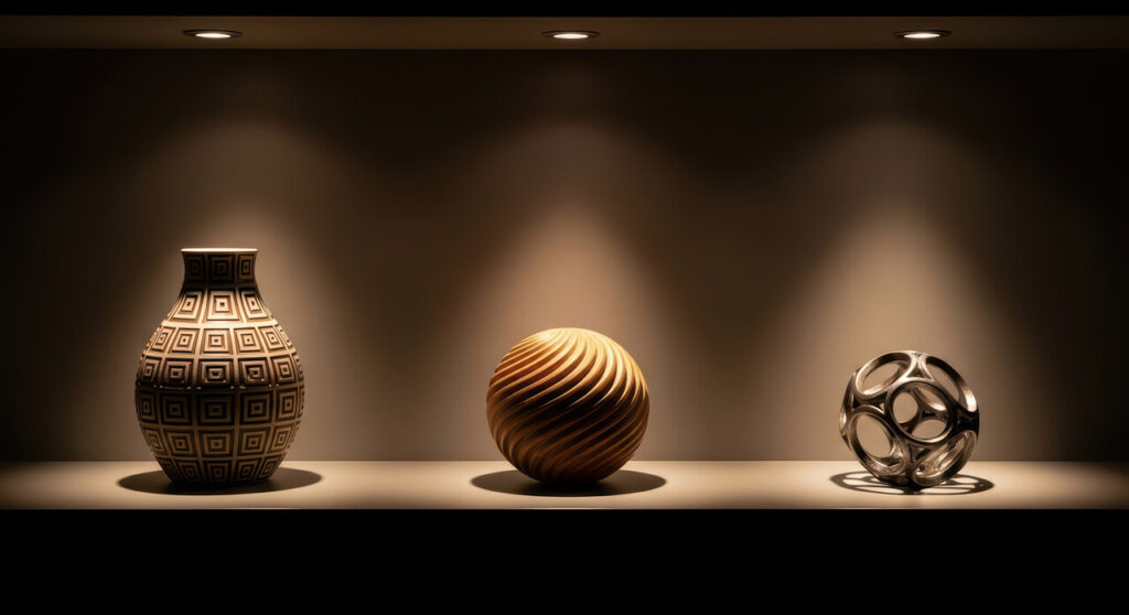
7. Shiny Metallic Orbs and Abstract Balls

Decorative metallic orbs and abstract spheres promise sophistication but often deliver glare and imbalance. Their reflective surfaces bounce light aggressively, highlighting imperfections in surrounding finishes. Because they lack texture or functional purpose, they rely entirely on placement to work. When that placement is off even slightly, they feel arbitrary. These objects also struggle to relate to human scale. They don’t invite interaction or comfort, which makes them feel cold in residential spaces. Over time, homeowners recognize that these pieces don’t ground a room. They float visually, offering shine without substance.
8. Faux Books and Decorative Props
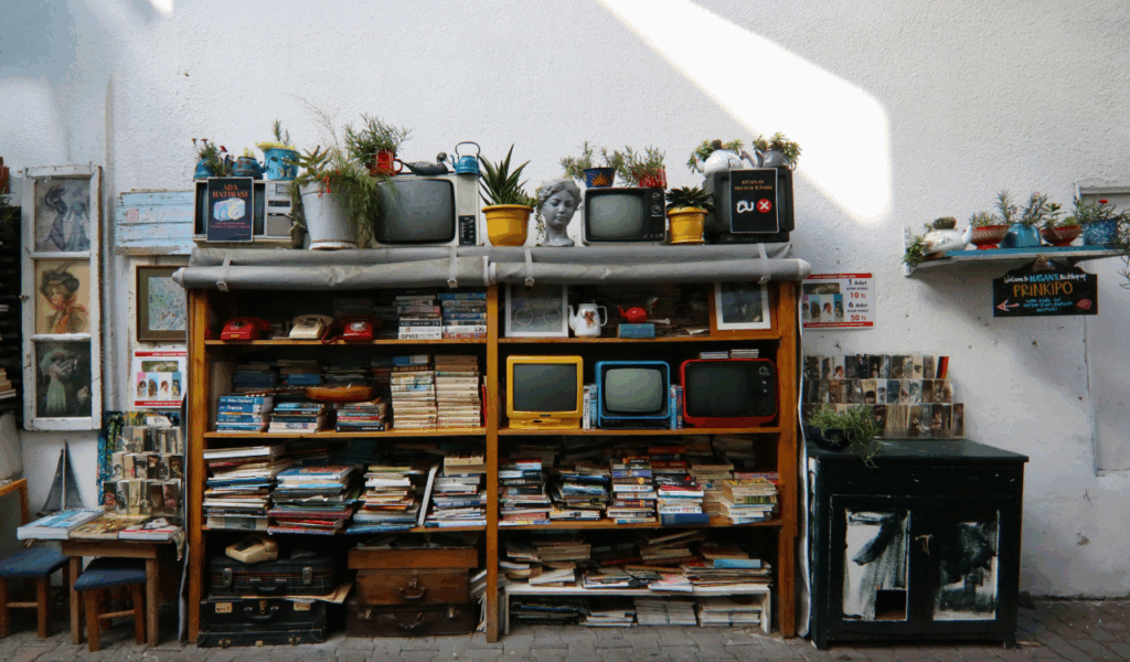
Decorative books and prop objects are designed to look like something meaningful without actually being useful. Once people realize they can’t open them or interact with them, the illusion fades quickly. These items often appear overly symmetrical and too pristine, which makes shelves feel staged rather than lived in. Instead of adding personality, they flatten it. Homeowners often replace them with real books or objects that reflect genuine interests. The difference is immediate. Spaces feel warmer and more authentic once décor stops pretending to be something it isn’t.