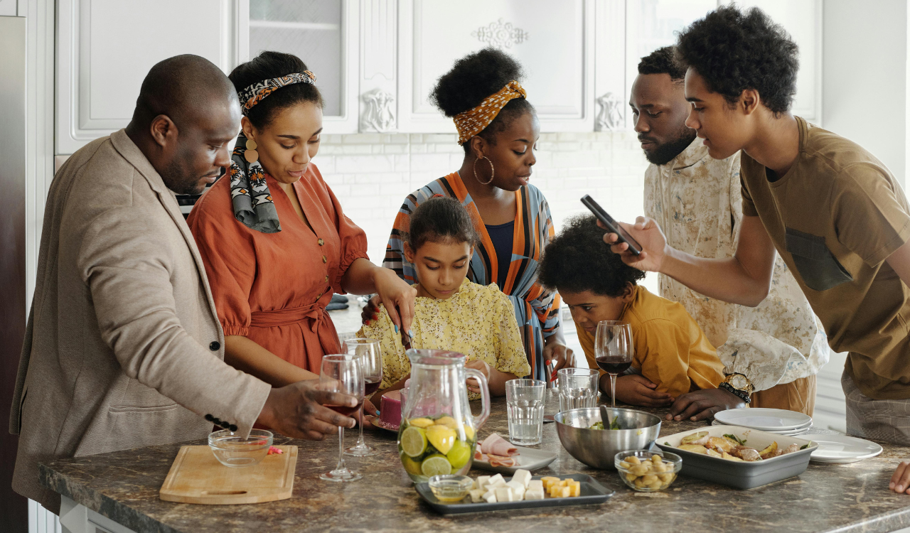
5 Restaurants That Feel Designed for Photos, Not Eating
Restaurants these days are more than simply places to eat; they are often designed to look good on social media. Lighting, decor, color schemes, and plating are all carefully planned to look great in pictures, sometimes even more than they are planned for comfort or taste. At first glance, this may seem exciting, but it may also imply uncomfortable seats, hard-to-eat meals, and menus that put looks ahead of taste. These restaurants aren’t always unpleasant, but they sometimes feel more like photo studios than somewhere to eat. These are five sorts of restaurants that often seem great on video but don’t live up to their promise when it comes to the food.
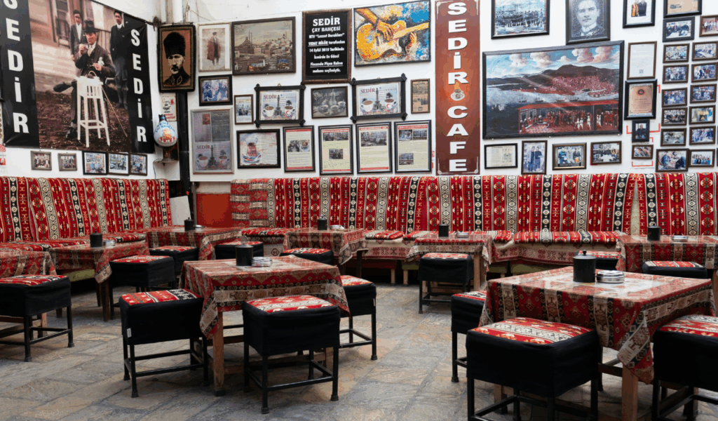
1. Neon-lit theme cafés
Cafés with neon lights are hard to miss because of their bright signs, bold slogans, and dramatic lighting that looks great in images. But the same illumination that makes images look good also make it hard to view your meal clearly. Bright colored lights can change how meals look in real life and make it hard to read menus. People typically choose seating based on how it looks instead of how comfortable it is. Hard stools or crowded benches are not good for long meals. Food presentation emphasizes bright colors and novel shapes, while flavors are usually bland. The venue is fun for a quick picture but not for a whole dinner.
2. Flower-covered brunch spots
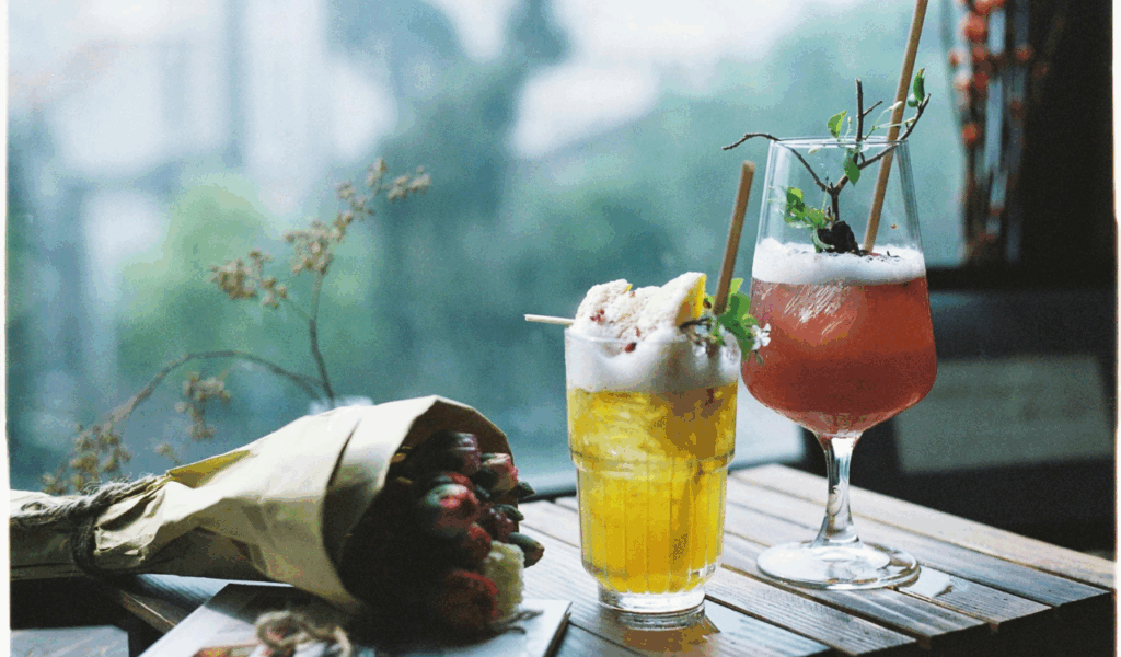
Restaurants with fake flowers, hanging plants, and pastel decor have become very popular for brunch photography. These places may look wonderful on the internet, but they might feel messy and useless in real life. To fit the style, tables are frequently small, which doesn’t leave much room for plates, beverages, and utensils. Garnishes that are too big and ornamental plating may appear nice, but they can make food harder to consume, especially when flowers or herbs are in the way. Because of the harsh surfaces and lack of sound control, noise tends to bounce around in these areas. The whole thing can be too much, which makes it hard to pay attention to the meal.
3. Ultra-minimalist dining rooms
To look sleek and modern, ultra-minimalist restaurants use clean lines, neutral colors, and vacant space. This style looks good in pictures, but it might be cold and uncomfortable to eat in. Seating is frequently stiff and sparse, with little privacy or cushioning between tables. The portions may be minimal on purpose to fit the sophisticated visual idea, which can leave guests feeling unsatisfied. Sometimes, the menus at these places are more about art than precise explanations, which can make things confusing for guests. If the dinner doesn’t have any warmth or comfort, it can feel more like an exhibit than a fun lunch that makes people want to stay and talk.
4. Over-the-top dessert bars
Dessert bars that are noted for their huge milkshakes, giant pastries, or desserts wrapped in glitter are mostly for show. These things seem great in pictures, but they are typically hard to eat. Very big servings can be sloppy, too sugary, and hard to eat without feeling sick. Too much frosting, candy, or sauces on a dessert can cover up its real flavor. The seating in these places is frequently cramped and meant for short trips, not long, relaxing ones. After the first thrill wears off, a lot of people discover that the dessert was more about show than taste or balance.
5. Concept-driven pop-up restaurants
Pop-up restaurants that are based on a single visual idea generally put theme consistency ahead of functionality. Everything, from the strange forms of the tables to the dramatic props, is meant to fit the theme rather than make the meal go smoothly. The seating can be uncomfortable, the tables might be wobbly, or the lighting might not be good for eating. Menus are generally short and experimental, and they focus more on how the food looks than on how it tastes or feels to eat. Because pop-ups are temporary, comfort and long-term use are frequently low priorities. These restaurants are fun to visit and take pictures at, but you rarely want to return.