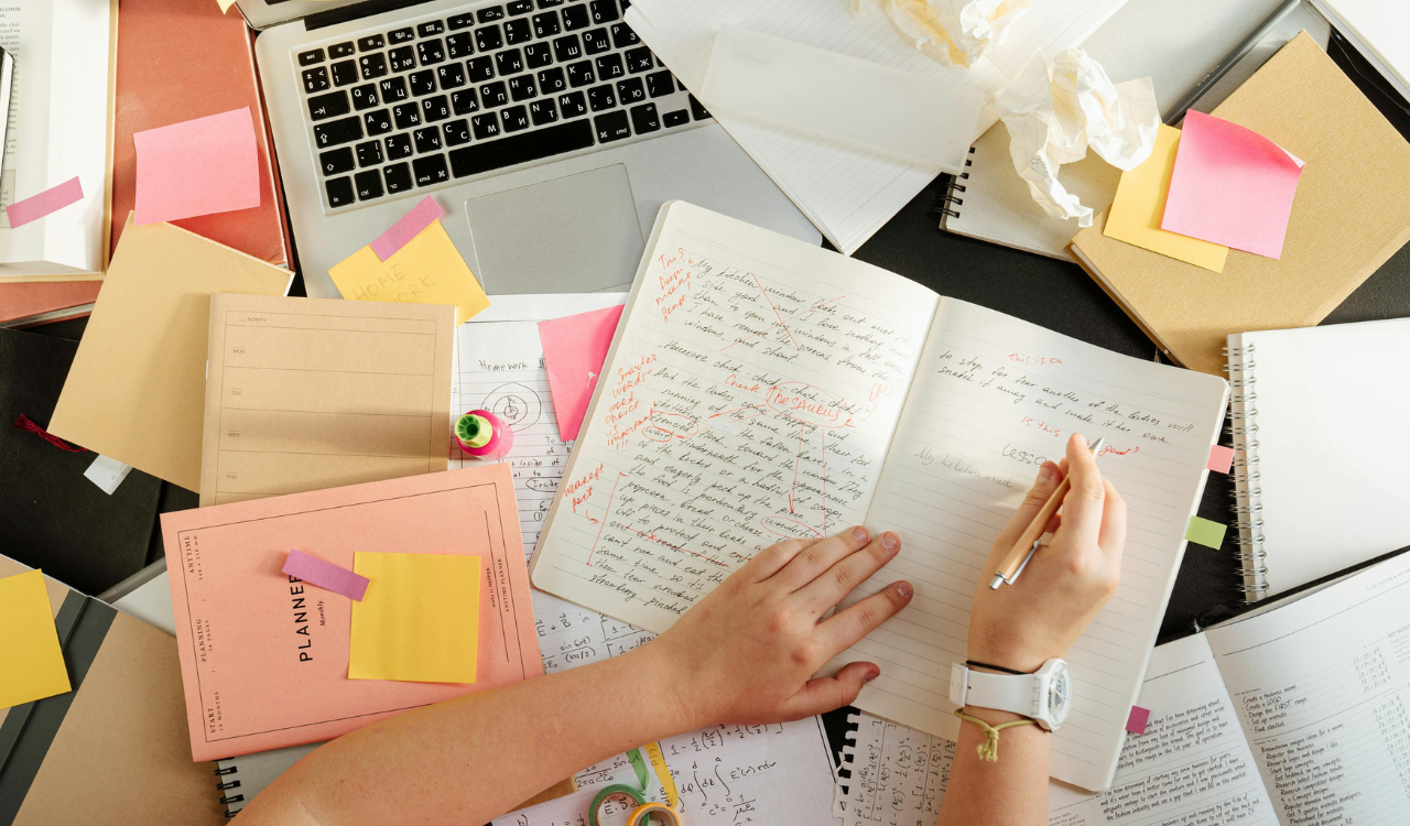
5 Décor Styles That Look Better in Magazines Than Real Homes
At first glance, interior design magazines are meant to wow, not to help people live their lives. Many forms of home decor are shown in homes that are properly set, with the right lighting, professional styling, and no clutter. In real life, those same styles can be unpleasant, hard to keep up with, or not useful. Everyday living includes things like needing storage, moving, pets, and wear and tear that magazine spreads don’t show. This article talks about five forms of decor that seem great on glossy pages but are hard to live with. It explains why the gap between inspiration and reality may be so big.
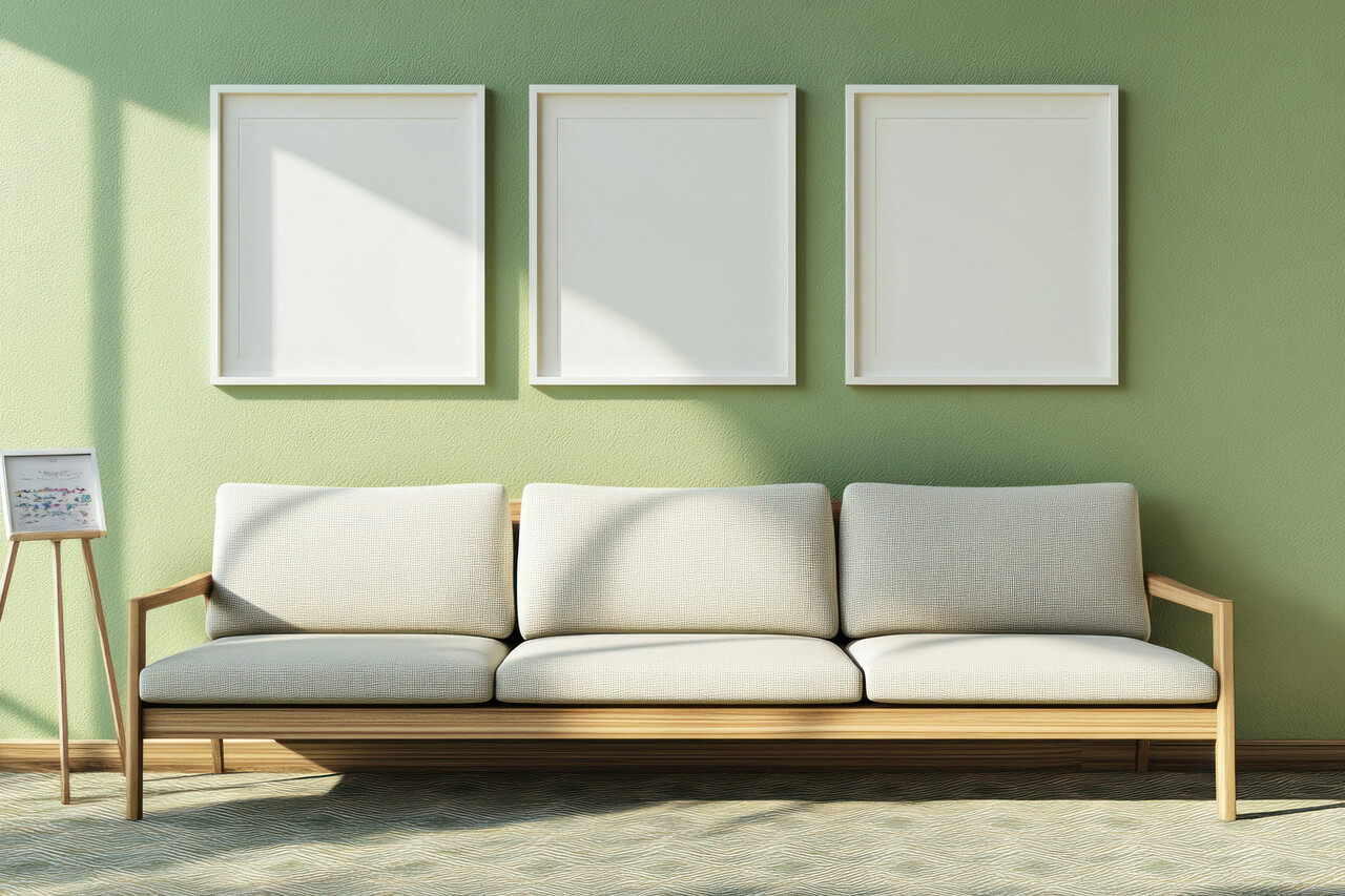
1. All White Minimalist Interiors

Magazines show that all-white minimalist rooms look serene, bright, and expensive, but real homes tell a different picture. White surfaces get dirty, dusty, and scratched up virtually right away, so you have to clean them all the time. The perfect look is easily ruined by families, dogs, and simply typical daily movement. Without appropriate layering, the absence of color contrast can also make spaces appear flat or frigid. When there is a lot of stuff on a white background, it makes storage difficult. Minimalism encourages simplicity, yet keeping a space all white frequently takes more work, discipline, and upkeep than most people want to do.
2. Ultra Industrial Loft Style
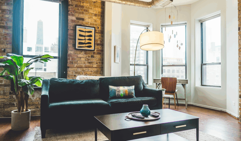
Industrial loft style has rough surfaces, exposed concrete, and metal finishes that look great under controlled lighting. These materials can feel chilly, echoing, and less pleasant in real homes. Hard surfaces make noise louder, which makes areas less suitable for everyday living. Over time, metal furniture and sharp edges can be hard on the body. It also becomes hard to control the temperature because concrete and steel don’t hold heat well. Many people think that the style seems bold and beautiful on paper, but it doesn’t have the softness and comfort that people require for long-term living.
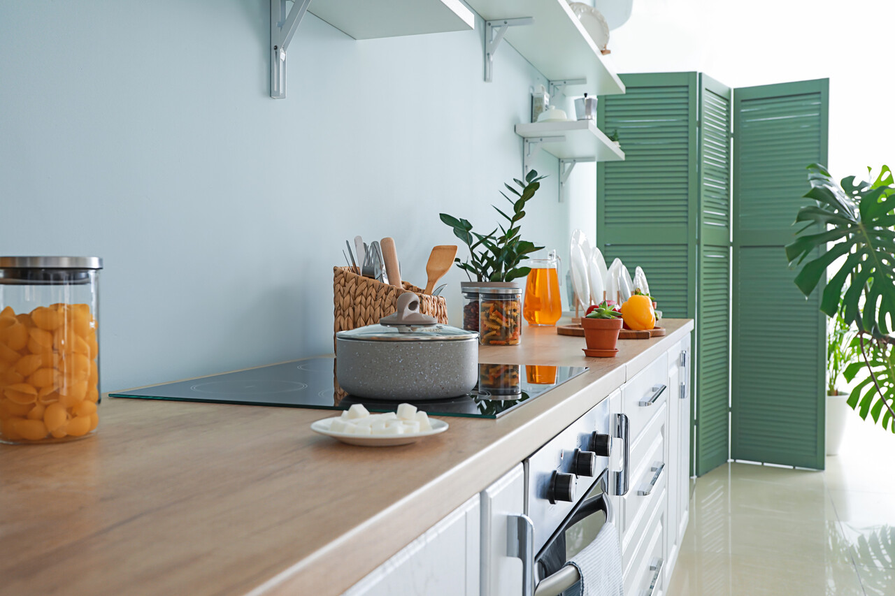
3. Open Shelving Everywhere
Magazines show open shelves as attractive and curated since each item is carefully chosen and organized. Shelves in real kitchens and living rooms get dirty, greasy, and cluttered rapidly. Things we use every day don’t always match properly, which makes things look cluttered. Open shelves also let moisture and cooking debris get to things. The look gets messy if you don’t keep modifying and cleaning. Some open shelves can work, but using them all the time takes effort, planning, and self-control that most real homes can’t keep up with all the time.
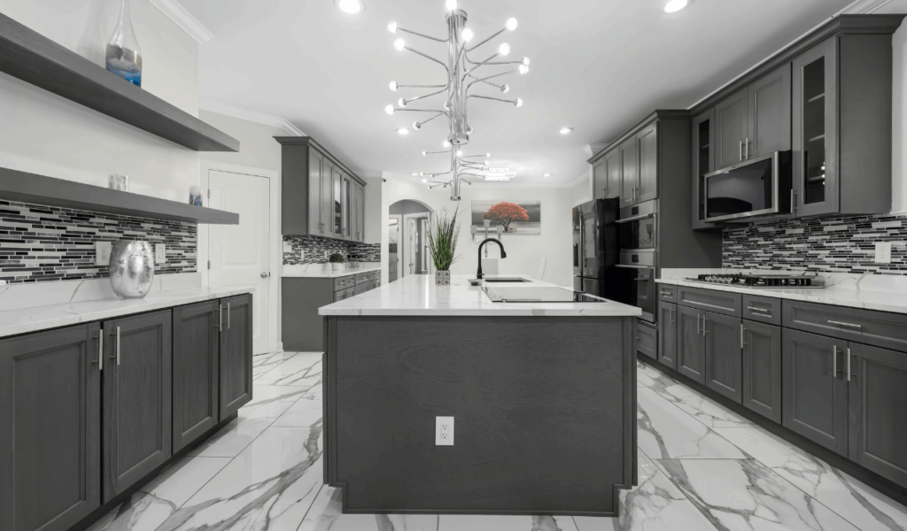
4. Matching Furniture Sets
Furniture sets that match perfectly make magazine layouts look good, but they might feel rigid and impersonal at home. Real rooms look better when they have different textures, sizes, and shapes. Rooms can feel flat and too staged when everything is the same color. They also make it harder to modify things up when layouts change or parts wear out. Mixing styles lets dwellings change and grow throughout time. Many homeowners think that matching furniture photos well, but they don’t like how cold and impersonal it feels. This makes rooms feel more like showrooms than places where people can relax and express themselves.
5. Extremely Bold Color Schemes
Magazines use bold color palettes to get people’s attention, especially when the lighting and styling are done well. When you encounter bright colors every day in real life, they can be too much. Bright colors might not go well with changing decor, seasonal light, or your mood. If tastes change, it can be expensive and time-consuming to repaint big areas. Bright colors can sometimes make a room feel smaller or more walled off. Statement shades are good accents, but utilizing them a lot might be tiring instead of thrilling for daily life over time.