10 Study Space Trends That Felt Too Busy

A study room is best when it is serene, tidy, and simple to concentrate in. However, many popular design ideas went in the opposite direction. Creative or trendy ideas that started out as good ideas often made desks feel messy, loud, and mentally draining. When too many things are fighting for your attention, both your productivity and your comfort go down. The initial impression of these trends was that they were cool; nevertheless, as time went on, they grew bothersome and were not beneficial for regular use. If you are aware of the reasons why they did not work, you will be able to create study environments that facilitate concentration rather than those that make it more difficult to concentrate.
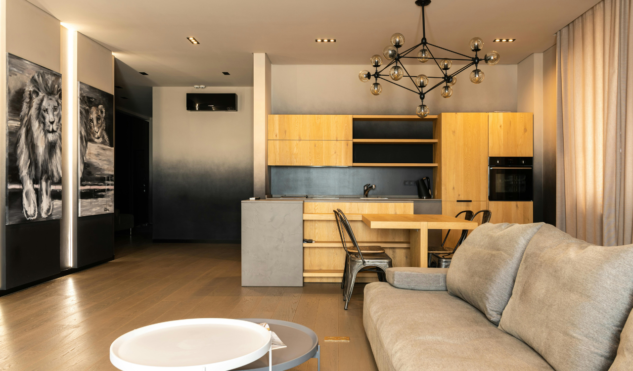
1. Overloaded Gallery Walls
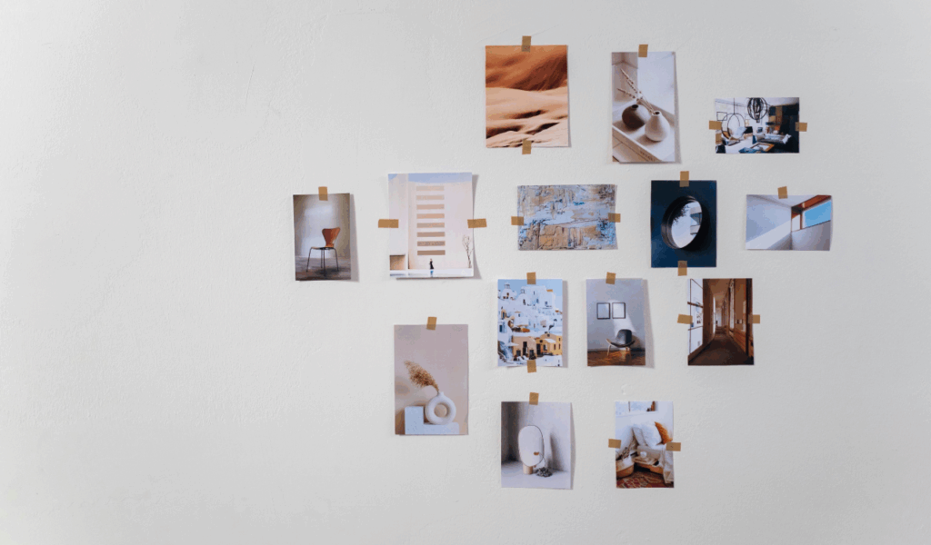
There were lots of frames, pictures, quotes, and artwork on the walls of the gallery to stimulate people, but in study areas, they often accomplished the reverse. When you have a lot of pictures in front of you, your brain keeps processing them even when you’re trying to focusThe implication of this is that there are always things that get in the way of reading or writing. These walls can also give the impression that a tiny room is confined and cluttered. In a study area, it is preferable to have one or two pieces that are pertinent to the topic at hand rather than a large collage that competes for attention.
2. Excessive Open Shelving
Open shelves looked clean and modern in photos, but in real study spaces they often became clutter magnets. Books, supplies, decor, and personal items quickly filled every inch, turning shelves into visual noise. Because everything is exposed, even minor disorganization becomes obvious and distracting. The accumulation of dust is another source of maintenance stress. An excessive amount of open shelves can be intellectually taxing for those who are working on focused tasks since it causes the eye to constantly jump from one object to another rather than settling on the subject at hand.
3. Multi Pattern Wallpaper
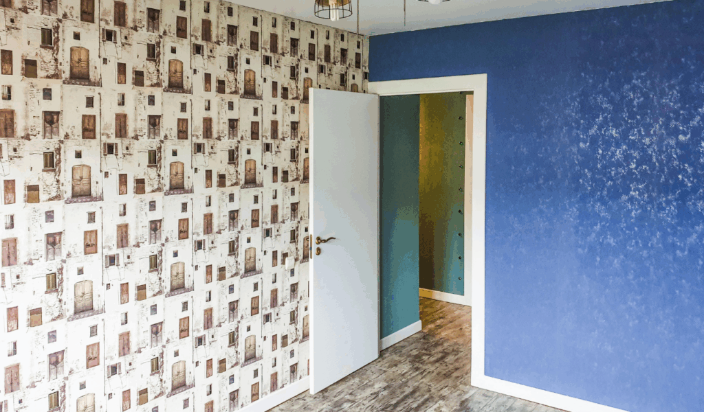
People liked to add flair to their homes with bold wallpaper that had rich patterns, brilliant colors, or motifs that repeated. But in a study area, these patterns can be too much for the eyes, especially when you’re working for a long time. The persistent alterations and repetitions provide the impression that objects are moving, which makes it more difficult to relax and concentrate on the task at hand. At first, it could appear to be enjoyable, but it can rapidly become tedious. In general, study rooms are more successful when they include backgrounds that, rather than catching people’s attention, assist them concentrate on what they are doing.
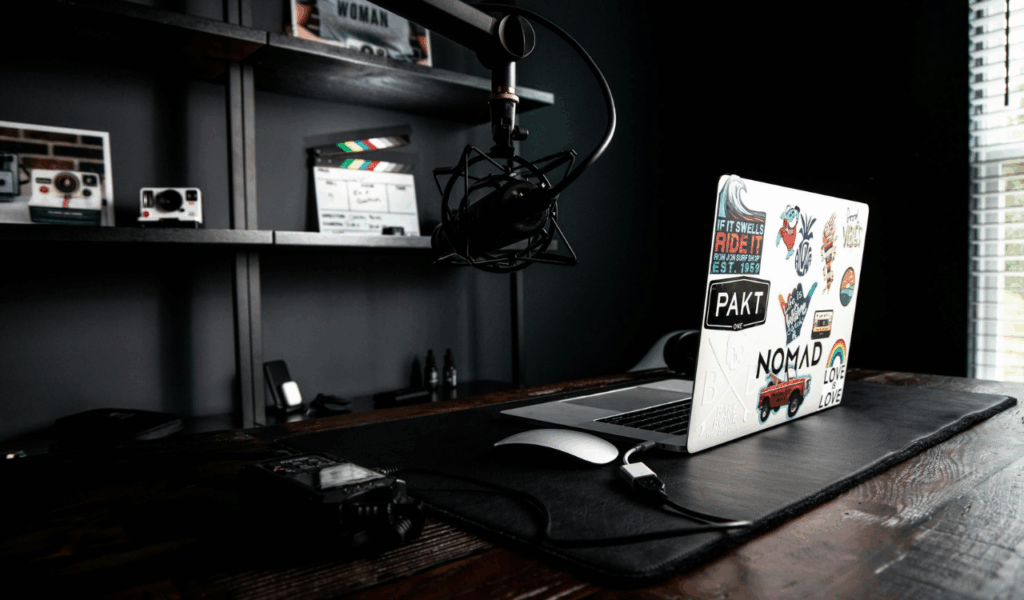
4. Decorative Desk Accessories Everywhere

Stylish organizers, fun pen holders, sculptural lights, and beautiful trays can rapidly fill up a desk. Each item may seem nice on its own, but when you put them all together, they take up too much space on the work surface. Rearranging items on a regular basis in order to make place for writing or a laptop is a time-consuming activity that reduces productivity. Stress can also be caused by a desk that is cluttered with decorations, even if it appears as though the decorations were placed there on purpose. When it comes to getting more done, accessories that are both easy and functional are typically the most helpful.
5. Statement Lighting That Dominates

People often picked big pendant lights, big lamps, or strong sculptural fixtures to create a statement. In study areas, these items occasionally became more of a distraction than a useful aid. When light is diffused improperly, it might generate glare, harsh shadows, or uneven brightness, all of which can cause discomfort to your eyes. Additionally, fixtures that are visually dominating draw the eye upward and away from the surface that is being worked on. In order to avoid drawing attention to itself, the lighting in a study should be designed to blend in with the rest of the room and produce a light that is even and comfortable.
6. Color Blocking Overload
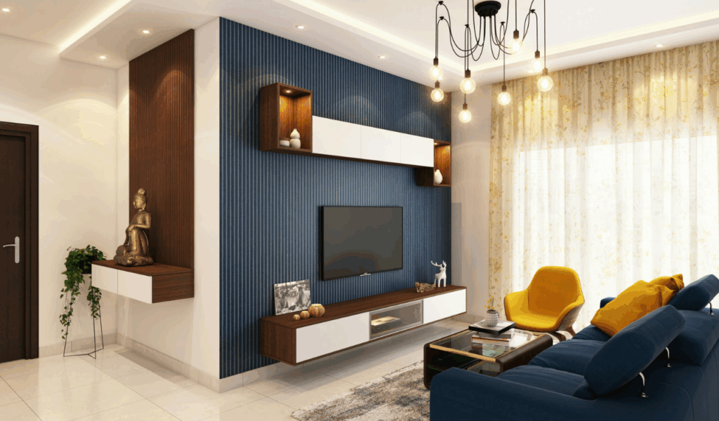
Color blocking added a lot of bright colors to walls, furniture, and decorations, frequently in strong contrast to each other. This method can be too much for a study place where tranquility and consistency are important. There are an excessive number of vibrant colors that compete for attention, which may cause the atmosphere in the space to be tense. If you do not have visual harmony, it is possible that you may become more exhausted and less concentrated over time. For the purpose of maintaining your concentration, it is preferable to have a limited color palette with subtle accents rather than having dramatic contrasts everywhere.
7. Maximalist Décor Trends
Maximalism said that every surface should be covered with things, textures, and layers of decoration. This typically caused sensory overload in a study setting. Because there were so many books, paintings, plants, fabrics, and artifacts in the area, it was difficult to rest on a psychological level. It is essential to have a personality, but an excessive amount of ornamentation can make things appear either too cluttered or too uninteresting. When it comes to studying or performing things that need concentration, a more controlled approach helps the mind remain clear and organized.
8. Mixed Furniture Styles in One Space
It seemed clever to mix different forms of furniture, such modern desks, vintage chairs, and industrial storage, but it frequently felt like a mess. It is not a good appearance for a tiny study place to have an excessive number of design languages that conflict with one another. The brain may become gradually distracted as a result of this irregularity because nothing appears to have been well planned or finalized. For a better study atmosphere, it is preferable to have furniture that complements one another both visually and practically. This provides the space with a sense of stability, which makes it easier to maintain concentration.
9. Overuse of Wall Mounted Boards
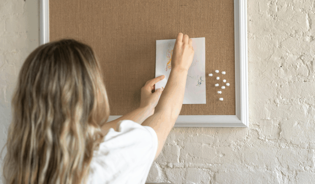
Pin boards, cork boards, whiteboards, and planners are all useful, but if you put too many of them on the walls, they can make the room look messyWhen there are bullet points, reminders, and lists affixed to each and every wall, the space begins to give the impression that it is too crowded in your head. During the process of organizing things, it is possible that crucial information will be lost among other items that are not as significant. Wall tools that are restricted and properly selected, with only those that truly aid everyday activities being retained, are more successful in a study environment than those that are not carefully picked.
10. Trend Driven Décor Without Function

A lot of study rooms followed trends without thinking about how people would really use them. Decorative ladders, stacked crates, or just pretty things often take up space without serving a purpose. With the passage of time, these items evolved into issues rather than positive outcomes. When a piece of decor does not contribute to the storage, comfort, or productivity of a space, it merely makes things appear heavy without providing any real benefits. Function is prioritized in a good study area, and style is allowed to complement it rather than taking precedence over it.