14 Holiday Decorating Shortcuts That Backfired
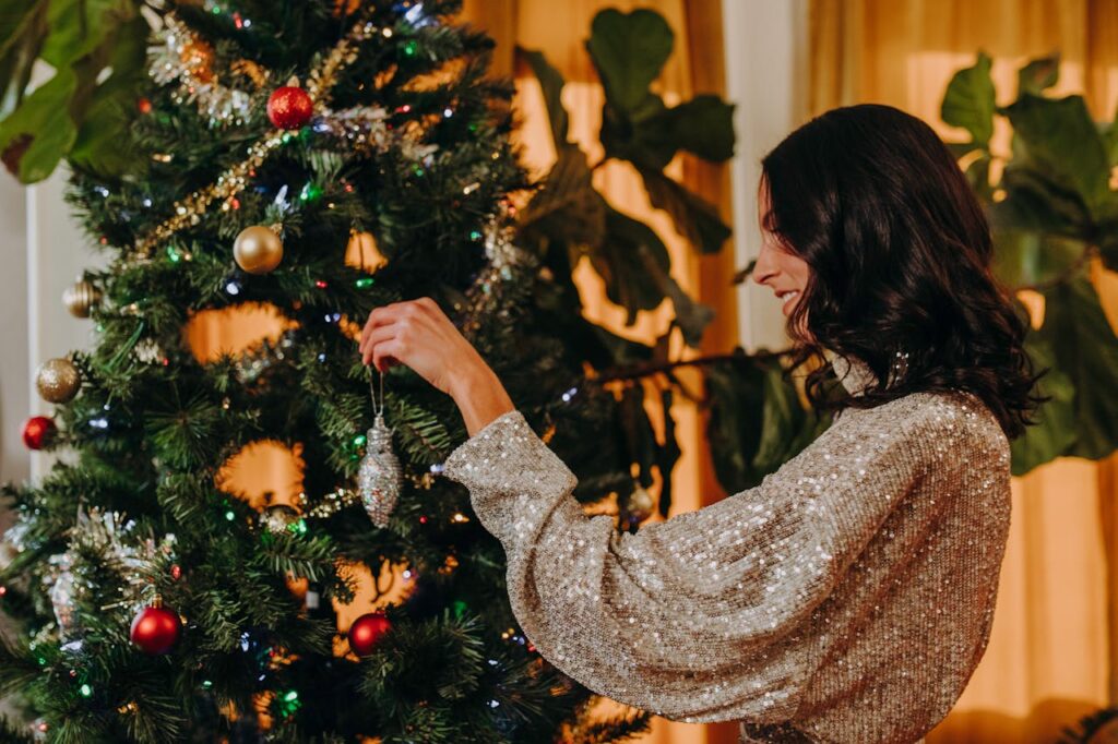
Holiday decorating shortcuts are tempting when time is short and energy is limited. Quick fixes promise fast results and festive impact without much planning. The problem is that many of these shortcuts trade long-term comfort and balance for instant visual effect. Once everything is in place, rooms can feel crowded, mismatched, or oddly unfinished. What looked easy at first often creates more work later when adjustments are needed to make spaces feel livable again. These are the decorating shortcuts that seemed efficient but ended up making homes feel less welcoming during the season.
1. Colored Christmas Trees That Clashed With Real Rooms
Brightly colored trees promise instant personality and less decorating effort, but they rarely blend with everyday interiors. Pink, blue, or metallic trees dominate the room instead of complementing it. Furniture, wall color, and flooring suddenly feel mismatched, which makes the whole space look less cohesive. Ornament choices also become limited because traditional decorations often clash with bold tree colors. What seemed like a shortcut to style ends up requiring even more planning to avoid visual chaos. Many homeowners find the novelty wears off quickly, leaving them with a tree that feels more playful than warm. Instead of creating a cozy holiday anchor, the tree becomes a statement that overwhelms everything around it.
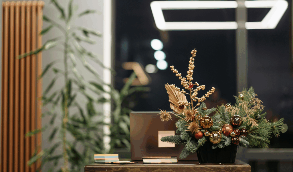
2. Greenery Only Decor That Felt Bare Instead of Festive
Relying only on garlands and wreaths feels elegant and simple at first, especially for people aiming for a natural look. The problem is that greenery alone often lacks contrast and visual depth. Without lights, ornaments, or varied textures, rooms can feel unfinished rather than styled. Dark corners stay dark, and focal points fail to stand out. Fresh greenery also dries out, drops needles, and loses shape, which makes displays look tired fast. What started as a minimalist shortcut ends up requiring frequent refreshing to avoid looking dull. Many people realize too late that greenery works best as a base layer, not the entire decorating plan.
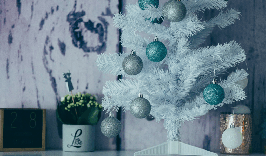
3. Perfectly Matched Decor Sets That Felt Flat
Buying matching ornaments, ribbons, and tree skirts from one collection seems like an easy way to achieve cohesion. The downside is that everything blends into a single visual tone. Without variation in shape, texture, and age, it displays a lack of personality and depth. Rooms start to feel staged rather than lived in. Personal touches like heirloom ornaments or handmade items have no place to shine. Over time, these uniform setups feel generic and forgettable. What was meant to save decision-making actually removes the charm that makes holiday spaces feel special and meaningful.
4. Fake Gift Boxes That Added Bulk Without Warmth

Decorative wrapped boxes fill empty floor space quickly and look tidy from a distance. Up close, they feel artificial and take up valuable room where real gifts, foot traffic, or seating could go. They collect dust, get crushed, and need storage just like real decorations. Guests can also find them confusing when trying to place actual presents. Instead of adding to the sense of anticipation, fake boxes often feel like props. The shortcut saves wrapping time but creates clutter that serves no real purpose once the initial visual impact fades.
5. Farmhouse Holiday Palettes That Felt Stuck in the Past
Soft neutrals, rustic wood, and muted blues once felt fresh and cozy, but repeating the same farmhouse holiday look year after year can make spaces feel dated. The style often lacks sparkle, contrast, and warmth when overused. Rooms can feel flat and dusty rather than bright and celebratory. When trends shift toward richer colors and layered textures, farmhouse palettes start to feel out of step. Homeowners who rely on these shortcuts often find their holiday decor no longer lifts the mood of the space, leaving rooms feeling unchanged instead of refreshed for the season.
6. Multicolor Lighting That Turned Into Visual Noise
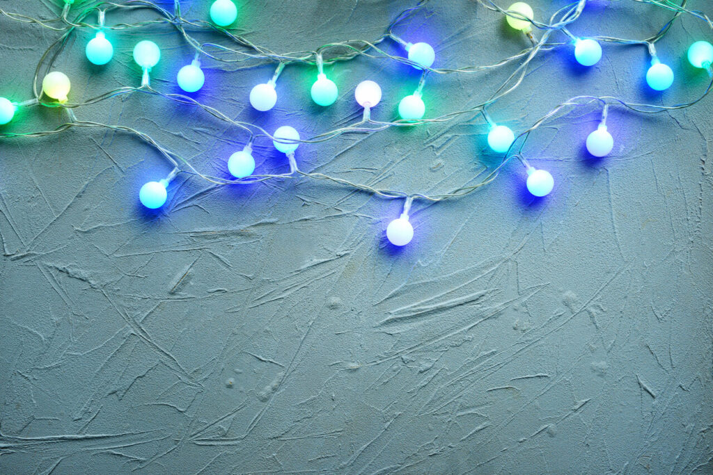
Using every color of light available feels cheerful and nostalgic, but too many competing hues quickly overwhelm both indoor and outdoor spaces. Architecture, landscaping, and entryways disappear behind flashing colors. Instead of highlighting features, the lights flatten everything into one bright blur. Inside the home, multicolor lighting can clash with existing decor and make rooms feel chaotic rather than calm. The shortcut avoids choosing a lighting theme, but the result often feels more like a carnival than a welcoming home. Many people end up wishing for a simpler, softer glow that supports rather than dominates the space.
7. Plastic Garlands With Oversized Red Bows
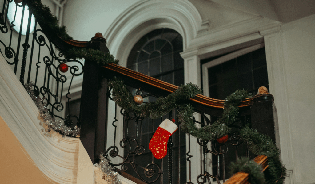
Plastic garlands are cheap and easy to hang, but they lack the depth and movement of real or higher-quality faux greenery. When paired with large, bright bows, the look becomes heavy and stiff. The materials do not drape naturally, which makes mantels and staircases feel rigid instead of graceful. Over time, dust and fading make the plastic shine look dull and artificial. What was meant to be quick decorating ends up calling attention to its own shortcuts, making spaces feel less polished and more temporary.
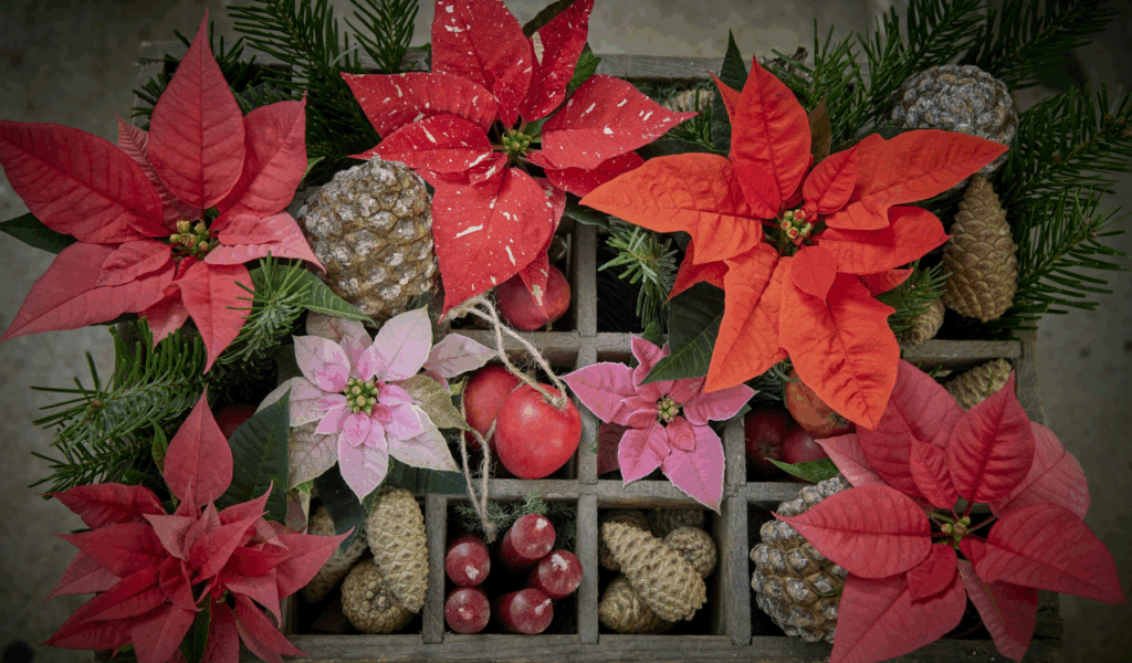
8. Too Many Novelty Decorations in One Room
Collecting themed figurines and novelty items is fun, but displaying them all at once overwhelms surfaces and shelves. Each piece competes for attention, and no single item stands out. Visual clutter builds even if everything is neatly arranged. Cleaning becomes harder, and dust settles quickly on small details. Instead of feeling festive, rooms start to feel crowded and busy. The shortcut of displaying everything avoids choosing favorites, but it sacrifices balance and breathing room. Holiday decor works best when it highlights a few moments, not when it tries to showcase every piece at once.
9. Decor Themes That Ignored the Home’s Style and Setting
Beach-themed decor in mountain homes or rustic accents in sleek modern spaces often feel forced. When decorations do not match the home’s architecture or natural surroundings, they feel out of place. Colors, materials, and shapes clash with existing design features. Instead of enhancing the space, the decor feels like it was dropped in without context. This shortcut comes from copying trends without adapting them to real homes. What looks great in magazines may not translate to different layouts, lighting, and finishes. Without thoughtful adjustment, themes feel disconnected rather than charming.
10. Mixing Multiple Holiday Styles in One Space
Combining traditional, modern, rustic, and whimsical elements in the same room may seem playful, but it often creates visual confusion. Each style has its own color palette and texture language. When mixed without restraint, the room lacks a clear focal point or mood. The eye keeps jumping instead of settling. Instead of feeling curated, the space feels accidental. The shortcut avoids committing to a single direction, but the result feels unsettled and busy. Consistency does not mean boring, but it does mean giving the room a clear identity.
11. Faux Garland Everywhere Without Visual Rest
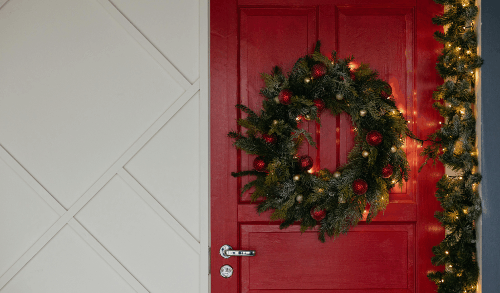
Garland works beautifully when used to frame doorways, mantels, or stair rails. When it appears on every edge and surface, it loses impact and starts to feel like visual clutter. Thick layers of greenery make rooms feel smaller and heavier. Without breaks, the eye has nowhere to pause. Synthetic garlands especially suffer from looking repetitive and flat when overused. What started as an easy way to spread holiday cheer turns into a wall of green that overwhelms rather than enhances the space.
12. Strict Red and Green Color Schemes Without Softening

Classic holiday colors work best when balanced with neutrals and metallics. When red and green dominate every decoration, the palette becomes intense and heavy. Rooms feel darker and more crowded, especially in low light. Fabrics, ornaments, and florals in the same bold shades stack on top of each other without contrast. The shortcut of sticking to traditional colors simplifies shopping, but it often results in spaces that feel visually tiring. Adding softer tones and varied textures usually creates a more comfortable and layered look.
13. Mantels and Shelves Packed With Too Many Layers
Mantels are natural focal points, which makes them tempting to fill edge-to-edge with decor. When every inch is covered, individual pieces lose their impact. Candles, garlands, figurines, and signs blend together into one dense line. The shelf itself disappears behind the clutter. What should be a highlight becomes visual noise. The shortcut of placing everything in one spot avoids distributing decor throughout the room, but it overloads the most visible surface and makes the entire room feel busier.
14. Decorating Without a Clear Plan or Theme
Bringing out every stored decoration and placing it wherever there is space feels fast and festive in the moment. Without a guiding idea, however, rooms quickly feel scattered. Colors, materials, and sizes clash. Some areas feel crowded while others feel empty. Guests may sense that something feels off, even if they cannot pinpoint why. This shortcut avoids decision-making, but it creates a lack of cohesion that is hard to ignore. A simple theme helps guide placement and prevents overloading certain areas while neglecting others.