9 “Console” Mirrors That Make Hallways Feel Claustrophobic
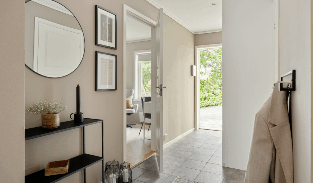
People often say that putting a “console” mirror in the right spot is the best way to make a tight corridor look wider, but if you do it wrong, it might have the opposite effect. A lot of hosts and homeowners pick frames that are too big or too fancy, which makes the transition areas of their homes seem and look crowded.
These mirrors don’t give depth; they make a corridor feel like a narrow tunnel instead of a pleasant entrance. Interior designers say that a mirror that is too big or too small for the console table below it breaks up the vertical flow of the room, pulling the walls in and making the ceiling look lower than it really is.
Experts suggest that the “claustrophobic” feeling comes from not having enough “negative space” around the borders of the mirror. Professional spatial designers say that if a mirror covers the full width of a tiny hall without leaving any space between the walls, it takes away the visual cues that tell our brains that a place is open.
Designers say that a mirror should not be used as a wall replacement, but as a window. When a host promises a spectacular entrance but instead gives a huge, reflecting slab that takes up the whole hallway, the mood is one of clutter and containment. To avoid this, you need to know how frame thickness, reflection angles, and lighting work together to either bring a corridor to life or kill it.
1. The Overly Intricate “Baroque” Frame
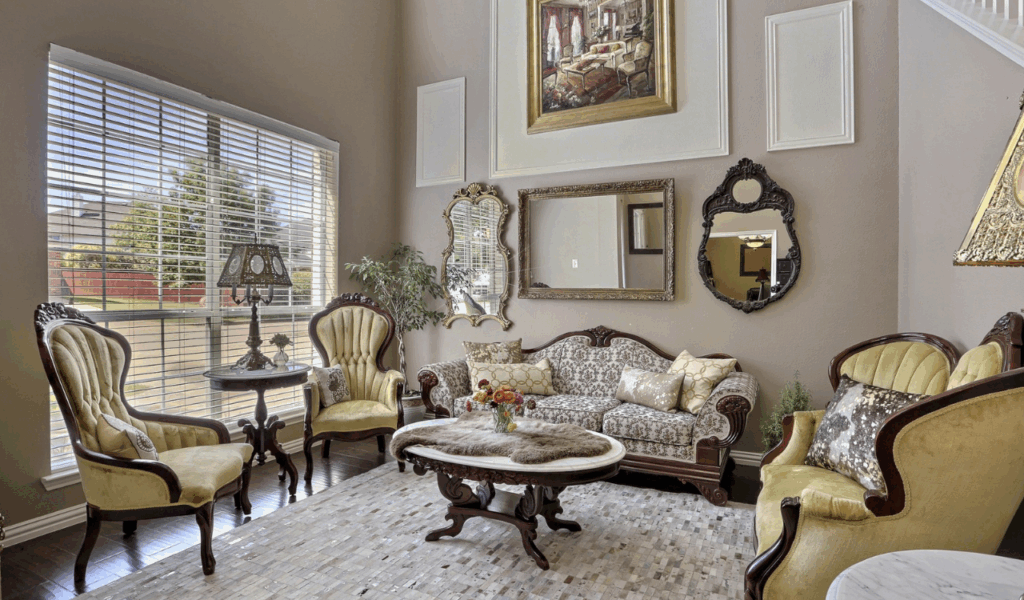
Many people who own homes appreciate Baroque-style mirrors with plenty of carvings because they make the residence feel like a classic luxury and add interest to the architecture. Interior designers, on the other hand, say that these big, fancy frames often stick out several inches from the wall, making the hallway narrower.
Professional contractors say that even a frame that is only a little bit deep might make guests feel like they need to turn sideways to get through a hallway that is 36 inches wide. This makes the area feel smaller and more cramped right away, as if someone is invading it.
According to specialists in etiquette and hospitality, a Baroque frame might be emotionally tiring in a tiny space because of how heavy it seems. The exquisite features draw the eye and demand attention, which can make a brief walk down a hallway feel “busy” and congested.
If you want a classic look, designers suggest going with a “slim-profile” gilded frame that gives you the look without the bulk. Professional flippers often find these massive mirrors still in stores since they don’t fit in with modern, narrower floor plans. A mirror should make the hallway look better, not take up space that people are walking past.
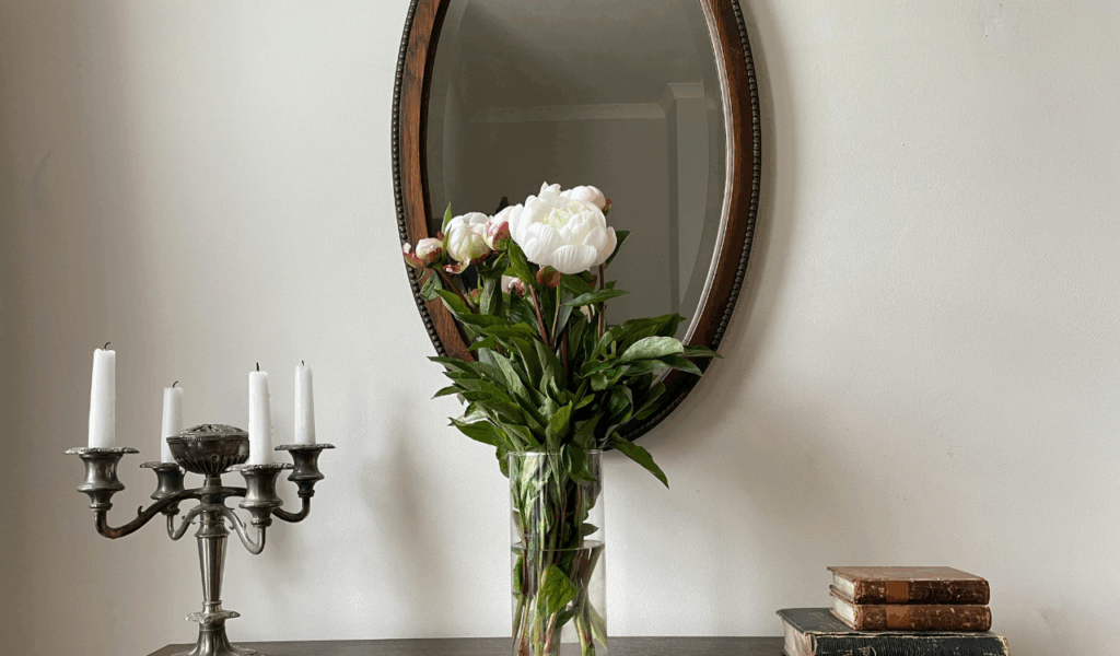
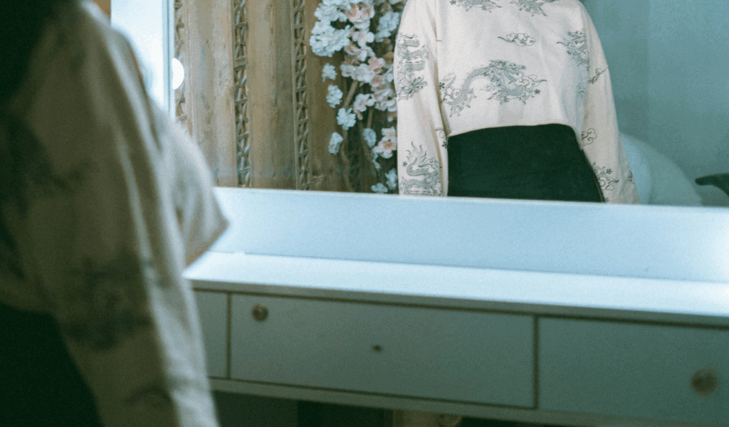
2. Low-Hanging “Portrait” Orientations

One mistake that people often make when designing hallways is hanging a tall, rectangular “portrait” mirror too low above a console table. Experts claim that a mirror that is only a few inches above the table top cuts off the “eye line” of the space and makes the ceiling feel like it is pushing down.
Professional interior organizers say that this location gives the impression of being “boxed in” because the reflection starts around the waist instead of at eye level. You are looking down at a table instead of “into” a reflected space. This makes the floor look narrower instead of the walls look taller.
Lighting experts say that mirrors that hang low don’t bounce light well toward the ceiling, which is important for making a hallway appear open. When the mirror is too low, it reflects the black shadows under the console table or the legs of the furniture, which makes the bottom half of the hall look “heavy.”
To keep the mirror looking upright, designers say to hang it so that the middle is around 58 to 60 inches off the floor. No matter how nice the mirror or console is, if the host gets the height wrong, the whole corridor feels “stumpy” and cramped.
3. The “Dark Tint” Smoked Mirror
People who want a melancholy, “speakeasy” ambiance in their houses often use smoked or tinted mirrors, however they are known for making narrow corridors feel like caverns. Experts say that these mirrors don’t give the “expansion” benefit that people expect from a mirror since they absorb light instead of reflecting it.
Professional home stagers say that a dark hue makes a “void” on the wall that pulls the eye into a dark hole, making the walls around it feel closer and more imposing. This doesn’t live up to the promise of a bright, pleasant transition room.
Interior designers say that smoked mirrors work best in big, open-concept rooms where they can be a planned focal point without making the room feel smaller. A tinted mirror might make it hard for guests to check their look in a corridor, which is what an entryway mirror is for. This is because natural light is generally limited in hallways.
Organizers say that the “thrift store” look happens when the tint is uneven or has a cheap, brownish color that makes the hallway look dirty. Experts say that to avoid a cramped entry, you should use “high-clarity” silvered glass that lets in as much light as possible.
4. Wide “Horizontal” Mirrors in Narrow Halls

A wide mirror could seem like a good idea to make a wall look longer, but a horizontal mirror that goes almost the whole length of a corridor might make it look like a tunnel. Spatial experts say that the horizontal lines make the corridor feel even shorter than it is by drawing attention to the wall on the other side. This is a classic example of a design choice that promises “width” but doesn’t deliver by showing how little “depth” there is.
Designers say that the long lines of the mirror, which end at the end of the hall, make you feel like you’re stuck in a hallway. Professional flippers and renovators say that a sequence of smaller, vertical mirrors or a single well-proportioned “arch” mirror works much better to break up a long wall than a single large mirror. Vertical lines help “lift” the corridor, making it feel more like a room and less like a tunnel.
Interior designers say that the mirror should never be wider than 75% of the console table it is on. When the mirror is wider than the furniture, it makes the hallway look “top-heavy,” which makes it feel small and insecure. To keep a hallway from seeming like it’s closing in on you, you need to keep things in proportion.
5. Heavy “Rustic” Wood Slab Frames
The “farmhouse” style has brought a lot of massive, reclaimed wood slab mirrors into modern corridors, but these pieces are sometimes too “chunky” for areas that are in between. Experts believe that the deep, dark wood absorbs light and makes the wall look “frame-heavy.”
Professional furniture builders say that these frames are typically so hefty that they need a lot of mounting hardware, which might keep them from sitting flush against the wall. This gap makes shadows and adds to the physical bulk, which makes the hallway feel too crowded and “woody.”
Interior designers say that a thinner, more refined wood frame that still displays the grain is better for getting a “rustic” effect than a frame that is too big. Professional organizers say that these thick frames also attract dust in hallways, which are inherently busy locations.
When the frame is too thick, it covers up the “reflective surface” of the glass, which means you don’t get as much of the space-expanding benefits you expected. If a host doesn’t want their corridor to look like a “thrift store” or “cabin,” they should pick a mirror with a glass-to-frame ratio that favors the glass. This will make the hallway feel airy and fresh instead of heavy.
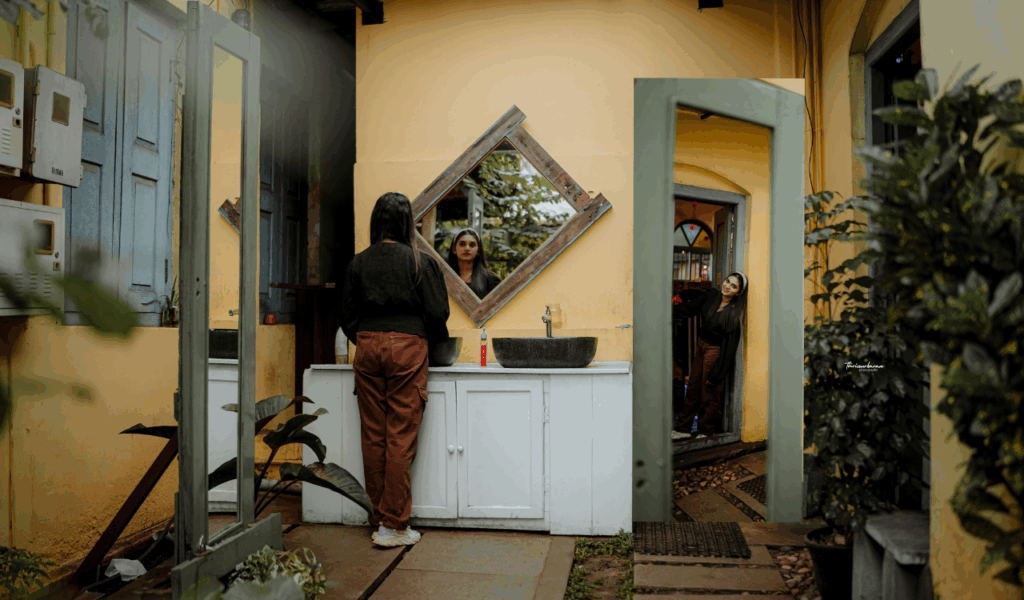
6. The “Grid” or Windowpane Mirror
Windowpane mirrors are made to look like windows, which is a terrific idea for a hallway that doesn’t have any windows. Experts, on the other hand, say that the “muntins” (the bars that separate the glass panes) can make a hallway look more crowded and walled off.
Professional interior designers say that the many small reflections might be confusing in a small area since they divide up the picture into dozens of tiny boxes. You don’t receive a single, clear reflection that makes the room feel bigger; instead, you get a broken “grid” that can feel like a prison.
Experts in hospitality say that the “windowpane” impression only works if the mirror is showing a bright, open space or a piece of art. The grid layout merely makes the issue worse if it is reflecting a bare wall or a coat rack full of stuff. For a cleaner, more modern style that doesn’t draw attention to itself, designers suggest utilizing only one sheet of glass.
Professional flippers say that windowpane mirrors make a home look older and make short corridors look “fussy” instead of “sophisticated.” Experts say that to avoid a cramped feeling, you should choose a “arched” mirror without the interior dividers. This will give you the architectural shape without the annoying grid lines.
7. Deep “Shadowbox” Mirror Frames
Shadowbox mirrors, which have glass that is set back a few inches from the frame, are a popular modern choice. However, they are a “deadly” choice for tight hallways. Experts say that the recess makes the margins of the glass very dark, which makes the reflected vision smaller and makes the mirror seem like it is “retreating” into the wall.
Lighting experts say that these shadows stop light from bouncing off the glass at wider angles, which is exactly what you need to make a corridor feel bigger. The end result is a mirror that looks cool but doesn’t work well in a small environment.
Interior designers say that shadowbox frames also accumulate a lot of “visual noise” since people often use the ledge as a place to put keys, mail, and other small items. This makes the space feel smaller and more cluttered by adding physical clutter to an already limited area. To get the most light reflection, organizers say that a hallway mirror should be as “flush” to the glass as feasible.
If the host promises a “designer look” but gives the guest a shadowbox that makes the corridor look darker and gathers junk, the guest will think the room is “dark and tight.” To keep the reflection bright and the margins clean, experts say that halls should have flat or beveled frames.
8. Too Many “Gallery” Mirror Groupings
A “gallery wall” of small, mismatched mirrors is a frequent DIY project that people do to make a corridor more interesting, but it often falls short by making the space feel “fragmented” and cramped. Professional interior designers say that having a lot of distinct reflection points at different heights looks messy.
Your brain needs to interpret dozens of conflicting images instead of perceiving a clear, open area. This can make you feel “overloaded” in a narrow hallway. This gives the corridor the impression that it is full of “things” instead of “space.”
Experts agree that a single, big, well-placed mirror is nearly always preferable than a bunch of small ones. Spatial psychologists say that a unified reflection helps the brain understand how a home is laid out, while a gallery of mirrors makes it look different. Designers say that if you like the “collected” effect, you should only use three mirrors of the same style and quality to keep everything looking neat. When a host goes too far with the gallery design, the hallway starts to look like a “thrift store” display wall instead of a well-curated house. One big “anchor” mirror over the console table is the safest and best method to keep the corridor feeling open.
9. Mirrors Reflecting “Dead” Spaces
The last reason a console mirror might make a corridor appear small has less to do with the mirror itself and more to do with what it shows. Experts say that if your mirror is in the right place but reflects a dark closet door, an untidy laundry room, or a blank, black wall, it will make you feel even more “closed in.” Professional home stagers say that a mirror is a “multiplier” since it will make whatever is in front of it look bigger. If it shows a “dead” or messy area, it makes the hallway feel twice as small.
Interior designers say that before you hammer in the nail, you should think about what you see in the mirror. A mirror should show off a piece of art, a plant, or a gateway that leads to a brighter room. The mirror becomes a “static” object that only takes up wall space and doesn’t give you any visual relief if the reflection is “uninspiring.”
If you can’t modify what the mirror shows, professional organizers say you should think about moving the console table to a different spot. If a host doesn’t pay attention to the “reflection quality,” they’re not doing their job right, and the guest will feel like they’re stuck in a corridor that just mirrors more hallway.