9 Paint Colors Designers Secretly Hate But Homeowners Keep Using
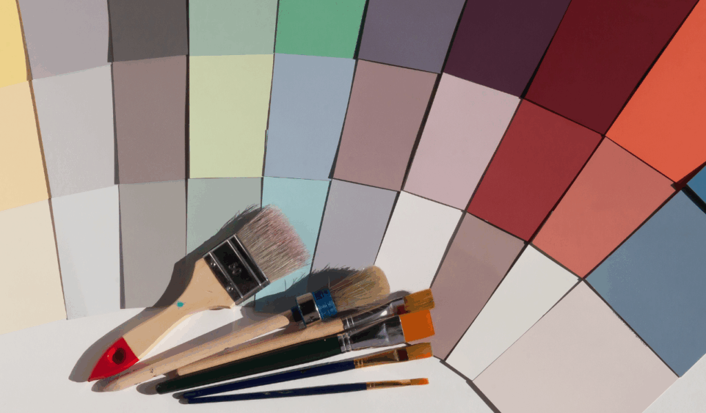
Picking the right paint color is a major deal because it sets the mood in your home, yet a lot of the most popular colors are actually the hardest for professionals to work with. Designers say that some hues may look safe on a little piece of fabric, but they often act strangely when put on four walls.
When homeowners see something on social media that doesn’t match how a hue looks in real light, the room can feel old or out of place. The first step to making a truly professional and timeless interior that will last is to know about these mistakes.
Realtors say that choosing the wrong paint color may make a home seem less valuable and make rooms appear smaller or less welcoming during an open house. Experts note that designers often have to hold back when clients want current colors that would lose their charm in a few years.
Professional flippers say that they nearly always have to repaint these “homeowner favorites” to sell them faster. This post looks at nine popular color choices that experts say you shouldn’t use. It will help you avoid the most prevalent decorating mistakes in modern design.
1. High Contrast Stark White
A lot of homeowners choose a pure, stark white color to have a clean, modern look, but designers say that a more subtle approach is better. Experts suggest that a white without any undertones can appear chilly and clinical, making visitors think of a hospital instead of a home.
Interior designers say that stark white is also particularly unforgiving since it shows every smudge, fingerprint, and flaw on the walls. Because it needs a lot of care, this choice typically makes a room feel empty or unfinished instead of light and airy.
Professional flippers say that stark white can look blue or gray depending on the time of day, which can make a room feel depressing when it’s dark. Realtors say that a room that is completely white may not have the “cozy factor” that buyers want in a family home.
Designers say that choosing “off whites” with warm or neutral undertones will make the space feel more welcome and sophisticated. If you stay away from the harshest whites, your area will feel more like a home and less like a sterile gallery or an incomplete building site.
2. Dated Tuscan Terracotta
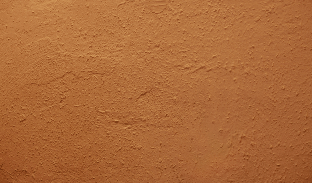
Terracotta’s warm, earthy orange was very popular in the early 2000s, but designers say it has mostly run its course. Experts say that this color is quite hard to match with modern furniture and carpeting that has a cold tone. Designers say that terracotta may make a room feel heavy and “stuffy,” and it can also make everything in the room, including your skin, look orange. It tries to be warm like the Mediterranean, but it often feels like something from a decade ago that is impossible to bring up to date.
Professional flippers say that terracotta is one of the most popular colors they have to paint over during a makeover because it is so divisive. Realtors say that buyers today like lighter, more flexible neutral colors that let them put their own stamp on the home. If you want warmth, designers say you should search for soft sands or clay colors with less orange pigment. These other options give you the same earthy feeling of being in nature without the heavy-handedness of an old color trend that calls for a complete interior redesign.
3. Oversaturated Sunshine Yellow
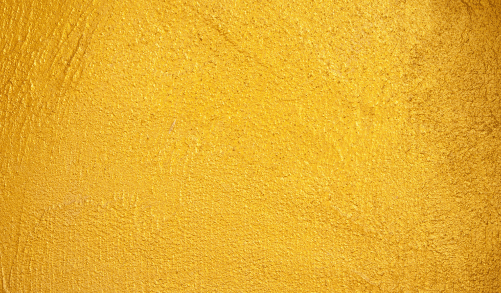
People frequently think of yellow as a happy color, but designers believe that too much sunshine yellow might make people feel bad about their decorating choices. Experts claim that yellow is a hue with a lot of vitality that can quickly become too much when utilized on all four walls of a space.
Interior designers say that bright yellow might make people feel more anxious or agitated in a room that is supposed to be relaxing. It is also one of the hardest colors to get right because it typically looks much brighter and more forceful after the paint dries than it did on the small sample.
Realtors say that bright yellow is a really personal decision that doesn’t usually work well for a lot of people who might want to buy. Designers say that if you like yellow, you should stick to buttery creams or gentle ochre tones that feel more stable. Organizers say that bright yellow can also make your decor look dull and make your furniture look dirty by comparison. You may create a happy mood without the eye strain that comes with a neon or primary yellow paint job by picking a more subdued version of the sun’s favorite color.
4. Drab Builder Beige
For years, builder beige was the go-to neutral color because people thought it was safe. But designers secretly despise it since it doesn’t have any personality. Experts say that these mid-tone beiges frequently have muddy undertones that make a house look “dirty” or “uninspired” all the time. Designers say that beige can make a room feel dead since it doesn’t add warmth or coolness; it merely makes it forgettable. People typically use it to avoid making a mistake, but experts say that being too safe is a design problem in and of itself.
Flippers say that to make homes feel more modern, they have stopped using beige and started using “greige” or soft whites. Real estate agents say that beige can make a home look older than it is, especially if the trim is also a wood tone that is out of style. Designers say to choose deeper taupes or warmer greys that feel more planned and polished. You may make your home look like it was planned by an expert instead of a mass-market builder by shifting away from the usual builder beige.
5. Cold Steel Grey
For more than ten years, grey was the most popular color in design, but designers argue that the trend has moved away from the “cold steel” types. Experts suggest that blue-based greys might feel cold and sad, especially in northern areas where there isn’t much natural light. Interior designers say that these cold grays can make a room feel like a rainy day, even when the sun is shining. People used to think of it as the best modern neutral, but today it seems overused and a little too industrial for a home.
Realtors say that a house that is all cold gray can feel impersonal and “flipped,” which puts off current purchasers. Designers say that “warm greys” or “mushroom” tones that have a little bit of beige or brown in them are better because they make the space feel more inviting and natural. Organizers say that cool gray can also clash with warm wood floors, making the home’s architecture look out of place. You may keep the classy look of gray without the cold, unwelcoming feel of the steel-toned past by choosing a more balanced neutral.
6. Neon Lime and Electric Green
Green is normally a peaceful green, but neon or electric lime variants are a nightmare for professional designers. Experts say that these really bright greens are very hard to light effectively and can make a room feel like a teenager’s bedroom instead of a classy living environment. Designers say that vivid green reflects off of the ceiling and furnishings, making everything in the space look odd and radioactive. It is a color that needs regular attention and doesn’t let the other parts of your design take center stage very often.
Professional flippers say that homeowners who want to be “bold” often use bright green in their kitchens or bathrooms, but it usually takes many coats of primer to cover it up. Realtors say that these bright colors can be very distracting during a property showing since buyers have a hard time looking past the neon walls. For a more classic and natural style, designers say to seek for sage, olive, or forest greens. These darker colors give you the same connection to the outdoors, but they are more mature and elegant than bright lime.
7. Moody Burgundy and Wine Red
In the 1990s, dark crimson walls were the most luxurious thing you could have. But designers say that they often make modern rooms appear small and cramped. Experts say that deep burgundy may soak up so much light that it makes a room feel like a cave and heavy. Designers say that red is also a very hard hue to work with because it doesn’t go well with current textiles and art. It tries to be “royal elegant,” but it often ends up feeling “theatrical,” which doesn’t work well for regular family life.
Professional painters say that red is one of the hardest colors to paint over since the pigment is so intense. This sometimes means using tinted priming and several layers of paint. Realtors say that red bedrooms or dining areas can make potential buyers feel more stressed than relaxed. Instead of using red as the main color on the walls, designers say to use it as an accent color in carpets or pillows. If you really want a dark, somber wall, experts say to search for deep blue or charcoal instead. These colors are just as dramatic but are more modern and can be used in a variety of ways.
8. Basic Baby Blue
Designers typically tell clients not to choose “basic” or “primary” baby blue, even though blue is a color that everyone likes. Experts claim that these colors can make a room feel “child-like” and are preferable for a nursery than a master bedroom or living room. Interior designers say that when you paint a big area with basic blue, it can look flat and one-dimensional. It doesn’t have the depth of blues that include gray, green, or violet undertones, which are what make a hue feel sophisticated and fit well with a home’s style.
Real estate agents say that very pale blue can sometimes look like a hue that was mixed wrong, which can make things confusing when selling a home. Designers say that “dusty” blues or deep teals with more depth and character are better choices. Organizers say that simple blue can also make a room feel colder than it really is, which is not what you want in a pleasant home. You can get the calming effects of blue while still making your home look professionally designed and grown-up by choosing a blue with a more complicated formula.
9. Heavy Chocolate Brown
Dark brown was a popular “earthy” choice for accent walls, but designers say it frequently appears more like muck than a stylish design feature. Experts say that rich chocolate brown can make a room look old and dreary, especially when it’s matched with beige furniture that was popular at the same time. Brown is a color that needs a lot of light and texture to appear good, according to designers. Without those, it might look flat and boring. It frequently seems like a squandered chance to add a true color or a more interesting neutral.
Professional flippers say that one of the first things they do to make a room look better for sale is take down brown accent walls. Realtors say that dark brown can make tiny rooms appear very small because it makes the walls look like they are closing in on the spectator. Instead of painting the walls a solid chocolate color, designers say to use “camel” or “cognac” leather tones as highlights. You may get a dramatic and cozy look without the heavy, old-fashioned feel of a brown paint job by going with warmer, lighter browns or more sophisticated charcoals.