8 Pattern Mixing Fails That Give Guests Instant Headaches
Pattern mixing is an art that can turn a plain space into a stunning one, but if you don’t do it well, it may make the room look messy and hurt your eyes. Interior designers say that the brain wants a living area that has a sense of order and rhythm. When patterns clash and there isn’t a unifying theme, the “noise” in the picture gets too much.
Experts claim that the most common mistake is not giving the eye a place to rest, which makes the room feel busy and restless instead of carefully designed. Psychologists and designers say that places with too much visual stimulation might make guests feel tense or give them headaches.
Professional flippers say that homes with designs that don’t match well generally stay on the market longer because people can’t picture themselves relaxing in them. To stay away from these typical mistakes, it’s important to know how scale, color, and density work together. Decorators say that a space should feel like a discussion between different things, not a loud argument where every piece of fabric is trying to get your attention.
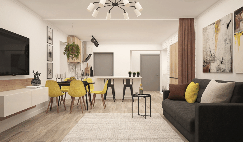
1. Using Multiple High-Density Small Prints
Putting too many little, complicated designs on top of each other in one place is one of the most common mistakes people make while decorating their homes. Designers say that a room needs a balance of scale to feel right. When you put a small floral, a small polka dot, and a tight gingham together, the patterns start to blend together from far away, making a vibrating impression. Experts suggest that this visual vibration is frequently the main reason why visitors have “instant headaches.” This is because the optic nerve has a hard time telling the difference between the tiny details on each surface.
Professional organizers say that you shouldn’t use minor patterns as focus points; instead, you should think of them as “textures.” The space loses all feeling of depth if every cushion, rug, and curtain has a high-density print on it. Interior designers say that the solution is to combine a little print with a much larger, bolder pattern to make the hierarchy evident. The space feels small and crowded when everything is small and active. Designers say that guests are more likely to feel nervous in these areas since there is no firm base or “negative space” to help hold the design together.
2. Clashing Dominant Color Palettes
Color is what keeps different patterns together, and if they don’t have a common palette, things get rather messy. Contractors that work on home renovations say that even the most expensive designer materials will seem cheap if their base colors don’t match. For instance, putting a blue floral with a cold tone next to an orange paisley with a warm tone can make the two colors look very different from each other.
Experts claim that the lack of a “bridge color” makes it hard for the eye to move smoothly across the room, which makes the brain work harder to make sense of the contradicting information. Realtors say that a consistent color story is the key to make random pattern mixing look like it was meant to happen.
Designers say you should choose one “anchor” hue and make sure it is in every pattern in the room. The room will feel more put together if all five of the patterns have the same shade of forest green. If there isn’t a unifying thread, guests could feel like they’re in the middle of a fabric store’s cheap bin. Organizers say that using a small number of colors lets you be considerably more daring with the shapes of the patterns themselves.
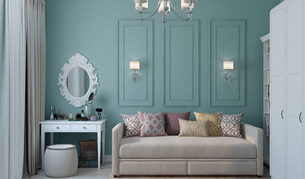
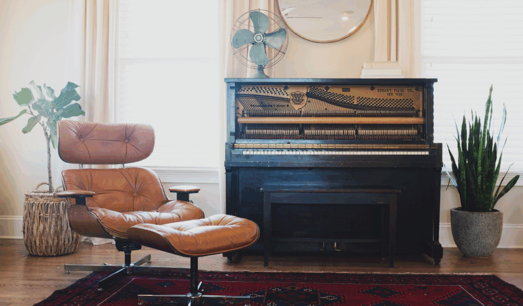
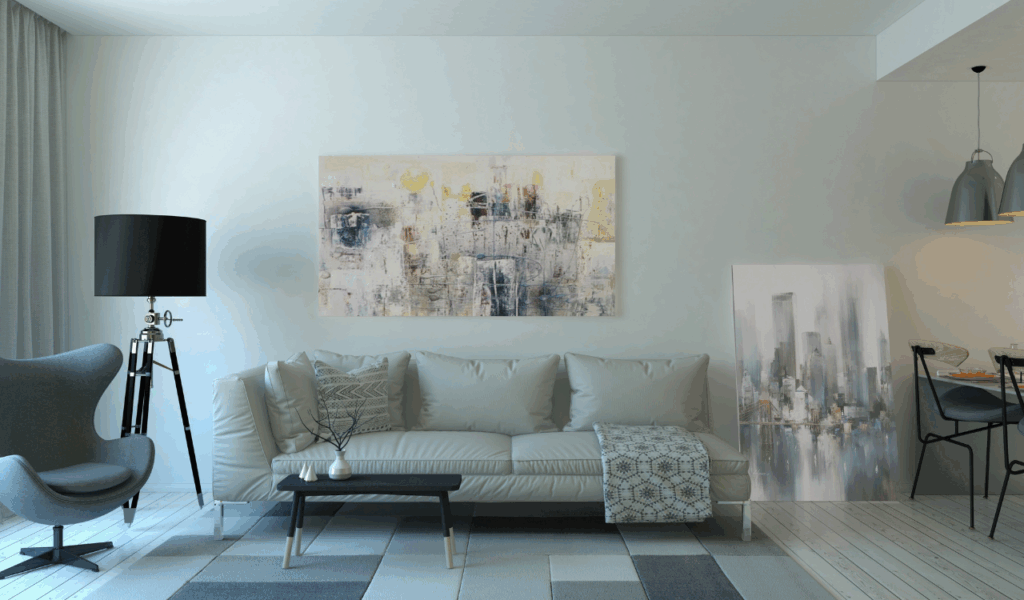
3. Ignoring the Power of Solids
A space with no solid colors at all is a design catastrophe that makes guests feel tired. Interior designers say that solids can help break up the visual energy of many patterns by acting as “palate cleansers.” Experts say that the “fail” happens when a patterned sofa is put on a patterned carpeting with patterned drapes behind it. The room feels “loud” and tiring to be in because there isn’t enough visual relief. Professional decorators say that to keep things balanced, at least 40% of a room should be made up of solid colors or very light textures.
Designers say that solids give your preferred designs a place to really shine. Nothing is special if everything is patterned. Professional flippers say that a room that feels “too busy” is frequently just one that doesn’t have a solid-colored rug or a set of neutral draperies. Experts suggest that placing a solid block of color around the patterns makes them feel like a purposeful choice and keeps them from spreading out. The space doesn’t have the “breathable” character that makes guests feel truly comfortable and welcome without these resting spots.
4. Pairing Competing Geometric Shapes
It’s trendy to mix diverse geometric patterns, but putting together too many “directional” forms can make things look disorienting. For example, designers say not to put a zig-zag chevron next to a sharp diamond print and a vertical stripe. Architects say that these lines that are fighting with each other tug the eye in too many places at once, which makes the eye tired. Experts claim that the brain naturally attempts to follow the lines of a pattern.
When those lines are always crossing and clashing, some guests may feel ill to their stomachs.
Professional decorators say that to address this, you should pick one main geometric shape and match it with something more natural, such a floral or botanical pattern.
If you have to employ more than one geometry, designers say you should change the scale a lot. A extremely wide stripe can work with a little grid, but two medium-sized, bold shapes will almost always clash. Realtors say that the best rooms are those where the patterns look like they are “nesting” together instead of fighting for the same visual space on the walls and furnishings.
5. Overloading a Single Focal Point
Putting all the varied patterns in one tiny location, such on one armchair with four different pillows and a throw blanket, is a classic mistake when designing a living room. Designers say that this “clumping” of patterns makes the room feel weighty and out of balance. Experts believe that the patterns are so strong in one area that the rest of the space feels empty and off-balance. This lack of balance can make guests feel “off” in their bodies because the weight of the decorations isn’t spread out equally in the living space.
Organizers say that the ideal approach to mix patterns is to “spread the love” over the whole area. If your rug has a bold pattern, you could put a smaller version of that pattern on the other side of the room in a piece of art or a lampshade. Designers suggest a “triangular” technique, which means repeating a pattern or color in three separate places to provide the impression of movement. Experts say that when patterns are placed correctly, the eye can move across the room easily, which stops the visual strain that leads to those awful headaches.
6. Mixing Too Many Different “Themes”
“Eclectic” is a real design style, however there is a thin line between “eclectic” and “messy.” Designers say that blending patterns from very different ethnic or historical themes might make a room feel empty. For instance, putting a traditional Scottish plaid next to a tropical Hawaiian design and a mid-century contemporary atomic starburst can be hard to understand.
Experts say that these “thematic fails” don’t have a story, which makes guests feel like they’re in a storage unit instead of a house. Interior designers say that you should only choose two motifs that have a similar “vibe” or history. Professional flippers say that a space seems most anchored when the patterns have a reason to be there.
Even if the colors match, the organizers say that the patterns’ “mood” needs to be somewhat compatible. Guests often say they have a headache because their brains can’t categorize the place when the energy is too scattered. Experts argue that a good mix should sound like a story that makes sense when you walk through the door.
7. Forgetting the Importance of Texture
A lot of homeowners just think about how the print looks and forget that the fabric’s texture is also a “pattern.” Designers say that blending a shiny satin with a rough burlap and a shaggy fake fur can be just as intimidating as prints that don’t match. Experts say that when there are too many different tactile sensations in a place, it might seem “itchy” and uncomfortable. This overload of the senses is a common but subtle cause of guest discomfort, as the brain struggles to make sense of both the visual pattern and the many physical textures.
When blending patterns, professional decorators say to keep the “sheen” levels around the same. If most of your materials are matte, stick with matte textures. Designers say that a room with a consistent “language” of textures feels considerably more expensive and professional. Realtors say that purchasers often like rooms more when the materials are mixed in a deliberate way, like velvet and linen. Experts suggest that making the transitions between textures smoother lowers the overall “noise” in the space, making it a far more relaxing place for socializing and talking for a long time.
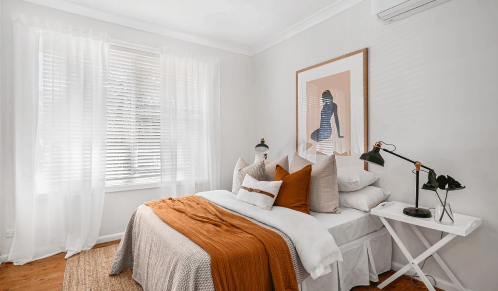
8. Neglecting the Background “Canvas”
The last and maybe most important pattern mixing mistake has to do with the walls and floor. Designers say that if your wallpaper and carpeting are both busy, the patterns on your furniture don’t matter much because the “canvas” is already filled. Experts say that the background surfaces should support your decor.
The space doesn’t have a solid base when the walls and floors are both very patterned. This “sandwich” effect, where the guest is stuck between two loud patterns, is a sure method to get them tired of looking at things. If you want a vibrant, patterned rug, professional flippers say you should keep the walls a solid hue, or the other way around.
Designers say that one big “hero” pattern should be the main focus, with everything else acting as a background. Decorators say that the most typical rooms that give people headaches are those where the floor, walls, and ceiling are all fighting for attention. Experts believe that if you make the background less busy, the various patterns on your furniture and accessories will look more like a selected collection than a messy explosion of fabric.