9 Study Area Décor Choices That Felt Distracting
A study area should make it easier to focus, not harder. Yet many décor choices that look creative or stylish at first quietly work against concentration. Bold colors, layered textures, and decorative accents can overwhelm the senses once daily study or work begins. What feels inspiring during setup often turns distracting during long sessions of reading, writing, or screen time. As routines settle in, people start noticing eye fatigue, restlessness, or an urge to constantly. These study area décor choices looked appealing but ultimately pulled attention away from what the space was meant to support.
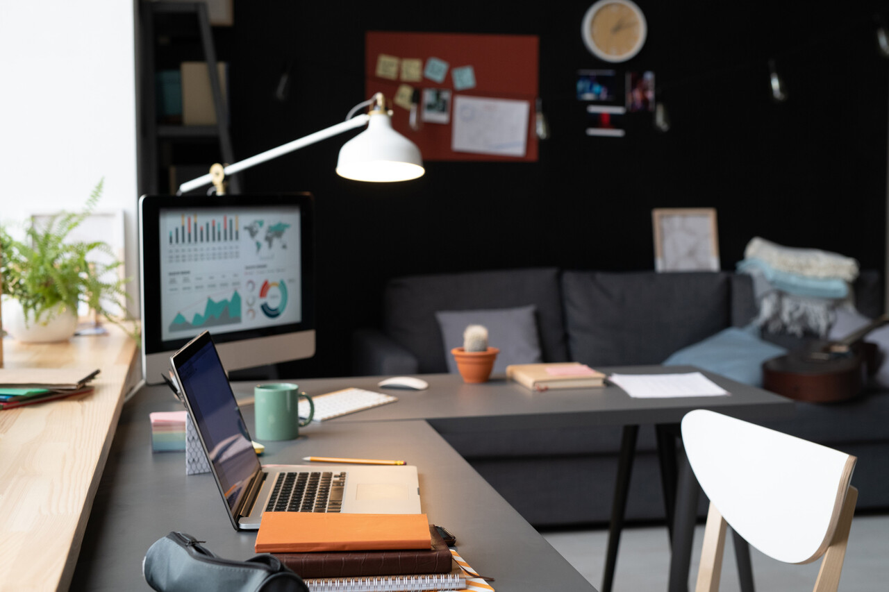
1. Busy or Loud Wall Patterns That Pulled Attention Away
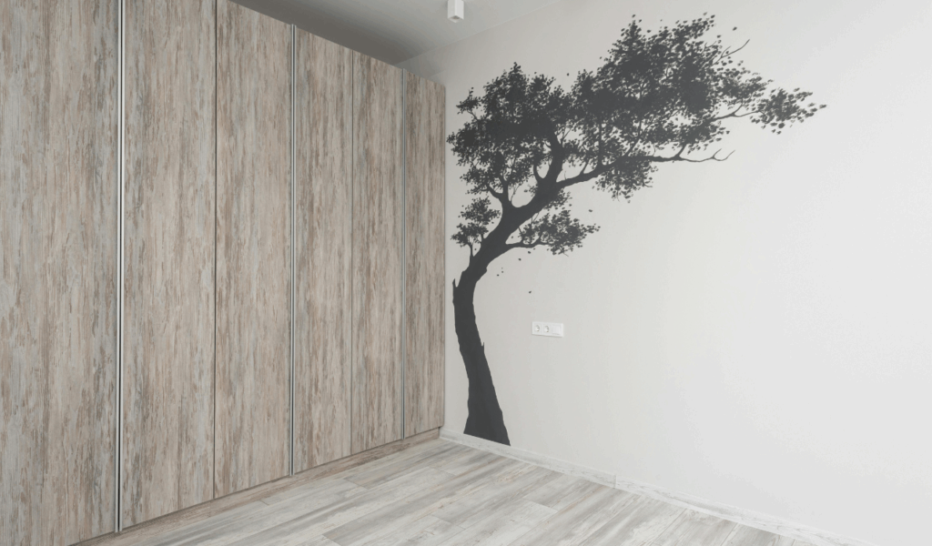
Walls set the tone for a study space, and when they are visually loud, focus is usually the first thing to suffer. Bold wallpapers, oversized maps, or busy graphic murals may look inspiring at first, but they constantly compete for attention. The eye keeps drifting, especially during reading or screen work, which increases mental fatigue. Research on visual environments consistently shows that high-contrast patterns and complex visuals demand more cognitive processing. In a study area, that extra processing pulls energy away from learning or problem-solving. Over time, what once felt creative starts to feel restless. Many people realize too late that calm, low-contrast walls support concentration far better than statement designs.
2. Overuse of Accent Colors That Felt Overstimulating

Color affects mood and energy, and in study areas, too much stimulation works against productivity. Bright reds, saturated yellows, and intense blues are often used as accents, but when overdone, they raise alertness to the point of distraction. Instead of helping focus, these colors keep the brain slightly on edge. This is especially noticeable during long study sessions, where visual calm matters. Accent colors work best in small, intentional doses. When they dominate walls, furniture, or accessories, the space feels busy rather than supportive. Many people end up feeling mentally drained faster, even if they cannot immediately explain why.
3. Decorative Items That Took Over Shelves and Desks
Decorative objects are meant to personalize a space, but too many turn into visual noise. Shelves filled with figurines, framed quotes, souvenirs, and plants create multiple focal points. The brain keeps scanning instead of settling. Desk surfaces suffer even more. When décor crowds functional space, it interferes with writing, typing, and organizing materials. Studies on workspace clutter show that excess visual stimuli reduce working memory efficiency. What starts as motivation becomes distraction. Over time, people notice they feel calmer and more productive when surfaces are simplified, even if the room looks less styled.
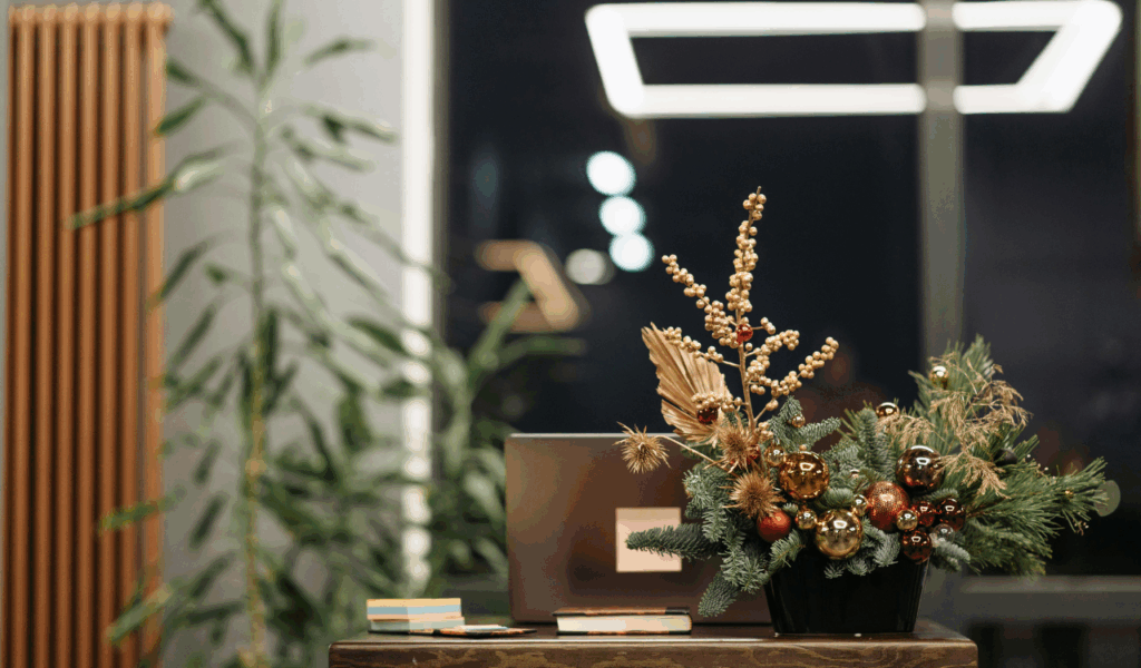
4. Large Artwork Placed Too Close to the Work Zone
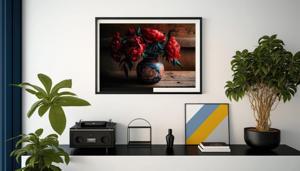
Artwork can inspire, but scale and placement matter. Large pieces positioned directly in front of or beside a desk draw the eye repeatedly, especially when they contain movement, faces, or strong contrast. During focused tasks, this becomes disruptive. The brain is wired to notice large visual elements in close range, even when trying to ignore them. Instead of fading into the background, the artwork demands attention. Many people eventually realize that large art works better on peripheral walls, not within direct sightlines of the desk. In study areas, subtlety supports focus better than visual drama.
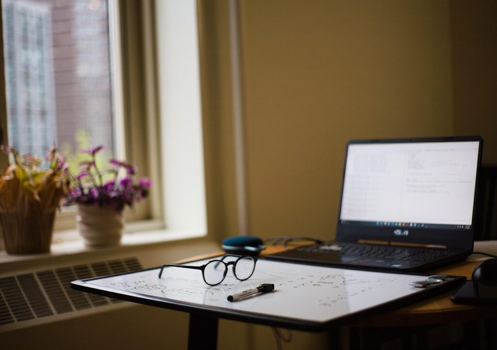
5. Decorative Lighting That Created Glare or Distraction
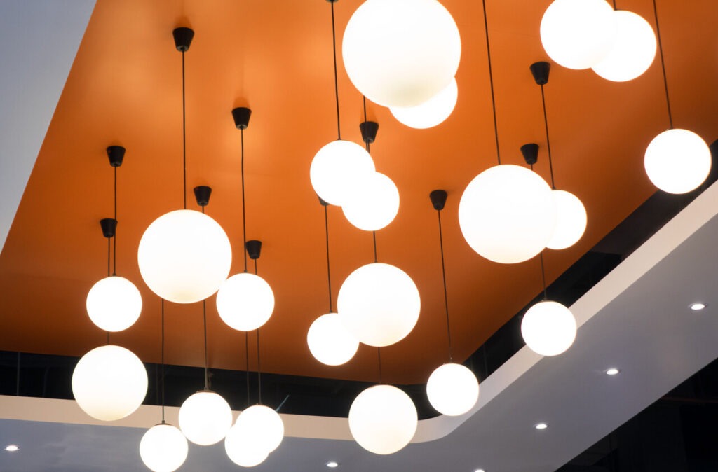
Lighting should support concentration, not steal it. Statement lamps, exposed bulbs, or decorative pendants placed too close to the desk often create glare, shadows, or uneven brightness. Flicker from certain bulbs or reflective surfaces adds to eye strain. When lighting draws attention to itself, it breaks concentration repeatedly. Task lighting works best when it is predictable, soft, and properly directed. Many people regret prioritizing style over function, especially during long study hours. Once headaches or eye fatigue set in, decorative lighting quickly loses its appeal.
6. Patterned Rugs That Competed With the Workspace
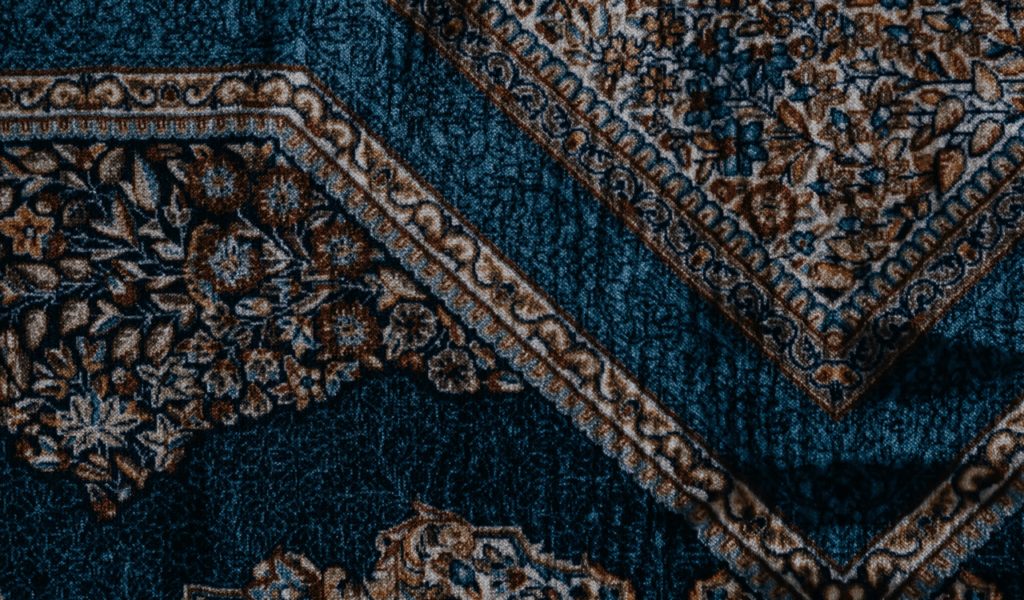
Rugs add warmth, but busy patterns introduce unnecessary movement into a study area. Stripes, bold geometrics, or high-contrast designs pull attention downward, especially in small rooms. This constant visual activity can be subtly distracting, even when the rug is not consciously noticed. Research on visual ergonomics suggests that stable, low-contrast surroundings help the brain maintain focus longer. In study spaces, patterned rugs often work against that goal. Many people find that switching to neutral or textured rugs without strong patterns immediately makes the room feel calmer and easier to work in.
7. Overstuffed Wall Shelving That Felt Overwhelming
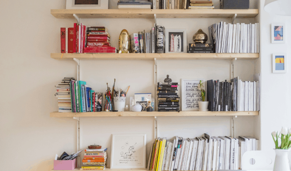
Wall shelving is useful, but too much of it creates a crowded, boxed-in feeling. When shelves are packed with books, décor, and storage boxes, the wall becomes visually heavy. The brain perceives this as clutter, even if items are neatly arranged. In a study area, that sense of crowding increases mental load. People often underestimate how much visual weight shelves carry, especially at eye level. Over time, many remove items or reduce shelf density, realizing that fewer, well-spaced shelves support focus better than filling every inch of wall space.
8. Streams of Small Decorative Pieces With No Visual Hierarchy
Small décor pieces scattered across surfaces create constant micro-distractions. The eye jumps from one object to another without settling. Unlike one strong focal point, many small items fragment attention. This is particularly problematic in study areas, where sustained focus matters. Without a clear visual hierarchy, the space feels restless. People often notice they feel calmer after removing half their accessories, even if the room looks simpler. The lesson becomes clear. In functional spaces, fewer visual elements with clear purpose outperform decorative abundance.
9. Furniture With Busy Textures or Overly Stylized Designs
Furniture is meant to fade into the background in a study area, not demand attention. Highly patterned upholstery, bold wood grains, or sculptural shapes pull focus away from work. When every piece has strong visual character, the room feels competitive rather than cohesive. Textures catch light differently throughout the day, creating constant visual change. Over time, this movement becomes distracting. Many people regret choosing statement furniture for study spaces, realizing that clean lines and neutral finishes support concentration far better. Furniture that blends in allows the work itself to stand out.