9 Neutral Color Schemes That Make Homes Feel Lifeless
Neutral color schemes promise calm, balance, and timeless appeal, which is why so many homeowners gravitate toward them. But when neutrals are used without contrast, texture, or warmth, they often drain the life out of a space instead of enhancing it. What looks polished in photos can feel cold, flat, or unfinished in everyday living. As design trends shift, homeowners are realizing that neutrals need intention and layering to work. Without those elements, even the most expensive finishes can feel dull, uninviting, and emotionally empty.
1. Stark White Walls With No Accent
A room painted entirely in stark white often looks clean and modern at first glance, but living in it tells a different story. Without accent colors, trim contrast, or layered materials, pure white walls can feel sterile rather than serene. Light bounces aggressively instead of softly, which makes spaces feel exposed and unfinished. Over time, homeowners notice that these rooms lack emotional warmth and visual anchors. There is nowhere for the eye to settle, which creates subtle discomfort rather than calm. Designers increasingly point out that white works best as a supporting player, not the entire cast.
2. Uniform Beige Across All Surfaces
Beige earned its reputation as a safe choice, but using it everywhere drains a home of energy. When walls, ceilings, furniture, and flooring all sit in the same beige family, the space loses depth and contrast. Light gets absorbed instead of reflected, which makes rooms feel dull, especially in homes with limited natural light. Homeowners often describe these spaces as sleepy or dated rather than cozy. Beige needs variation to succeed. Different undertones, textures, and materials give it life. Without those layers, it becomes visual background noise. What was meant to feel calming ends up feeling forgettable, as if the room has no personality or intention behind it.
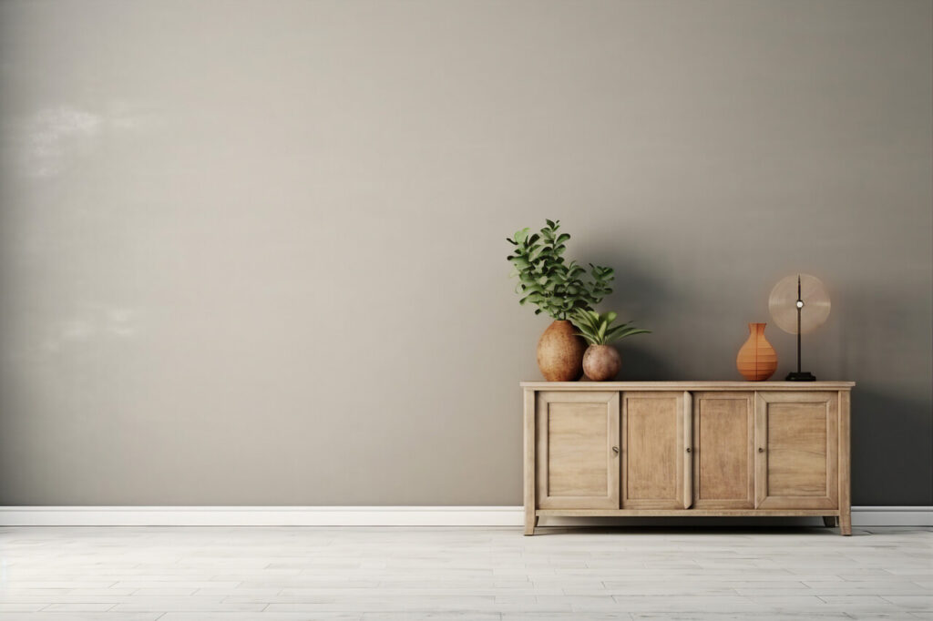
3. Gray Only Interiors Without Warmth
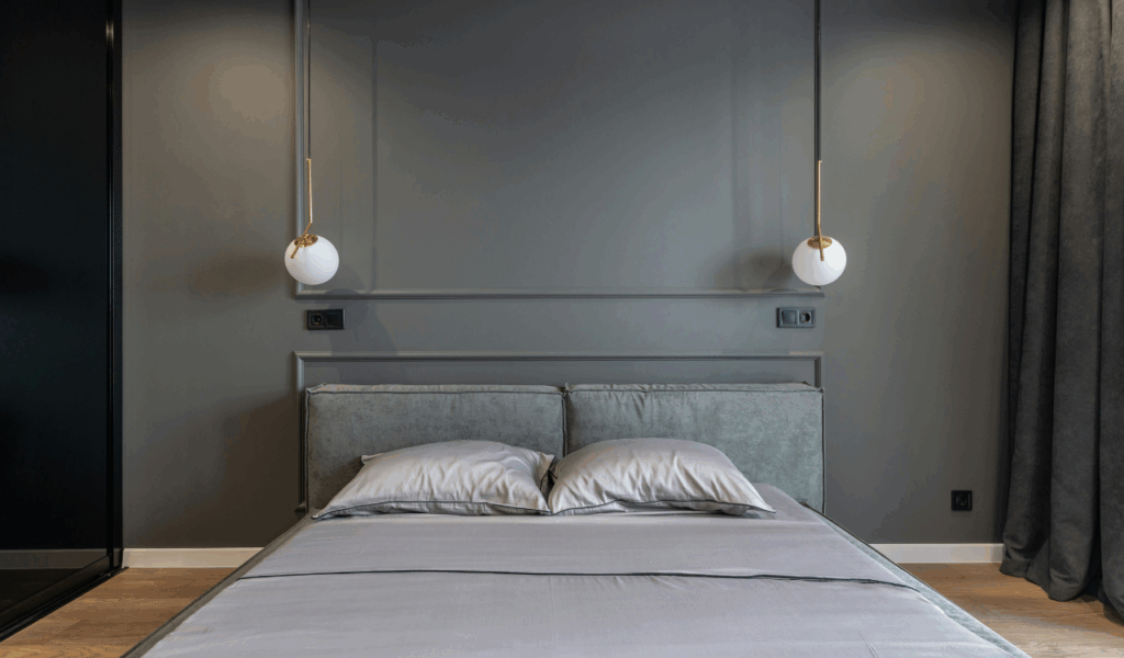
Gray dominated interiors for years, but spaces built entirely around cool gray tones are starting to feel emotionally flat. Gray walls, gray floors, and gray furniture can create a heavy atmosphere that lacks warmth and comfort. Instead of feeling modern, these rooms often feel corporate or temporary, like a staged rental rather than a home. The issue is not gray itself but the absence of balance. Without warm woods, soft fabrics, or warmer accent colors, gray becomes oppressive. Homeowners frequently report that these rooms feel colder over time, both visually and emotionally. Gray works best when it shares the stage with warmth, not when it stands alone.
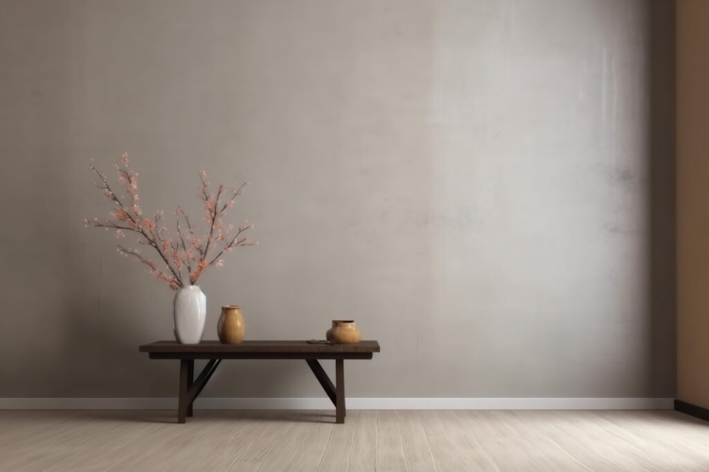
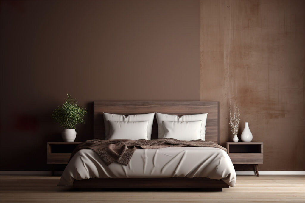
4. Taupe and Greige Used Without Contrast
Taupe and greige promise sophistication, but when used without contrast they can flatten an entire space. These colors sit quietly between warm and cool, which makes them easy to overuse. When walls, upholstery, and flooring all land in similar taupe tones, rooms lose definition. Corners blur together and architectural details disappear. Lighting plays a huge role here. In poor light, taupe can look muddy or lifeless. Homeowners often realize too late that the room feels heavy and dull rather than refined. Adding contrast through trim, artwork, or varied materials restores clarity and energy. Without it, the palette feels stuck in neutral.
5. Sandy Neutrals With No Texture
Sand, cream, and soft neutral tones can feel peaceful, but only when texture is doing the heavy lifting. In rooms where everything is smooth and flat, these colors fall short. Without woven fabrics, layered rugs, or natural materials, the space lacks visual movement. Light has nothing to interact with, so rooms feel static and unfinished. Homeowners often describe these interiors as looking fine in photos but feeling empty in real life. Texture creates warmth without adding clutter. When it is missing, sandy neutrals feel thin and lifeless, more like a showroom than a place meant to be lived in.
6. Pale Taupe in Small Rooms
Pale taupe is often chosen to make small rooms feel calm, but it can easily backfire. In compact spaces, taupe without contrast tends to compress the room rather than open it up. Low light makes the color feel dull instead of soothing. When furniture and walls blend too closely, the room loses visual structure. Homeowners often notice that these rooms feel smaller and more closed in over time. Strategic contrast through trim, mirrors, or lighter accents helps taupe work as intended. Without those elements, it quietly drains energy from already limited spaces.
7. All Beige Living Rooms With Matching Furniture
Living rooms dressed head to toe in beige often feel safe but uninspiring. Matching sofas, walls, rugs, and curtains erase focal points and reduce visual interest. The result is a room that feels flat and overly controlled. Homeowners frequently realize that these spaces feel dull during the day and lifeless at night. Beige needs contrast to feel rich. Wood tones, darker accents, or even subtle color variations add dimension. Without them, the room becomes visually silent. What was meant to feel cohesive ends up feeling bland and uninviting.
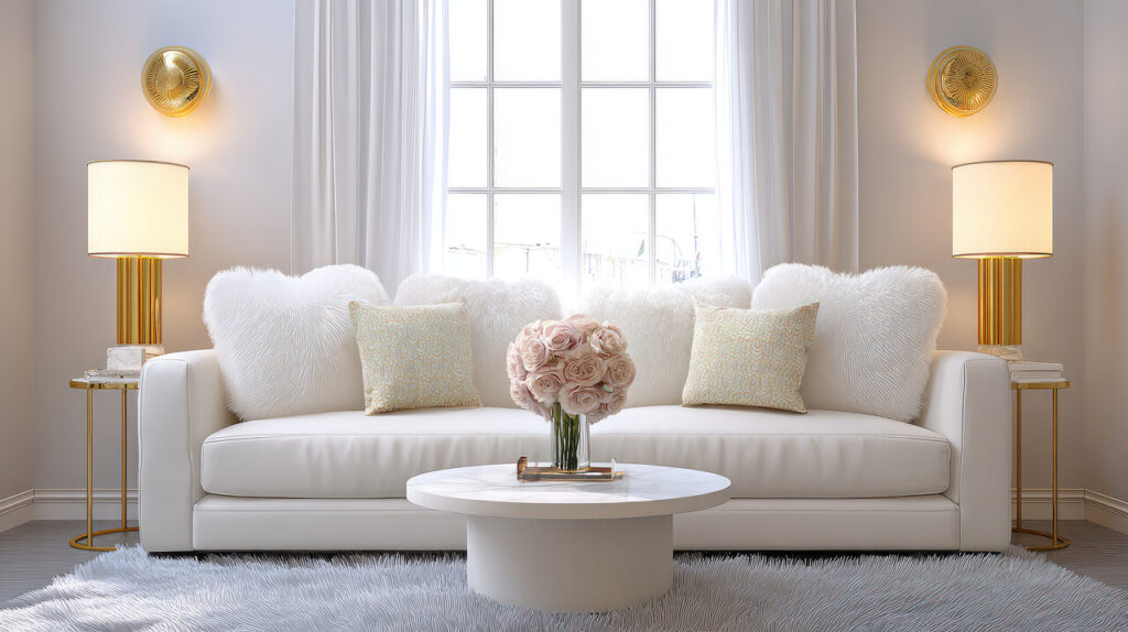
8. Cool White and Blue Neutrals Without Warm Touches
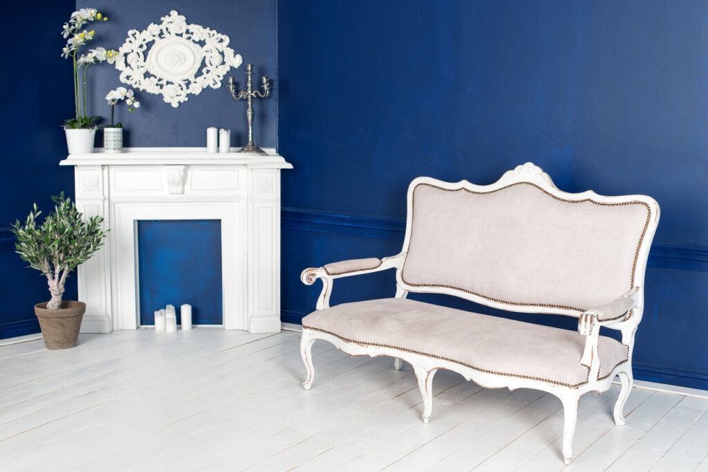
Cool white paired with pale blue creates a crisp look that works well in small doses. When overused, it can feel icy rather than refreshing. These schemes often lack the warmth needed to make a home feel welcoming. In spaces without abundant sunlight, the colors emphasize shadows and cool undertones. Homeowners often describe these rooms as feeling distant or impersonal. Adding warmth through wood, textiles, or warmer lighting changes the experience entirely. Without those elements, cool neutrals feel more like a waiting room than a living space.
9. Flat Beige Hallways and Corridors
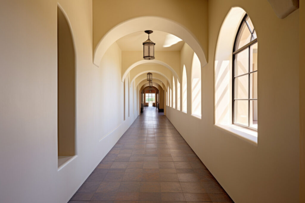
Hallways already struggle with light and purpose, and flat beige walls only amplify the problem. When corridors lack contrast, texture, or visual breaks, they feel like forgotten spaces rather than intentional transitions. Beige walls without trim or artwork create a tunnel effect that feels dull and endless. Homeowners often ignore these areas until the monotony becomes obvious. Simple additions like contrast paint, wall art, or varied finishes transform hallways into connective spaces with personality. Without them, beige corridors quietly sap energy from the rest of the home.