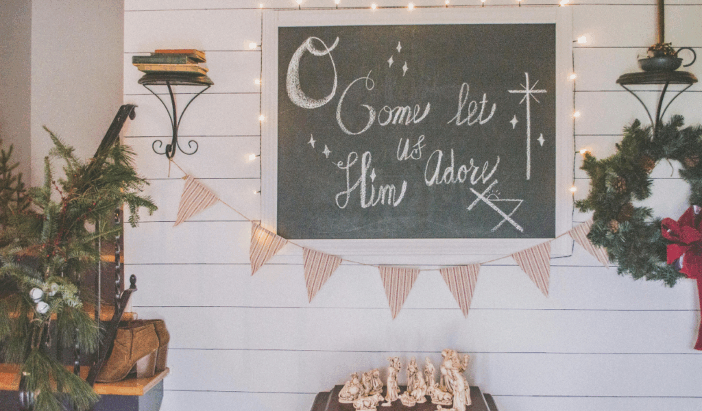
8 Gallery Wall Styles That Ended Up Looking Chaotic
Gallery walls promise personality, creativity, and a collected feel, but in real homes, they often go sideways fast. What looks effortless in inspiration photos can feel overwhelming once frames hit the wall. Poor spacing, mismatched styles, and lack of planning turn meaningful art into visual noise. Instead of anchoring a room, these gallery walls dominate it, making spaces feel cluttered and unsettled. Homeowners frequently realize too late that more art does not equal better design. Balance, restraint, and intention matter far more than quantity. When those elements are missing, gallery walls stop telling a story and start competing for attention, creating chaos where calm was meant to live.
1. Overcrowded Eclectic Mix
What starts as an attempt to create personality often turns into visual overload. An overcrowded eclectic gallery wall usually forms when people keep adding pieces without stepping back to reassess spacing or hierarchy. Frames end up stacked too closely, leaving no breathing room for the eye. Instead of reading as intentional layering, the wall feels busy and restless. The problem is not variety itself but density. When every inch is filled, nothing stands out. In real homes, this quickly becomes overwhelming, especially in rooms designed for relaxation, such as living areas or bedrooms. Viewers struggle to process individual pieces, and the wall reads as clutter rather than expression.
2. Mismatched Frames Without a Unifying Thread
Mixing frame styles can look charming in theory, but without a unifying element, it often feels accidental rather than curated. When materials, colors, and finishes all compete, the wall lacks cohesion. Shiny metal adjacent to distressed wood, paired with thick black frames, creates visual friction rather than contrast. In photos, this can sometimes pass, but in person, the imbalance is obvious. The eye keeps jumping, unable to settle. Successful mixed-frame walls usually share something subtle, such as consistent matting, a limited color palette, or similar frame widths. Without that anchor, the display feels scattered. In smaller spaces, this effect is amplified, making the room feel noisier than it actually is.
3. Random Size Placement With No Planning

A gallery wall built without planning almost always shows it. Random size placement often leads to awkward gaps, uneven visual weight, and an unintentional sense of imbalance. Large pieces may end up too high, while smaller ones float without purpose. The eye expects a flow, either centered around a focal piece or arranged along a loose grid. When sizes are scattered without intention, the wall feels chaotic. In real homes, this can make ceilings feel lower or walls feel narrower. Many people underestimate how much proportion matters. Even asymmetrical layouts require structure. Sketching the layout or arranging frames on the floor first helps prevent this issue.
4. Art That Clashes With the Room’s Aesthetic
Gallery walls fail when they ignore the room they live in. Art that clashes with the surrounding colors, furniture style, or mood can make the entire space feel disjointed. A sleek modern sofa paired with rustic landscapes or ornate frames creates tension that feels unresolved. The issue is not mixing styles but ignoring balance. Successful rooms allow contrast while still maintaining harmony. When the wall feels like it belongs to a different house altogether, it disrupts the flow of the space. This is especially noticeable in open-plan homes where walls are visible from multiple angles. Instead of enhancing the room, the gallery wall becomes a distraction.
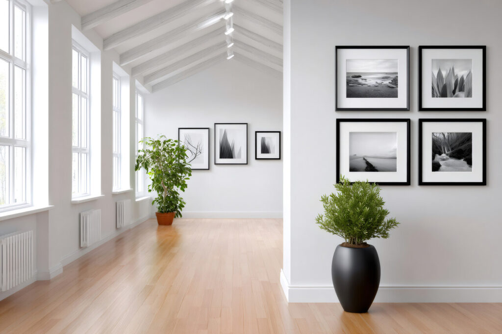
5. Incorrect Scale for the Wall Space
Scale mistakes are one of the most common reasons gallery walls feel off. Too many small frames on a large wall create a timid look that feels unfinished. On the other hand, oversized pieces crammed into a narrow space feel oppressive. Scale affects how a room feels emotionally. Walls that are overwhelmed can feel heavy, while underfilled walls feel bare despite being decorated. Real homes rarely have the perfect proportions seen in inspiration photos. Windows, furniture, and walkways all influence how much space a wall truly has. Choosing art that matches the wall’s actual visual weight is crucial. When the scale is right, the wall feels balanced and intentional.
6. Inconsistent Placement That Lacks Visual Flow
Inconsistent placement breaks the rhythm of a gallery wall. Frames that sit at uneven heights or drift without alignment confuse the eye. Humans naturally look for patterns, even in casual arrangements. When those patterns are missing, the wall feels unsettled. This often happens when pieces are added over time without considering the existing layout. Each addition slightly disrupts the balance until the whole display feels off. In real spaces, this can make rooms feel disorganized even if everything else is tidy. Establishing at least one consistent line, whether through top alignment, center alignment, or spacing, helps anchor the design. Without it, the wall lacks a visual path for the eye to follow.
7. Wrap-Around or Corner-Spilling Displays

Gallery walls that spill into corners or wrap around architectural features often feel more confusing than creative. Corners naturally interrupt visual flow, and art that bends around them rarely reads as one cohesive display. Instead, it feels like two unfinished walls fighting for attention. In small homes, this can make spaces feel chopped up rather than connected. Wrap-around layouts also complicate furniture placement, as the eye has no clear starting or stopping point. Successful gallery walls usually respect natural boundaries. When those boundaries are ignored, the display feels restless.
8. Mixed Media Without Clear Balance
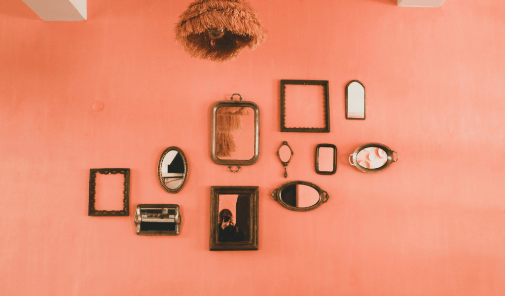
Incorporating objects like mirrors, shelves, textiles, or sculptural elements into a gallery wall can add depth, but without balance, it quickly turns chaotic. Mixed media introduces different visual weights, textures, and reflections. When too many compete, the wall loses clarity. A mirror next to glossy frames next to textured art can overwhelm the senses. In real homes, lighting conditions amplify this problem through glare and shadows. The key is restraint. One or two-dimensional elements can elevate a gallery wall, but too many turn it into visual noise. Balance comes from spacing, repetition, and clear hierarchy.