7 Chevron Patterns Designers Can’t Wait to Never See Again
The chevron pattern used to be the most popular design style for homes. It could be found on everything from kitchen backsplashes to ornamental throw cushions. Its strong, V-shaped rhythm gave it a lot of vitality that felt very new during the design revival of the early 2010s. However, after more than ten years of being everywhere in the market, industry experts claim the motif has finally lost its edge and become a boring cliché.
Professional designers now tell homeowners to stay away from these boring and predictable zig-zags. An overdone chevron can make a modern area look old and messy instead of stylish or trendy. With the growing preference for more natural shapes and softer textures among all of us, the rigid geometry of the traditional chevron is being replaced with solutions that are more timeless and will last for a longer period of time. The implementation of this shift represents a return to interior design that is more thoughtfully selected and deliberate.
1. High-Contrast Black and White Zig-Zags
The stark, high-contrast black and white chevron pattern is probably the most tired variation of this style. Many experienced interior designers say that this color combination makes a “strobe light” impression that can be hard on the eyes over time. At first, it was popular because of its strong, graphic look, but it swiftly became a sign of fast-fashion home design that lacks depth and soul.
It frequently seems more like a thing from the past than a modern design choice. If you really have to employ a geometric pattern in your house, designers say to choose tonal shifts that are considerably gentler. When the contrast is too strong, the pattern takes over the whole room, making it hard for furniture or fine art to stand out.
Using muted colors lets the room’s architecture breathe. The idea now is to make things work together instead of making them look like an old trend from 2012. Experts say that the secret to making a space appear expensive and planned is to be subtle.
2. Multi-Colored Pastel Nursery Chevrons
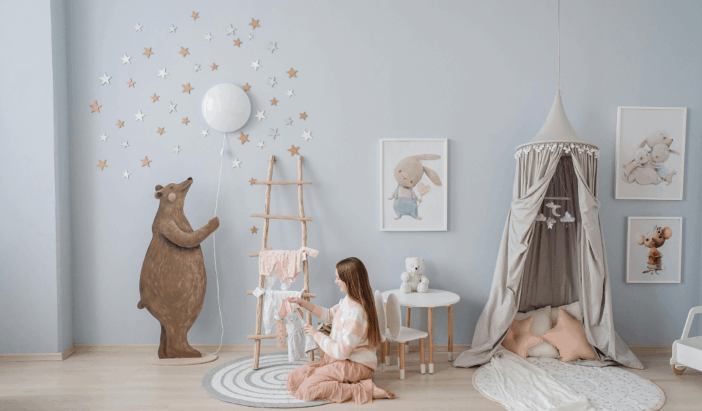
For a long time, the multi-colored pastel chevron was the most popular choice for nurseries and kids’ rooms all over the world. Organizers and designers today argue that this style seems quite generic and doesn’t have the personal touch that modern parents really want. These busy designs usually have four or five different colors in them. This can make a tiny room look messy and congested even before you add furniture or toys. It makes the space feel uneasy and hard to balance.
Instead of these dizzying waves, experts say to use solid colors with different textures or wall murals that portray a tale that is all your own. A nursery should be a calm place, but a multi-colored chevron typically has the opposite effect. By breaking away from this tendency, you make a room that can develop with the child instead of needing to be completely redone in a few years. Designers say that instead of utilizing loud and repeated prints, they should use designs that promote quiet and creativity.
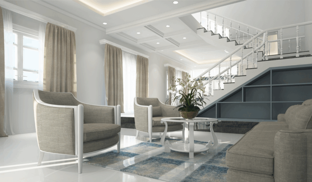
3. Oversized Chevron Accent Walls
There was a time when painting a huge, wall-to-wall chevron pattern was the most sophisticated thing you could do yourself. However, expert flippers say that these bright accent walls are now a big turn-off for those who want to buy a home. An enormous chevron can make ceilings feel lower and walls feel more closed off than they really are because of the way it fits in with the room’s inherent proportions.
It takes up so much area that it decides every other design choice. Designers say that if you want to make a wall more interesting, you should use wood molding or light lime-wash finishes instead. These choices add personality and complexity without the strong commitment of a big geometric pattern.
In the past, people liked “statement walls,” but now they prefer to create rooms as a whole, with every wall adding to a peaceful and harmonious ambiance. You may make your home more timeless and elegant by getting rid of these loud designs. This will appeal to more people.
4. Chevron Kitchen Backsplashes with Contrasting Grout
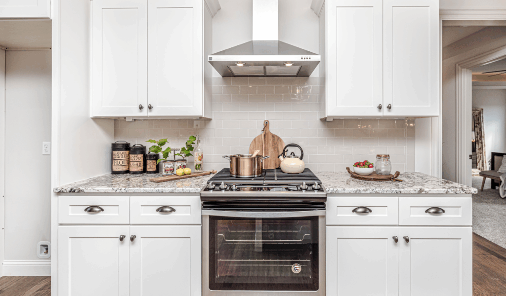
The chevron backsplash was a popular kitchen design for a long time, especially when it was used with dark grout to make the crisp pattern stand out. Contractors now say that this style has sadly become “the new avocado green” of the 2020s. A chevron tile plan with contrasting grout can make a kitchen feel cold and uninviting, like an industrial space. It pulls the eye so strongly to the joints that the tile’s beauty is sometimes missed.
Experts suggest using a herringbone layout instead to get the same feeling of movement without the old-fashioned look. The herringbone is a historic architectural bond that is similar but older than modern styles and looks more upscale. Choosing a grout color that goes with the tile will also make the pattern feel more like part of the room than a separate piece of art. This will make the kitchen look much more elegant. Designers say that the kitchen should seem warm and connected, not like it was made to fit a short-lived tiling trend.
5. Small-Scale Chevron Upholstery
Many designers wish they hadn’t put a small, tight chevron pattern on big pieces of furniture like sofas or armchairs. When you look at these little zig-zags from a distance, they can turn into a fuzzy, vibrating texture that is hard to look at for lengthy periods of time. Experts in textiles say that little chevrons typically look “cheap” since they are often printed on lower-quality fabrics used to make furniture for the mass market.
This makes the furniture feel less sturdy and more like it can be thrown away. Modern design is moving away from chaotic designs and toward fabrics that feel good, including boucle, linen, and velvet. Designers say that a traditional stripe or a delicate windowpane check will look better on your seating if you desire a pattern.
These options give a structured design that will always look classy. A sofa is a big purchase, and wrapping it in a trendy chevron is a quick way to make sure it appears old-fashioned by next season. Experts say that while buying expensive things, you should choose textiles that will never go out of style.
6. Cheap Chevron Window Treatments
Chevron curtains used to be the best way to give a “pop” to a room, but they frequently look like they were put up after the fact. Designers claim that the chevron pattern is too stiff and horizontal to go with the vertical folds of a curtain. This makes the windows look smaller and the view outside look less clear. The pattern’s broken lines against the creases in the cloth make it look out of place, and it’s hard to rectify without getting new ones.
Interior designers now say that employing solid draperies made of high-quality natural fibers like hemp or silk would give you a superior finish. If you want to make the space feel taller, a vertical stripe or a delicate floral will do a better job than a horizontal zig-zag. Window treatments should not be noisy billboards for a fading visual trend. Instead, they should frame the light and the view. Putting money into good window treatments may radically change how much a room seems to be worth.
7. Mismatched Chevron Accessories
A “chevron explosion” often happened in a room when a bunch of mismatched accessories, like picture frames, trays, and lampshades, were put together. This is what designers call “pattern fatigue.” When the same pattern is used on a lot of small things, it makes a home look like a showroom floor. It doesn’t have the curated, collected look that is popular in high-end interior design nowadays.
When every accessory has the same pattern, the unique beauty of each one becomes buried in a sea of zig-zags. The people in charge say that you should get rid of these old accessories and replace them with handmade ones made of wood, stone, or glass. When you mix shapes and materials, you make the space more intriguing and layered for both residents and visitors.
You let the distinctive objects in your home really shine when you get rid of the repetitious chevron clutter. Experts believe that a home should show that you have had a good life, not that you are obsessed with a certain geometric shape that was trendy in a certain decade.