7 Accent Walls That Made Rooms Look Smaller
A good accent wall can turn a boring room into a designer masterpiece, but a few missteps can make it feel confined. Most homeowners think adding color creates depth, but ignoring proportions and lighting often does the opposite. An accent wall grounds the room, but if positioned or textured poorly, it can draw the walls in and steal visual square footage. This guide discusses design decisions that make tiny spaces appear even smaller. Understanding these risks can help you add flair to your next home project without losing the open and airy vibe every comfortable home needs to feel welcoming and large.
1. Using Dark Matte Charcoal Tones
Dark colors are popular for creating a moody or sophisticated ambiance, but painting a tiny room wall deep charcoal or matte black can be problematic. Matte surfaces absorb light, making the wall appear to move toward the center. This inward movement generates a tunnel appearance in narrow rooms, making the ceiling lower and the floor narrower. Dark tones might look great with artwork, but they need lots of natural light to avoid seeming like a cave. If your space lacks large windows, a dark accent wall will absorb the light and make the room feel smaller.
2. Horizontal Stripes in Narrow Areas
Horizontal stripes are sometimes used to make a wall look broader, but in a tiny or narrow room, they can make the area look smaller by making it look like it’s not there. The lines across the room draw the attention; if the room is already tight, these stripes make the ceiling feel like it is pushing down on you. Also, thick horizontal stripes make the room feel heavy, which makes it hard for the furniture to breathe. Repeating lines can close the room like a fence. Stripes can make a small bedroom or office look cluttered and smaller than a pure bright color. Because stripes don’t stand out and have little contrast.
3. Large Scale Floral Wallpapers
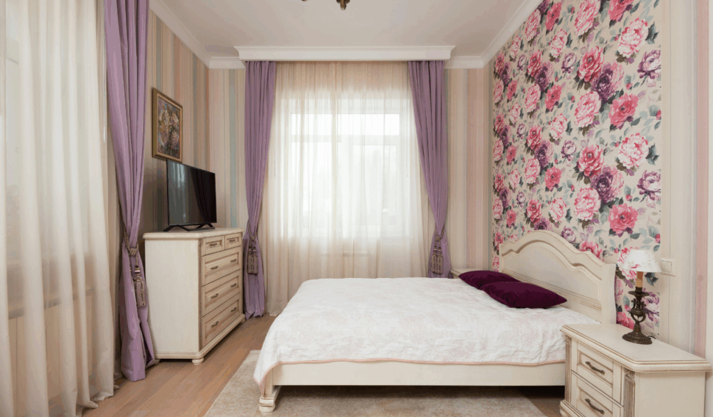
Putting up large, bright floral patterns on one wall is a classic way to add interest, but the size of the print is important for keeping the room feeling open. Huge flowers and leaves can make a small room look too big; the big patterns are so eye-catching that they make the furnishings look crowded. If the pattern is too big for the wall it is on, it can be hard for the eye to find a place to rest, which makes the space feel chaotic and closed in. Because there isn’t any “white space” in the design, the wall looks like it’s leaning into the room. A delicate or small-scale image is safer for smaller rooms. If not, the huge blooms will block the view and shrink the room.
4. High Contrast Geometric Shapes
Geometric patterns are fantastic in modern design, but sharp angles and brilliant colors can make a room look smaller by creating visual disruption. Painting a small space bright yellow and navy blue will make the wall an assertive focal point that pulls attention to one side. This concentrated emphasis makes the other three walls feel disconnected and breaks up the room’s flow. The brain struggles to process crowded shapes, cluttering your thoughts and body. High-contrast geometric walls might cramp a tiny living room. Without uniformity, the eye cannot readily move throughout the area, which is essential to making a small space feel wide and open.
5. Textured Stone and Heavy Bricks
A wall made of natural stone or hefty brick can add a lot of warmth, but these materials can make tiny areas feel smaller and less inviting. Real stone and brick are quite thick and can take up several inches of space. The most significant thing is that their rough surfaces make thousands of small shadows. These shadows make the wall look darker and heavier, which makes it look like it is hanging over the room. Large stone accent walls can look “heavy” in small kitchens and dining rooms. Uneven paint doesn’t reflect light, darkening the room. Darkness and rough texture draw the wall closer. The whole place feels smaller.
6. Saturated Warm Red Tones
“Advancing colors” are hues like deep crimson, flaming orange, or bright terracotta. They look closer to the eye than cold colors like blue or green. When you paint a big accent wall a bright, warm red, it looks like it jumps out at you. This makes a big room feel cozy, but in a small bedroom, it might make the space feel too cramped. These warm colors are bright and lively, which can make a tiny room look “loud” and restless. The accent wall appears to be advancing toward you, making the area feel smaller than it is. This psychological trick is one of the fastest ways to make a large area feel small and uncomfortable.
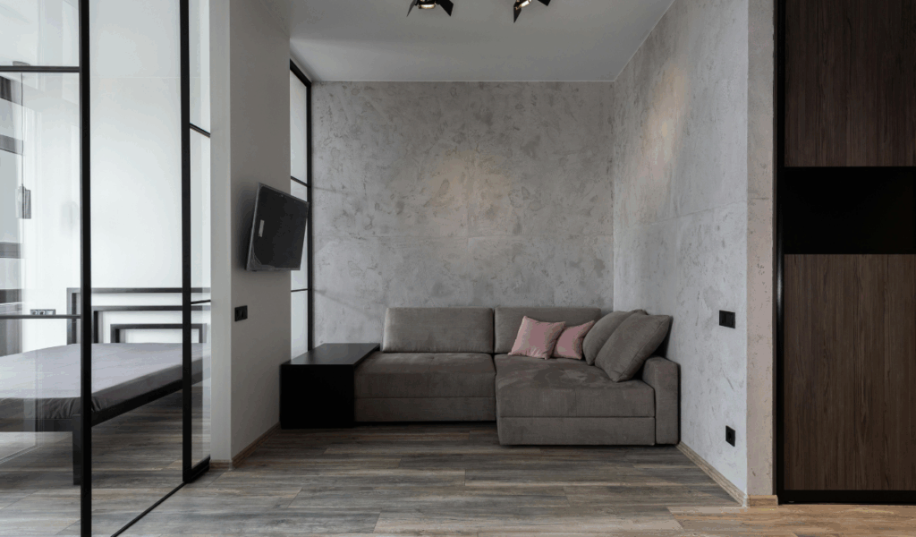
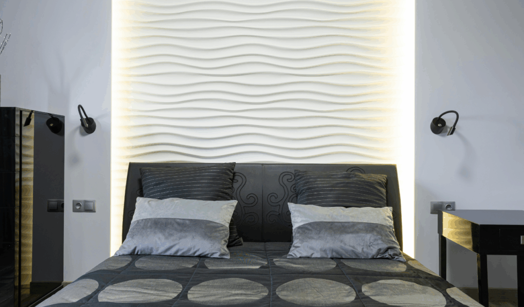
7. Glossy Finishes on Uneven Walls
Light-reflecting surfaces usually make a space feel bigger, but if an accent wall has any flaws, a high-gloss finish might make it look worse. Glossy paint makes every lump, fissure, or wave in the plaster stand out. This distorts the reflection and draws attention to the wall rather than the reflection. The highlights and shadows on an uneven glossy wall don’t create depth like a window. Instead, they clutter the wall. Visual wall created by texture stops the eye and feels substantial and near. Bright lamplight can cause “hot spots” that disturb room vision. It feels like the walls are closing in due to their uneven surface. The space is crowded and dirty.