10 New Year Color Trends That Didn’t Last the Season
New Year color trends often arrive with bold promises. Fresh palettes signal change, optimism, and a chance to reset spaces or wardrobes. Early forecasts can feel convincing, especially when colors look striking in curated photos and design previews. Once the season unfolds, reality steps in. Lighting, wear, comfort, and everyday use reveal which colors truly work and which ones fall flat. Many hues that felt exciting in January quietly disappear by spring. These are the New Year color trends that captured attention early but failed to hold up through the season.
1. Stark Pure Whites That Felt Too Cold Too Fast
Pure white shades always surge at the start of a new year because they promise clarity, calm, and a clean slate. In reality, many of these whites proved difficult to live with. Without enough warmth or undertone, stark whites reflected light harshly and emphasized shadows, making rooms feel clinical rather than welcoming. In homes with limited natural light, walls took on a gray or bluish cast that felt flat and uninviting. Everyday wear also became more noticeable, from scuff marks to uneven paint aging. What initially looked crisp in photos quickly felt sterile in real spaces. As the season progressed, people gravitated toward warmer off-whites and soft neutrals that felt more forgiving and livable.
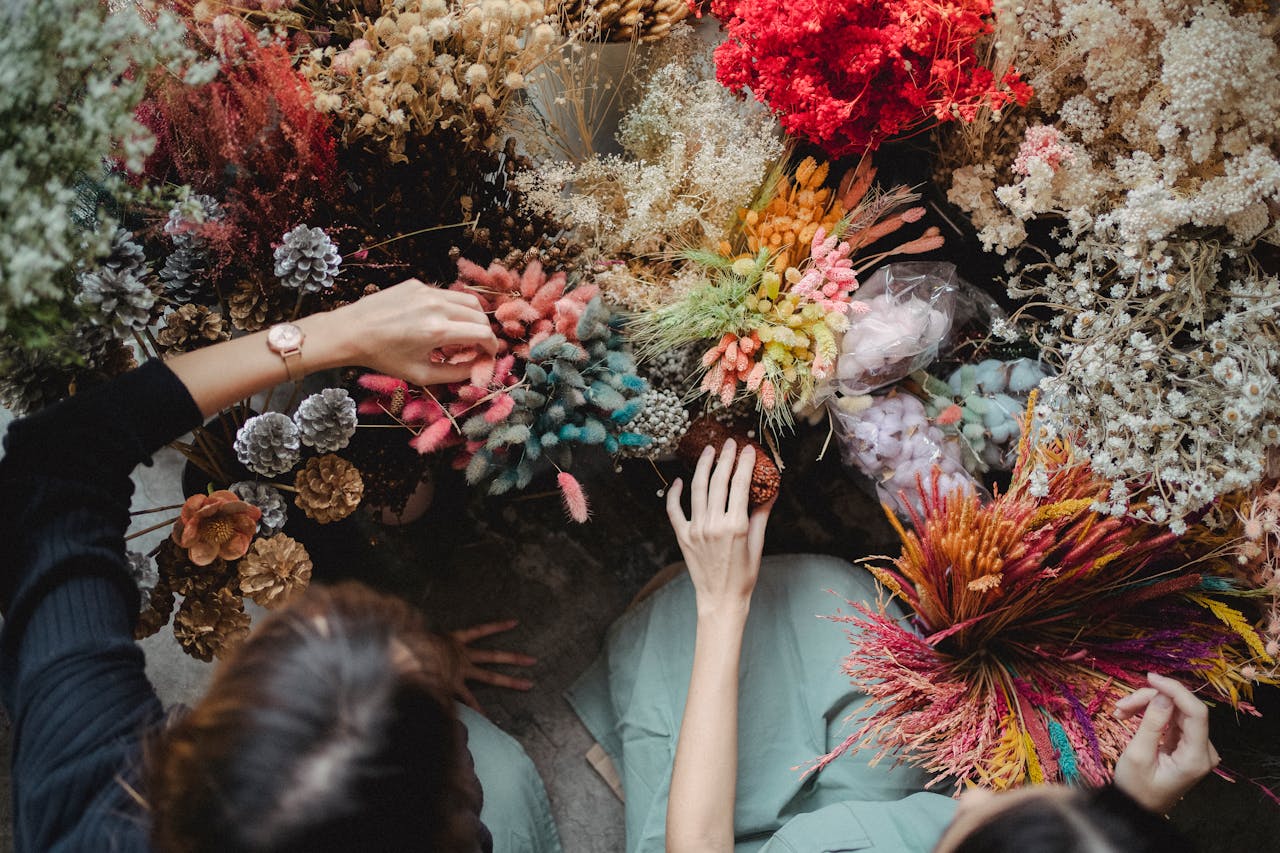
2. Chalky Pastels That Lacked Staying Power
Soft pastels like lavender and baby pink made early appearances as gentle, optimistic color choices. While appealing in theory, these shades struggled to hold visual weight. In larger applications, they often read as washed out or juvenile, especially under artificial lighting. Chalky finishes dulled quickly and clashed with wood tones, metals, and textiles that dominated interiors later in the season. Many homeowners found that these pastels lacked depth, making rooms feel unfinished rather than intentional. As richer and earthier palettes gained traction, these pale hues faded from relevance, proving better suited to accents than full commitments.
3. Butter Yellow That Overpowered the Room
Butter yellow arrived with promises of warmth and cheer, but its brightness proved hard to manage. In small doses, it added energy. On walls or large surfaces, it became overwhelming. The color shifted dramatically depending on light, sometimes appearing muddy, other times glaring. Pairing it with furnishings was also challenging, as it clashed with cool tones and overwhelmed neutrals. Over time, the constant visual stimulation led to fatigue. What initially felt uplifting began to feel loud and dated. Many people scaled back or repainted, opting instead for muted ochres or warm creams that offered similar warmth without the intensity.
4. Acidic Chartreuse That Was Too Sharp to Live With
Chartreuse gained attention for its boldness and fashion-forward edge, but living with it proved difficult. The color’s sharp green-yellow balance demanded constant attention and rarely blended naturally with surrounding elements. In interiors, it dominated the visual field, making other design choices feel secondary. It also amplified imperfections in lighting and finishes. While striking in editorial settings or small accents, chartreuse struggled as a long-term color choice. As the season matured, people favored greens with more grounding, such as olive or moss, which offered energy without visual tension.
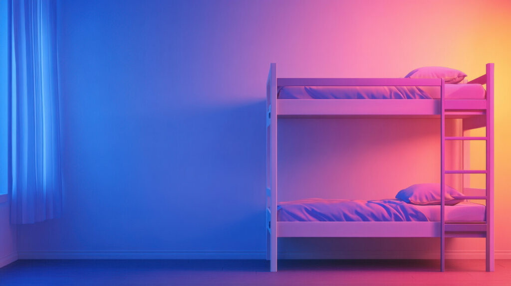
5. Sharp Clean Blues That Felt Flat
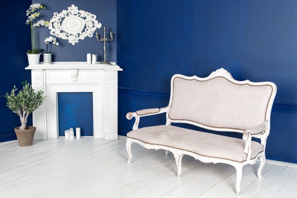
Bright, primary-leaning blues appeared fresh at the start of the year, signaling clarity and confidence. Over time, their lack of complexity became apparent. These blues often felt cold and rigid, especially when paired with modern interiors that leaned toward texture and warmth. They reflected light harshly and lacked the subtle variation needed for depth. As tastes shifted, softer blues with gray or green undertones replaced them. These newer blues felt calmer and more adaptable, while sharp blues quickly felt outdated and overly literal.
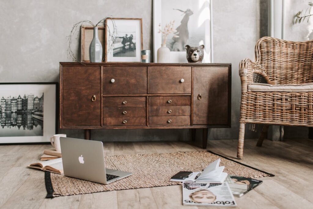
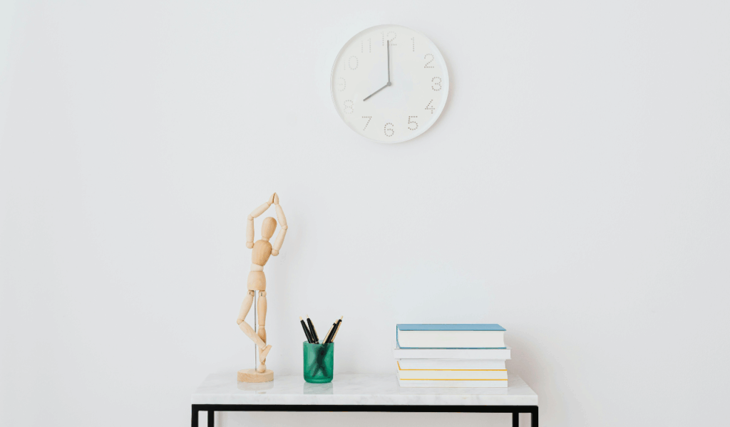
6. Ultra-Light Neutrals That Felt Empty
Very pale neutrals promised minimalism and versatility, but many spaces painted in these tones ended up feeling hollow. Without enough contrast or warmth, rooms lacked character. Furniture and décor struggled to stand out, and the overall effect felt unfinished. These neutrals also showed dirt and wear easily, which made maintenance frustrating. As the season went on, people wanted spaces that felt layered and personal. That pushed ultra-light neutrals aside in favor of warmer beiges, greiges, and soft taupes that added subtle richness without overwhelming the room.
7. High-Contrast Black and White That Aged Quickly
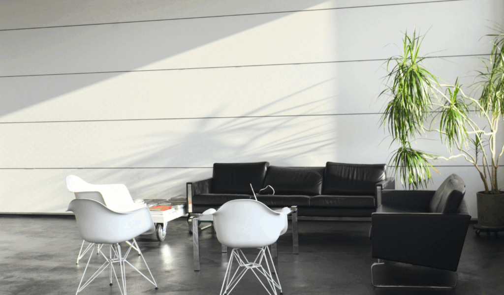
Bold black-and-white schemes made a dramatic statement early on. The contrast looked striking in styled photos but proved tiring in daily life. Sharp transitions between light and dark created visual tension and emphasized clutter. In lived-in homes, the look required constant editing to maintain its impact. Any imbalance felt jarring. As the season progressed, designers and homeowners softened these schemes with warmer tones, textures, and mid-range colors. High contrast lost favor as comfort and cohesion became priorities.
8. One-Dimensional Gray That Felt Dated
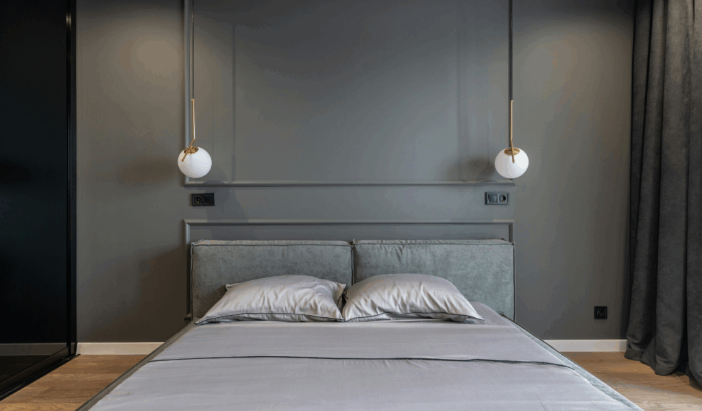
Gray lingered as a default choice, but its limitations became clear. Flat gray tones lacked warmth and depth, making spaces feel stagnant. As lighting changed throughout the day, these grays often shifted toward blue or green in unflattering ways. Without layering, they felt lifeless. People began associating them with past trends rather than fresh starts. Richer neutrals with brown, beige, or clay undertones replaced gray as the season evolved, offering more adaptability and emotional warmth.
9. Neon Accent Colors That Burned Out Fast
Neon accents generated excitement early in the year through fashion and design forecasts. In real spaces, they proved impractical. Their intensity dominated rooms and clashed with natural materials. Neons also tired the eye quickly, making them difficult to live with beyond short bursts. Many who experimented with neon found themselves removing or minimizing it within weeks. As the season settled, subtler accent colors took over, providing interest without overwhelming the senses.
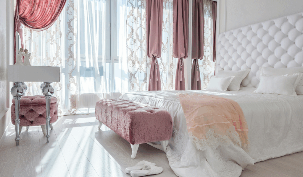
10. Delicate Primrose Pinks That Felt Too Fragile
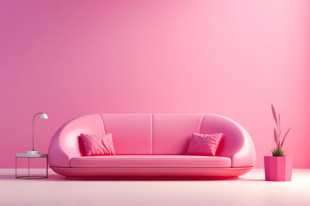
Light, airy pinks appeared elegant and modern at first, especially in trend previews. In practice, they lacked resilience. These shades shifted dramatically with lighting and often read beige, peach, or gray instead of pink. They also struggled to anchor a space visually. Over time, the color felt insubstantial, especially as richer palettes emerged. People gravitated toward deeper blushes or earthy rose tones that offered warmth and presence. The delicate versions quietly faded as the season progressed.