14 Seasonal Décor Ideas That Didn’t Blend With Everyday Style
Seasonal décor is meant to refresh a home without erasing its personality. When festive pieces clash with everyday colors, textures, and layouts, rooms start to feel staged instead of lived in. Many decorating ideas look charming on their own but struggle to blend with established interiors once placed in real spaces. Instead of creating harmony, they interrupt the flow of the home and make transitions between seasons feel abrupt. The most successful seasonal updates build on what is already there, rather than competing with it. These are the décor ideas that stood out, but not in a way that felt natural or lasting.
1. Neon and Plastic Pumpkins That Felt Out of Place
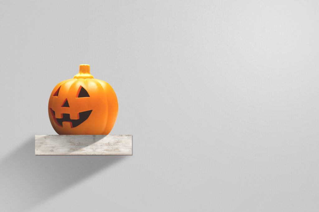
Pumpkins are a fall staple, but when they are made from shiny plastic or painted in neon colors, they stop feeling connected to the season and start looking like party props. These bright finishes rarely match the tones found in most homes, which tend to lean toward wood, fabric, and softer paint colors. Instead of blending in, the pumpkins demand attention and compete with furniture and artwork. Over time, they can make the rest of the room feel mismatched or unfinished. Many homeowners also find that plastic pieces cheapen the overall look of carefully styled spaces. Natural textures and muted shades usually integrate better with everyday décor, while novelty pumpkins feel temporary and disconnected once the initial excitement fades.
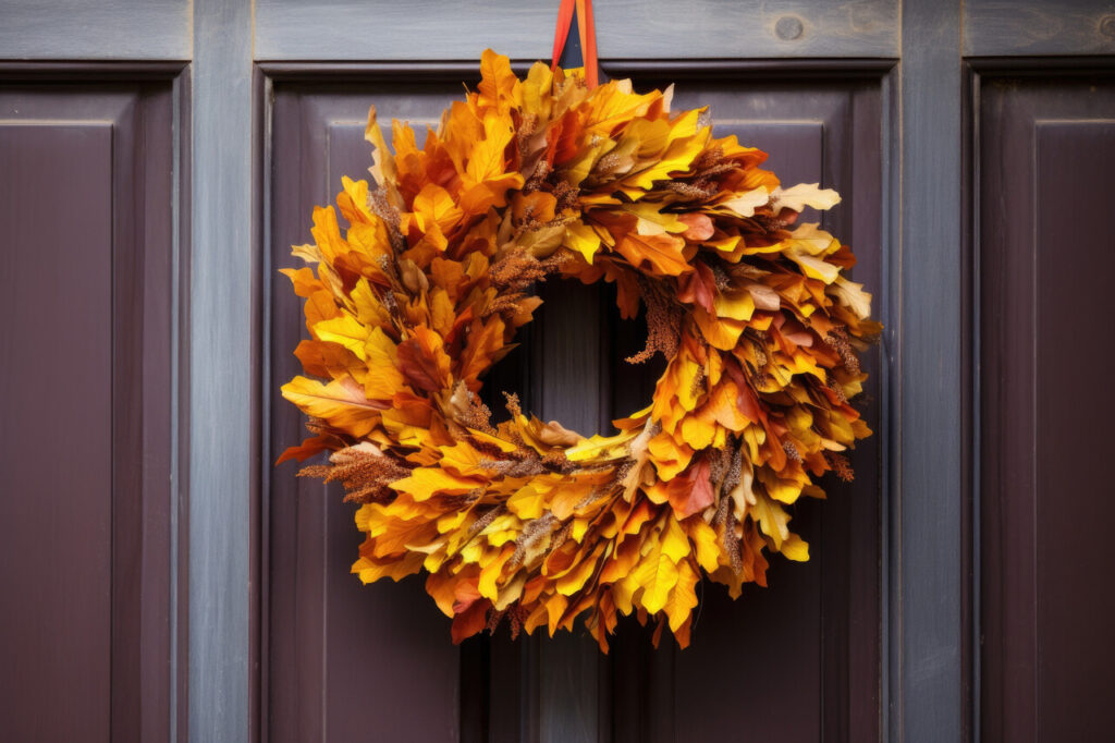
2. Glittery Fall Leaves and Overly Shiny Accents

Sparkly leaves and metallic fall decorations may look festive in stores, but in real homes they often clash with normal lighting and surface finishes. Glitter reflects light harshly, creating visual noise that pulls focus away from the room’s main features. These accents also collect dust easily, making them look dull rather than bright after just a few days. In homes that rely on wood, linen, or matte finishes, shiny fall pieces stand out in a way that feels accidental rather than intentional. What could have been a warm seasonal layer ends up reading as decorative clutter that never quite settles into the existing style.
3. Bold Seasonal Slogan Signs That Felt Like Advertising

Signs with phrases like seasonal catchwords or playful sayings are popular because they are easy to place and instantly signal the time of year. The problem is that text based décor often reads more like retail signage than home styling. These pieces rarely coordinate with wall art, family photos, or neutral décor themes. They also lock the space into a narrow seasonal identity that disappears the moment the holiday ends. When everyday design focuses on calm colors and personal items, loud slogans feel intrusive. Over time, homeowners often remove them because they interrupt visual flow instead of enhancing it.
4. Oversized Harvest Displays That Overwhelmed Entry Spaces
Large hay bales, tall scarecrows, and bulky porch displays can look charming in rural settings, but they often overpower standard home entryways. When scale is off, the décor blocks walkways, hides architectural features, and dominates first impressions. Instead of complementing the house, it becomes the main focus. These large items also limit flexibility in smaller outdoor spaces and can feel cluttered rather than welcoming. Everyday exterior design usually emphasizes clear lines and open paths. Heavy harvest displays interrupt that balance and make entrances feel crowded instead of inviting.
5. Christmas Throw Pillows With Loud Seasonal Patterns
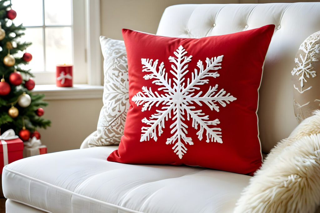
Swapping throw pillows is an easy way to decorate, but heavily themed holiday designs can quickly overwhelm sofas and chairs. Bright reds, novelty prints, and bold motifs clash with neutral upholstery and everyday textiles. Once multiple pillows compete for attention, seating areas lose their sense of calm. These pillows also have very limited use windows, which means they need to be stored most of the year. Instead of layering naturally with existing décor, they replace it, making rooms feel temporarily transformed rather than gently updated for the season.
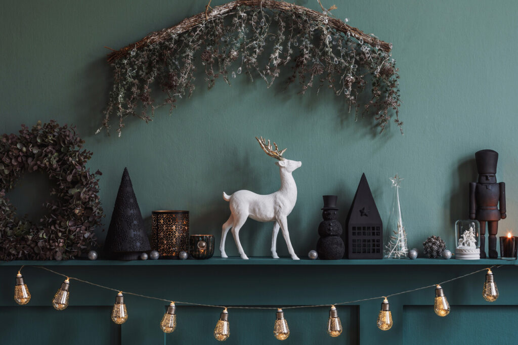
6. Flashy Ornaments That Clashed With Interior Style

Highly reflective or brightly colored ornaments look dramatic on trees, but they can clash with the overall tone of the room. When the tree becomes visually louder than everything around it, the rest of the décor feels muted and disconnected. Homes with soft lighting, natural materials, and neutral palettes often struggle to integrate shiny, bold ornaments without looking mismatched. Instead of serving as part of the room’s design, the tree feels like a separate decorative object. Balanced ornament choices usually echo existing colors and textures, which helps the tree feel like it belongs in the space.
7. Cute Holiday Figurines That Felt Too Juvenile
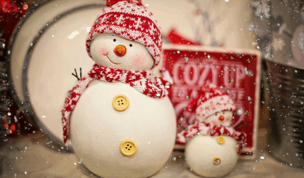
Figurines shaped like cartoon characters or exaggerated holiday figures can feel playful, but they often conflict with adult-oriented décor. When placed among framed art, ceramics, and curated shelves, these pieces disrupt the visual language of the room. They can make spaces feel themed rather than styled. Over time, homeowners may feel that their living areas resemble seasonal displays rather than everyday environments. What starts as cheerful quickly feels cluttered and inconsistent with the rest of the home’s tone. Subtle seasonal accents usually integrate more smoothly than character-driven décor.
8. Excessive Tinsel and Metallic Fringe That Added Chaos

Metallic strands and fringe introduce shine and movement, but too much of it creates visual confusion. When reflective materials cover mantels, stair rails, and shelves, the eye has no place to rest. Light bounces unpredictably, making rooms feel busy instead of warm. These materials also contrast sharply with wood, fabric, and stone surfaces that dominate many interiors. Instead of enhancing holiday atmosphere, excessive metallic décor can make spaces feel more like party venues than homes. Moderation matters when adding shine, especially in rooms designed for daily comfort.
9. Seasonal Color Schemes That Fought With Existing Palettes

Introducing strong seasonal colors like bright orange, deep red, or emerald green can clash with permanent wall colors and furnishings. When accent pieces do not relate to the home’s core palette, they stand out rather than blend in. This creates a sense of visual interruption that feels jarring. Instead of layering seasonal touches, the décor feels like a separate theme imposed on the room. Homes look more cohesive when seasonal colors are softened or repeated in smaller doses that echo existing tones rather than compete with them.
10. Large Inflatable Decorations That Dominated Outdoor Areas

Inflatables offer quick impact, but their scale and shape rarely complement home architecture. They often block windows, hide landscaping, and distract from entryways. Instead of highlighting the home, they draw attention away from it. In neighborhoods where homes have varied styles, inflatables can look especially disconnected from the surrounding environment. They also deflate, shift, and weather poorly, which makes outdoor spaces look messy rather than festive. Seasonal décor works best when it supports the home’s natural features instead of overpowering them.
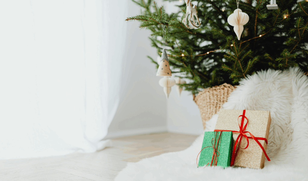
11. Holiday Wall Art That Felt Temporary and Disconnected

Seasonal wall art that replaces everyday pieces can make rooms feel incomplete. Removing personal artwork or framed photos disrupts the emotional connection to the space. Temporary prints often lack the texture and framing that permanent art has, making walls feel flatter. Instead of blending with the room, these pieces appear as overlays that do not quite fit. When holiday art does not align with the scale, color, or material of existing pieces, the wall loses cohesion. Seasonal changes should layer onto existing décor, not replace it entirely.
12. Garland With Colors Too Bold for the Space
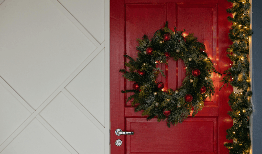
Garland is meant to soften edges and frame features, but when it comes in strong or unnatural colors, it becomes the focal point instead of a supporting element. Bright reds, deep purples, or glitter-coated greens pull attention away from mantels, door frames, and shelves. In homes with calm color schemes, bold garlands look inserted rather than integrated. Instead of enhancing architectural lines, they distract from them. Natural or muted garlands usually complement everyday décor far better than heavily tinted versions.
13. Seasonal Centerpieces That Didn’t Connect to the Room
Large holiday centerpieces often look impressive on their own but fail to relate to the surrounding décor. When table pieces use colors or materials that are not found elsewhere in the room, they feel isolated. Dining spaces benefit from continuity between tables, chairs, lighting, and accessories. When a centerpiece ignores that relationship, it becomes a standalone display rather than part of the environment. Guests notice the disconnect, even if they cannot name it. Smaller, repeated seasonal touches tend to feel more cohesive than one oversized statement piece.
14. Seasonal Rugs With Patterns That Clashed Long Term
Holiday rugs add instant seasonal flair, but bold patterns and motifs can fight with furniture and flooring. Rugs play a major role in anchoring a room, so when their design clashes, the entire space feels off balance. Because rugs cover large areas, the effect is stronger than with small accessories. Once the season ends, these rugs must be removed entirely, which interrupts room continuity. Choosing rugs that work with everyday style year round allows seasonal accents to be layered without forcing a complete visual reset.