10 Study Room Designs That Didn’t Adapt Over Time

Study rooms generally start out as clean, motivating places, but after time they stop looking like the way people really live, work, and study. A setup that seems perfect in the first year can become tight, uncomfortable, or out of date as gadgets change and workloads expand. This article talks about study room ideas that seemed good on paper but didn’t work out well in real houses, especially when space is tight and needs change. If you understand why prior designs failed, you can create a flexible, comfortable, and productive study space for school, remote work, and beyond. It won’t need major renovations every few years.
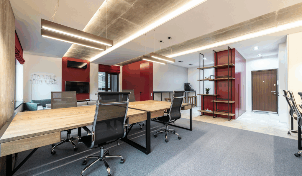
1. Fixed desk layout with no flexibility
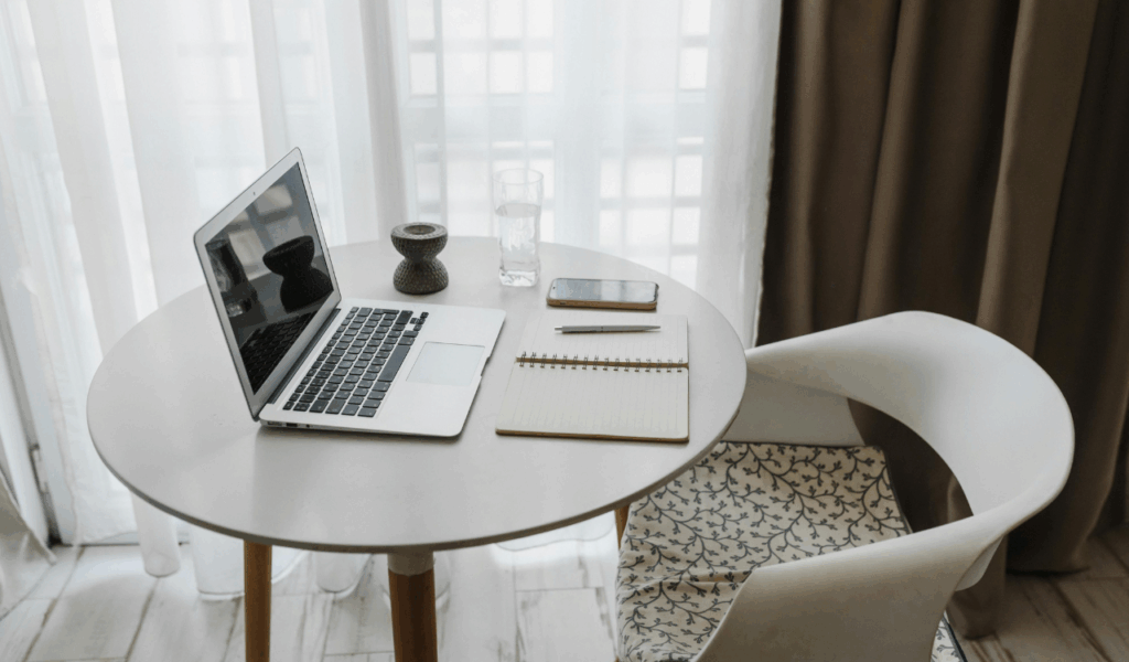
There was one big, fixed desk placed against a wall in many study rooms. This seemed like a good idea at first, but it didn’t leave any room to move things about when needs changed. The tight layout made things messy and bad for posture when a second person needed room or when a bigger monitor and paperwork came. Designers increasingly recommend modular or wall-mounted workstations that may be rearranged, put together, or folded up, especially in compact rooms. A single study corner can transform from a homework environment to a home office with two screens without regular maintenance if you create open floor plans and mobile furniture.
2. Ignoring ergonomic seating from the start
Many study rooms opened with nice-looking chairs that weren’t very comfortable. They were good for short periods of time, but they caused back, neck, or shoulder pain when study or remote work hours got longer. As individuals spend more time in front of screens, the height of the seat, the lumbar support, and the distance between the desk and the display become very important for comfort and focus. Bad seating is a common reason home offices and study rooms are inefficient. Early investments in an adjustable chair and desk height allow a small room to adapt to extended sessions, different users, and changing workloads without harming your health.
3. Single harsh ceiling light for every task
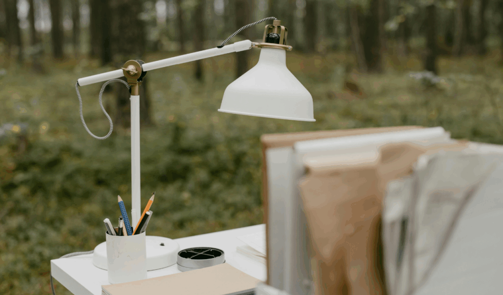
Rooms that only have one strong ceiling light may feel flat and boring, especially when used from early morning until late evening. As they read, typed, video conference, and created, they needed layered lighting—ambient, task, and accent lights. Screens can be hard to see, eyes suffer, and headaches occur without this. The room cannot be made more comfy for reading or late-night sessions. The study should have natural light, adjustable work lamps, and softer background lighting, advise experts. So, it can fluctuate depending on the time of day, the user’s age, and their changing digital habits.
4. No plan for cable and technology growth
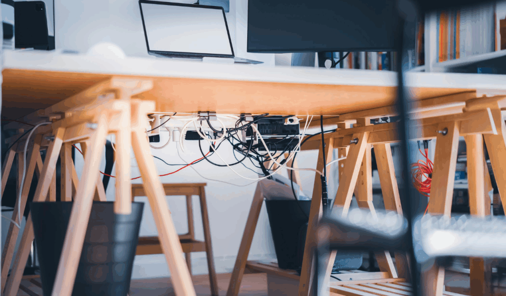
In the early days of study room design, they usually only had one computer and lamp, thus there weren’t many outlets or cable routes. As time went on, there were more computers, monitors, printers, chargers, speakers, and routers. This made wires get tangled, extension boards get full, and wiring become dangerous. This mess looks ugly, makes cleaning difficult, and is a trip hazard. Modern planning includes extra outlets, cable channels, and charging alternatives from the start, knowing devices may change. A design that adapts to new technology maintains the environment clean, safe, and easy to modify as tools and work patterns change.
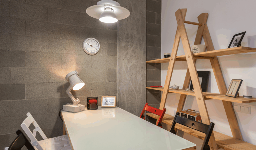
5. Storage designed only for year one

Some study rooms were created with just enough shelves and drawers for current books and supplies, not thinking about how learning materials build up over time. The space felt smaller and more chaotic as more books, folders, and homework piled up on the surfaces. Designers advise preparing for vertical storage, adjustable shelves, and secured drawers to reduce clutter. For small rooms, floating shelves and multipurpose furniture with storage help the space grow with the user. Instead of throwing boxes on the floor or pouring work into other rooms, a storage solution that accommodates future growth makes the study area usable.
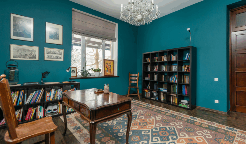
6. Over-decorated, visually busy walls
Covering the walls with bright colors, posters, and other decorative items can make a study space feel lively and personal at first. But over time, too many visual components might be distracting, especially when you need to focus and use the screen more. Strong patterns and bright colors that clash can make tiny spaces feel claustrophobic and chaotic in your head, which is not what you want when you’re trying to study in a quiet, concentrated way. Designers recommend balanced, neutral, or soft backgrounds with few critical elements. This strategy lets the space grow up while displaying personality with a pinboard, artwork, or mobile shelf displays.
7. No allowance for shared or multi use spaces

A lot of study designs treated the room like a single-person space, with just one desk, one chair, and no more surfaces. The area couldn’t change when another family member needed a quiet spot to work or as a youngster got older and started doing group projects and taking online classes. Modern planning likes layouts that can be used for more than one thing, including chairs that can be moved about, surfaces that can be folded out, or areas that can be used for both solo study and group work. A corner workstation with a small table or a wall-mounted desk in a bedroom that can also be used as a dressing or hobby area may let the room adapt as life changes.
8. Poor use of natural light and window placement
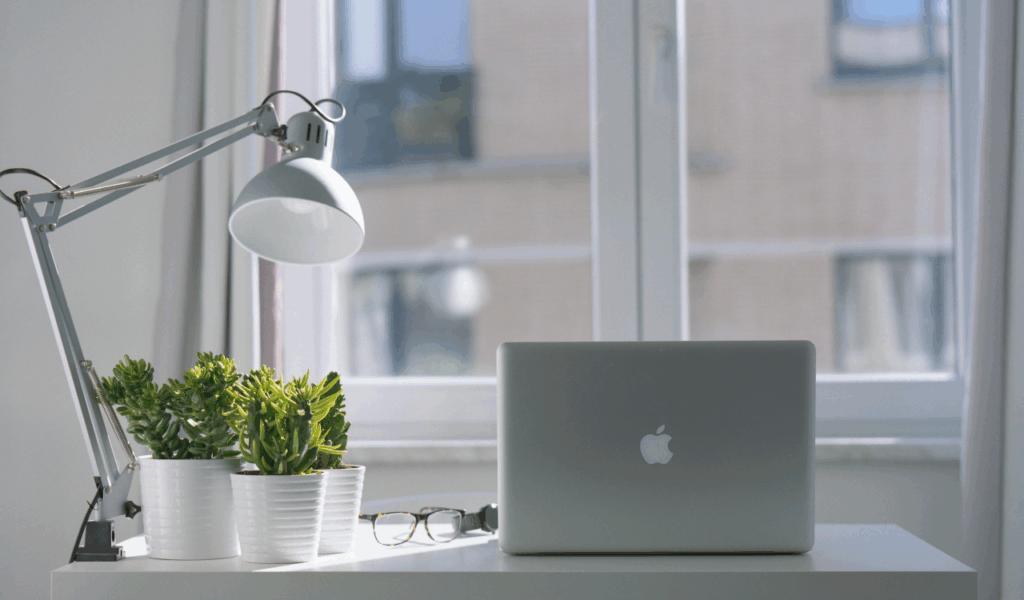
Some earlier study rooms had desks that were far from windows or under cupboards that obscured light. This made some corners quite dark and depended on artificial light. This can cause eye strain and a feeling of being closed in after years of reading and using screens. Good design makes good use of windows by putting desks next to them so that light comes from the side instead of right behind or in front of the screen. Light-colored finishes and reflective surfaces bounce natural light in small spaces. When study hours and tasks change, a structure that accounts for sun movement is more comfortable and energy-efficient.
9. Furniture that cannot scale with age

Some study rooms start with desks, low shelves, or fun furniture that is the right size for kids but not for teens or adults. When bodies grow and study materials get heavier and more complicated, undersized furniture can cause bad posture and wasted effort. Interior designers recommend choosing furniture that can be adjusted or is already the right height for the user as they grow, along with storage that can be changed. Add new accessories to your neutral, sturdy furniture instead of getting rid of it. This saves money on major repairs and makes the study useful during test seasons, university applications, and working from home.
10. Designing only for looks, not long term function
Some study rooms were made to look good in pictures, with elegant but useless desks, little storage, and decorations that could break easily. These rooms looked nice at first, but they didn’t hold up well when people started bringing in cables, notebooks, and more than one gadget. Interior design advice always says that looks should not come before function in work spaces. A good study should be flexible, easy to clean, have enough storage, and promote proper posture. Add style afterward. Function first design allows the room to adapt to new habits, technology, and people without losing its purpose or necessitating a complete redesign every few years.