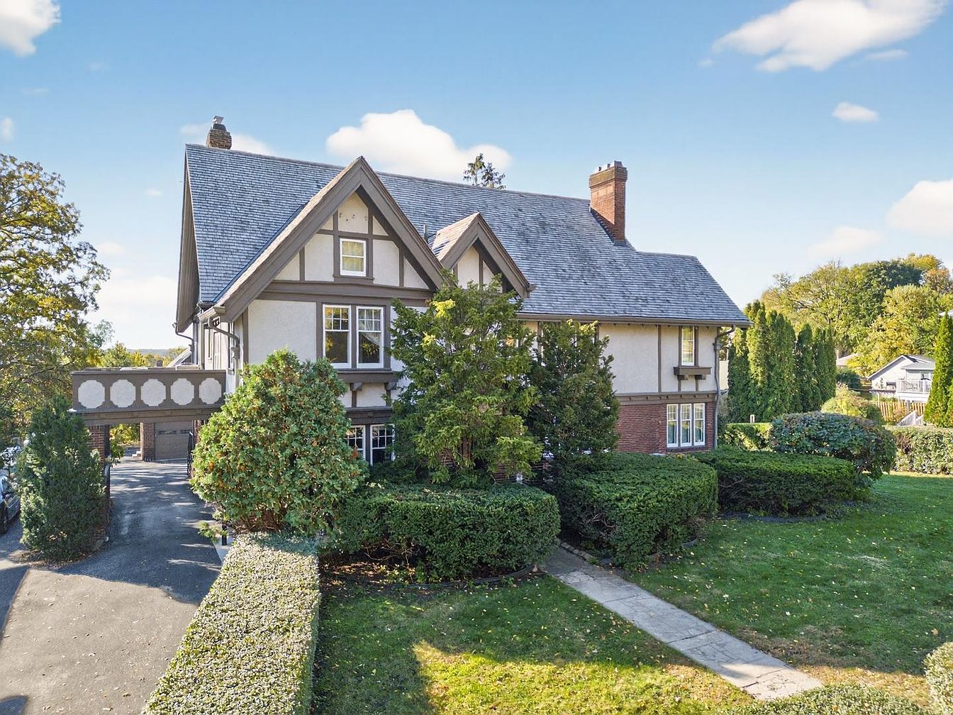
10 Paint Colors That Will Turn Buyers Off and Hurt Your Home Sale
When you’re getting ready to sell, paint becomes one of the most powerful tools you have. The right colors make rooms feel larger, brighter, and easier for buyers to picture as their own. The wrong ones do the opposite. Strong, trendy, or deeply saturated shades often take over a space so completely that buyers stop noticing the architecture and start thinking about repainting costs. What this really means is simple. The more neutral and adaptable your walls are, the fewer hurdles buyers imagine, and the more comfortable they feel making an offer. Knowing which colors routinely send people running is the easiest way to avoid that problem.
1. Fire Hydrant Red That Dominates Every Wall
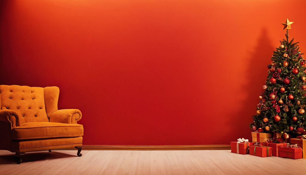
Red looks powerful in magazines, but on full walls it rarely behaves itself during a home sale. Intense reds reflect a lot of visual energy, which can raise the sense of busyness or even stress in a room. Buyers walking through an open house usually spend seconds in each space, so anything that feels aggressive or emotionally charged tends to register as a problem to fix. Red also skews how other colors read. Wood tones can look orange, skin can look ruddy and soft furnishings suddenly clash. On a practical level, most people know red is hard to cover and will require primer plus multiple coats, so they subconsciously add time and cost to the purchase.
2. Lime Green And Neon Greens That Scream Instead Of Settle
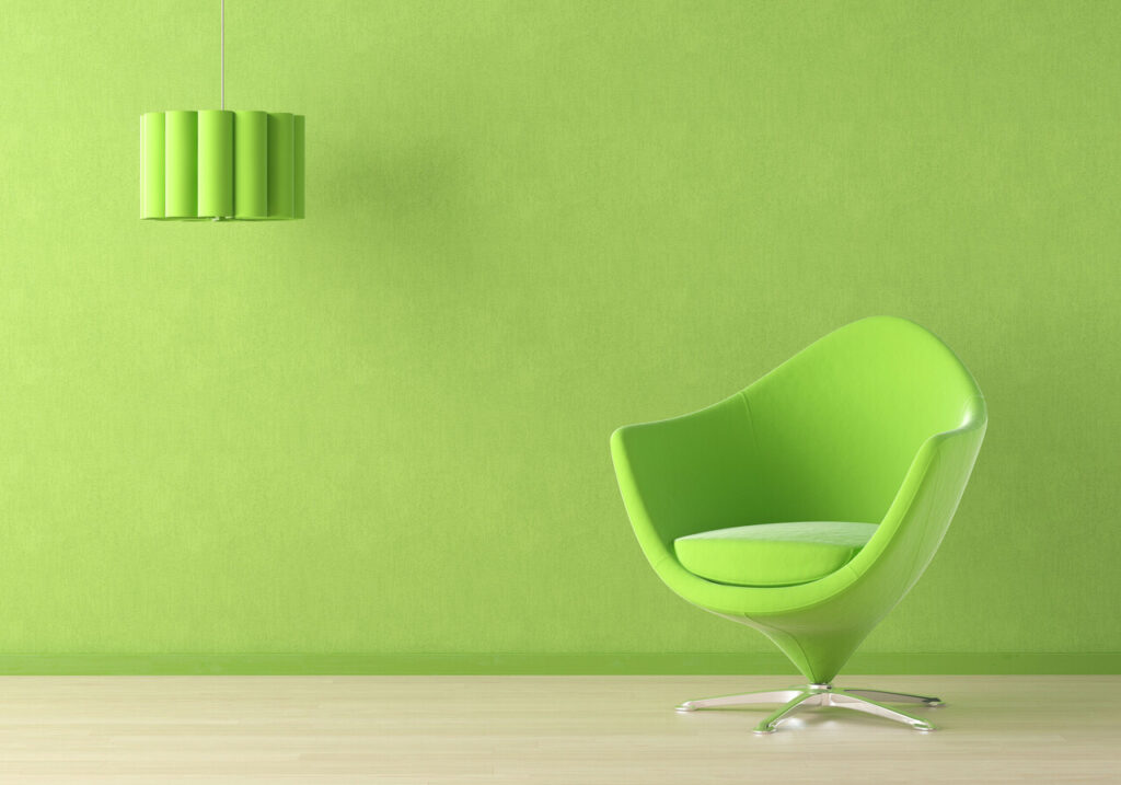
Bright citrus greens have a playful side, but they are among the least forgiving choices when it comes to resale. These hues are highly saturated, so they dominate rooms regardless of furniture or art. In daylight, they can glare, and under artificial light, they can turn acidic or oddly fluorescent. Because they skew toward a very specific taste, buyers have a hard time imagining their own style layered on top. Rooms meant to feel restful, like bedrooms or living rooms, come across as juvenile or overly themed. Even if flooring and fixtures are high quality, the eye lands first on the walls, and that immediate impression sticks.
3. Bright Yellows And Mustard Tones That Overstimulate
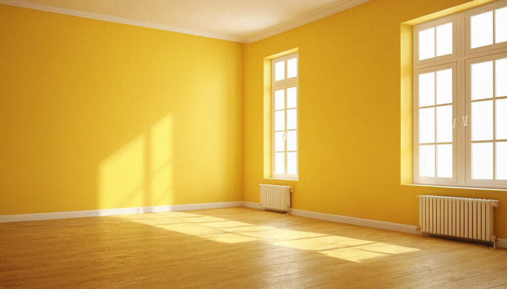
Yellow has a reputation for being cheerful, but strong yellows quickly tip into overwhelming when they cover large surfaces. These colors reflect more light than many other pigments, which can make a room feel visually loud and harder to relax in. Mustard and golden yellows also carry strong trend associations from particular decades, so buyers often read them as dated even if the paint is new. Kitchens and bathrooms in these shades can feel more like a retro set than a neutral backdrop, and buyers may worry that other unseen elements are equally out of step. On listing photos, bright yellow walls tend to dominate thumbnails in a way that does not always attract the right attention.
4. Turquoise, Bright Teal And Vibrant Aqua That Lock In A Style

Turquoise and bright teal can be stunning accent colors, but when they are used across entire rooms, they tend to pin a home to a narrow aesthetic. These hues are strongly associated with coastal, mid-century, or boho styles, which means buyers whose tastes sit elsewhere struggle to see past them. In spaces with warm wood floors or traditional cabinetry, vivid blue greens often clash, making both elements look off. Cameras also amplify these colors, so listing photos can show rooms that look far more intense than they feel in person, raising concern before buyers even book a viewing. During showings, people quickly categorize such rooms as high effort to repaint, particularly if ceilings or trim have been painted to match.
5. Purple And Deep Violet Tones That Polarize Instantly
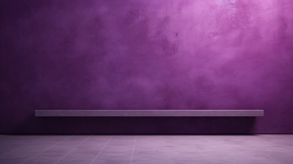
Purple is one of the most polarizing colors in interiors. Strong violet, plum, and eggplant shades evoke specific moods that people tend to either love or dislike on sight. In bedrooms or dining rooms, they can be dramatic, but they also darken and cool the space, which can feel uninviting to someone imagining everyday life there. Under warm lighting, some purples shift toward magenta, while under cool lighting, they can read as bruised or muddy, adding another layer of unpredictability. For family homes marketed to a broad audience, highly personal color decisions like deep purple often work against you.
6. Orange And Pumpkin Shades That Date A Room Fast
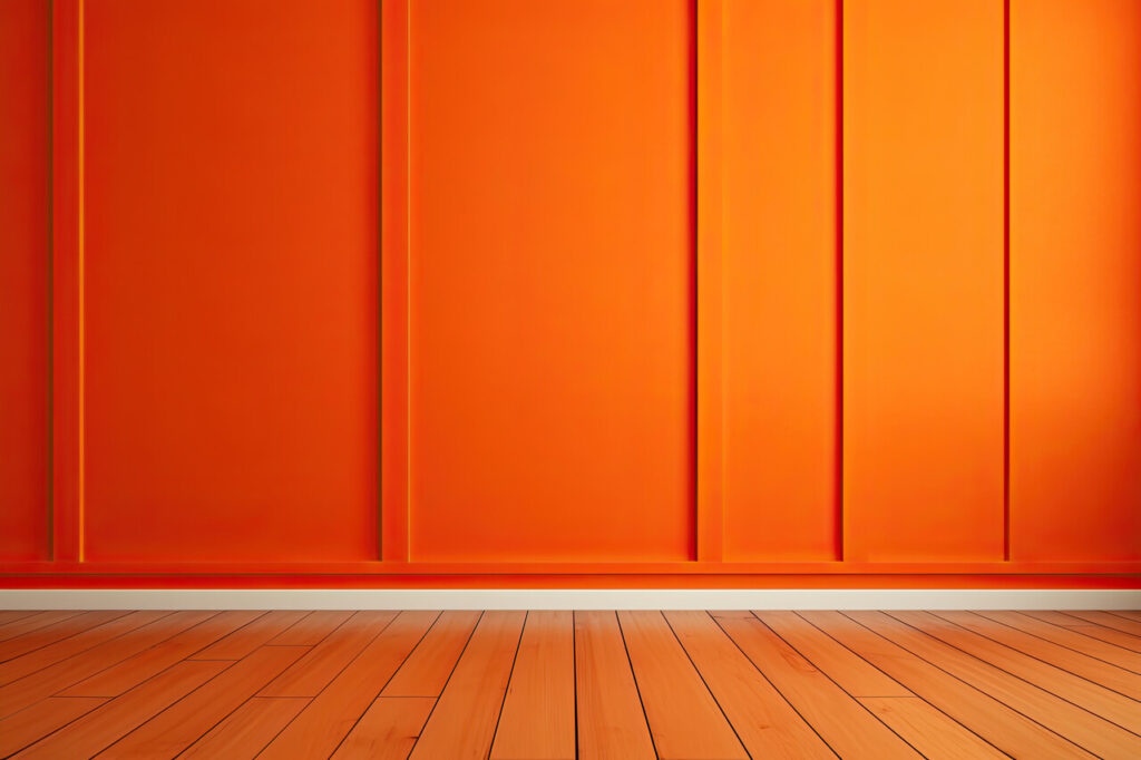
Orange walls rarely sit in the middle ground. Whether it is a bright tangerine, a burnt orange, or a pumpkin shade, the color brings strong associations with specific design eras and seasonal decor. That makes it risky when you are trying to present a home as timeless and flexible. In living areas, orange can visually warm the space, but it also energizes the eye in a way that feels restless to many people. With wood trim or cabinets, these tones often compound warm undertones, so everything skews overly yellow or brown. In photographs, orange can distort camera’s white balance, making it harder to capture accurate images for listings.
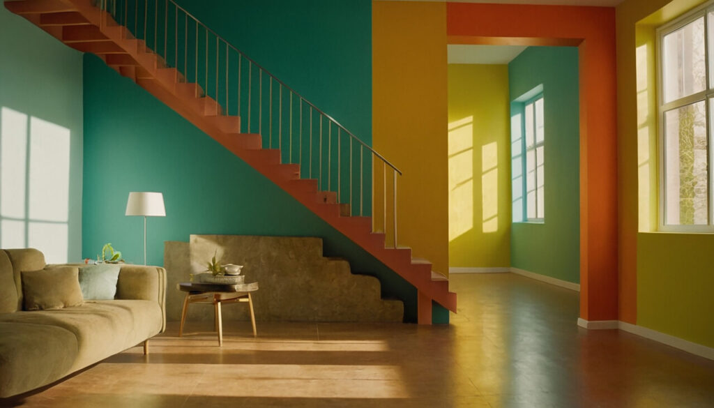
7. Harsh High Contrast Accent Schemes And Loud Trim Colors

Accent walls and colored trim are not inherently bad, but extreme combinations can turn buyers off quickly. Think charcoal or black paired with stark white in an otherwise traditional home, or neon accents on door frames and baseboards. These schemes draw attention away from room proportions and architectural details and put it on paint choices instead. If the rest of the house follows different palettes, moving from one high-contrast space to another can feel jarring. Reversing bold trim and accent treatments is more labor-intensive than repainting a single wall, because every window, door casing, and baseboard requires careful cutting in.
8. Bubblegum Pinks And Overly Sweet Pastel Pinks
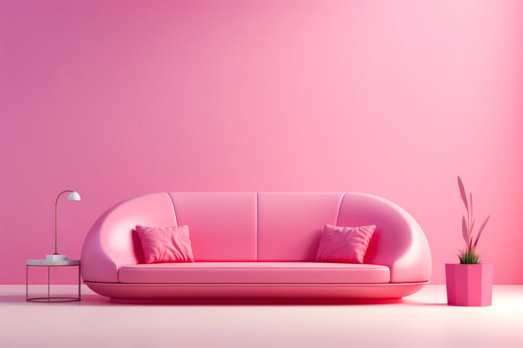
Soft blush tones can work in targeted ways, but saturated bubblegum pinks and very sugary pastels rarely appeal to a broad buyer pool. These colors strongly suggest a child’s room or a very specific personal style, which makes it hard for other demographics to picture themselves in the space. In main living areas, pink walls can cast a rosy tint on everything, including skin, art, and furniture, which feels unnatural to many people. Pastels that were trendy in one decade also age visibly, so a room painted years ago may now read as tired even if the surfaces are in good condition.
9. Murky, Dated Beige, And Heavy Brownish Neutrals
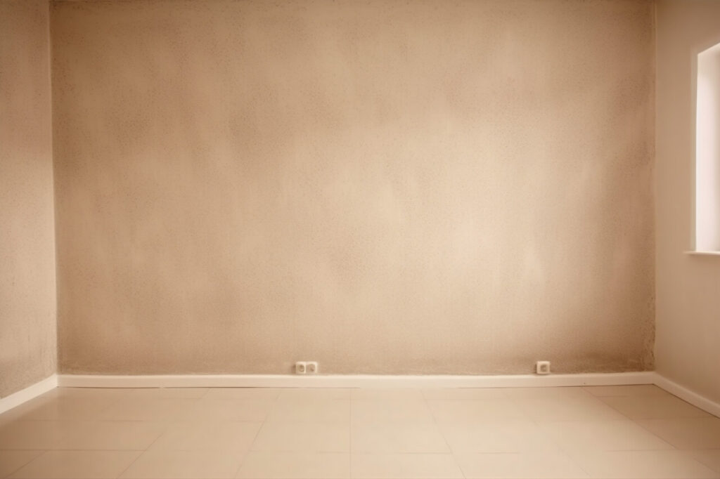
Neutral does not automatically mean sale-friendly. Many older beige paints lean heavily toward yellow, tan or muddy brown, which can make rooms feel dull and weighed down. In low light, these shades can read as dirty rather than warm, especially next to fresh white trim or contemporary furnishings. They also carry the look of past trends, particularly the heavy earth tone schemes popular in the early 2000s. Buyers today tend to respond better to fresher neutrals with cleaner undertones, such as soft greiges or light taupes. When walls are painted in murky beige, they can negate the impact of new flooring or updated fixtures by making everything feel dated anyway.
10. Very Dark Jewel Tones In Small Or Poorly Lit Rooms
Deep navy, bottle green and other jewel tones can look elegant in magazines, but they rely on generous natural light and strong supporting design to work. In smaller rooms or spaces with few windows, these colors absorb available light and emphasize shadows, which makes the room feel tighter and sometimes gloomy. During open houses, buyers typically move quickly and may not take time to imagine how different lighting could improve the feel. Instead, they register a dark, enclosed space that contrasts with their desire for bright, airy rooms. Heavy jewel tones also limit furniture and textile choices, because not every sofa or rug looks right against such strong backdrops.