8 “Geometric” Wall Art That Dates Faster Than Tie-Dye
There’s nothing wrong with a little geometry, until it starts screaming, “I bought this on sale in 2016.” Geometric wall art was once the go-to solution for dressing up blank walls on a budget. It was bold, clean, and everywhere, from influencer bedrooms to IKEA catalogues. But like tie-dye and shiplap, overexposure killed the cool factor.
What looked sharp five years ago now feels mass-produced and weirdly off-trend. These pieces haven’t aged into timeless classics; they’ve become red flags for dated taste. If your walls are still rocking one of these eight geometric offenders, don’t panic. Just know that it might be time for a change. Here’s what to ditch if you want your space to feel current instead of stuck.
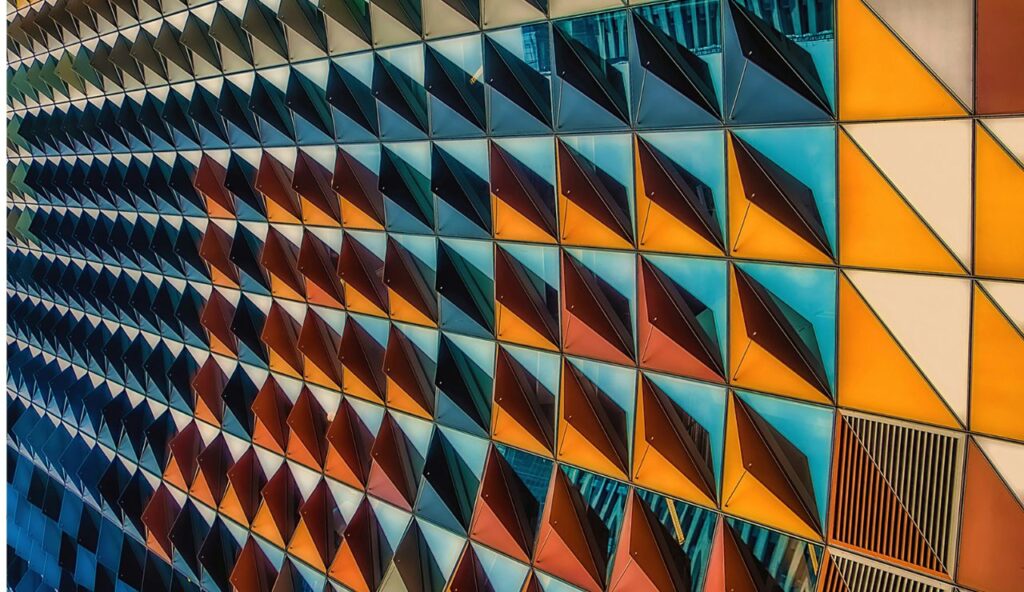
1. The Teal-Gold Triangle Explosion
This combo once ruled Pinterest. Teal added the pop, gold foil gave it a touch of faux luxury, and triangles kept things “modern.” It was the gateway drug for people wanting to dip their toes into design without committing to anything too personal. You could spot this trio in first apartments, dorms, and discount-store art aisles nationwide, often paired with matching cushions or generic typography prints.
Fast forward a few years, and this design now feels like a time capsule from the “Live Laugh Love” era. The problem isn’t just oversaturation; it’s also a lack of individuality. If you want your home to reflect you, this generic print just isn’t cutting it anymore. It reads more like “starter pack chic” than actual style, especially when surrounded by equally tired decor trends like chevron rugs and mirrored trays.
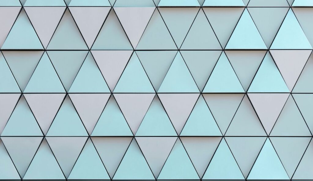
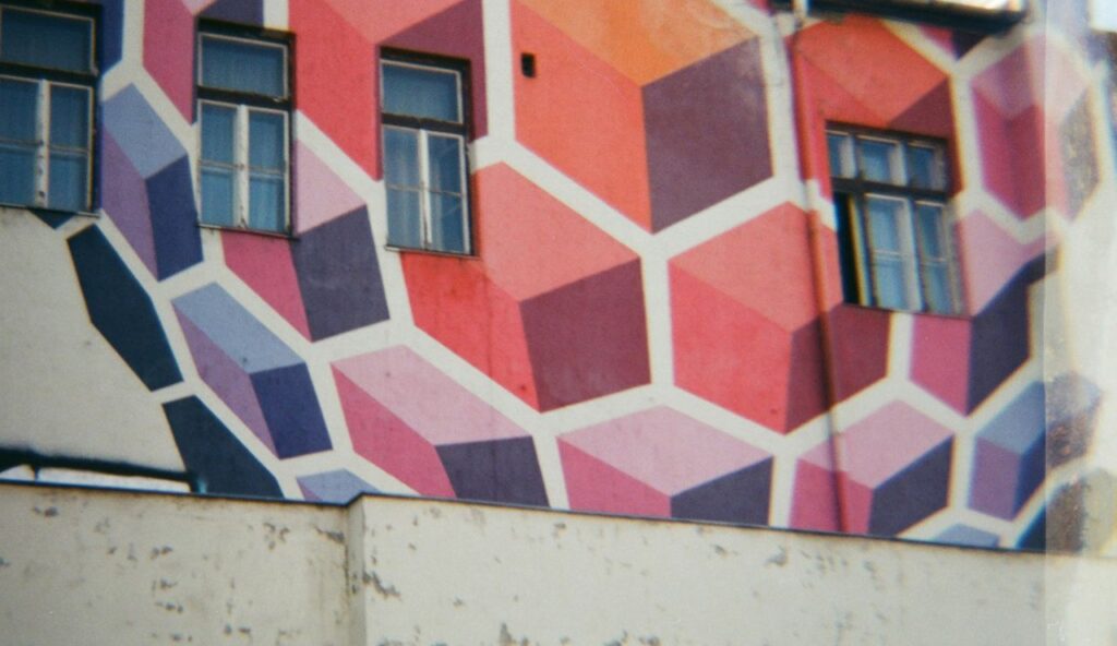
2. Abstract Hexagon Collages
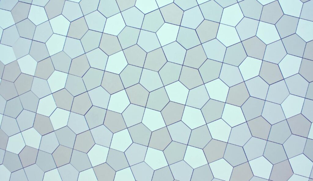
Once beloved for their symmetry and digital vibe, hexagon collages had a moment when everyone wanted their walls to feel minimalist and techy. These pieces were especially popular in grayscale palettes or subtle colour gradients, often chosen by people looking for “something neutral.” It checked a lot of boxes, but none that actually build warmth, character, or connection in a space where people live, not just scroll.
These days, that once-cool structure feels clinical. It lacks texture, warmth, and any real personality. It’s not that people suddenly hate hexagons; it’s that the execution was too polished, too sterile. If your goal is to make your home feel lived-in and layered, this kind of design now works against you. The effect is too safe, too curated, and ultimately leaves rooms feeling like Airbnb setups rather than personal homes.
3. Ombre Mountains in Polygon Shapes
These angular mountains in soothing gradients were supposed to bring peace and wanderlust to your walls. At the time, they blended modern geometry with nature-inspired calm. Add faux succulents and a framed quote, and you have the Instagram-perfect corner. The colors were muted, the shapes were trendy, and it all felt perfectly packaged for a well-lit, mid-scroll double-tap.
Now? It feels staged. These polygonal peaks have no real connection to place, memory, or meaning. They’re just abstract mountains made of math. The serenity people expected to feel has been replaced with a weird hollowness. In real homes, art with emotion lasts; these designs lack that core entirely. Instead of suggesting a love for nature, they give off a vibe of someone decorating by algorithm.
4. Gold Foil Circle Clusters
Gold-foil circular prints were intended to appear abstract and celestial, like mini solar systems or bursts of energy. They appeared on navy or blush backgrounds, adding a sense of “mature glam” to otherwise neutral rooms. And let’s be honest, they looked expensive at first glance, even if they weren’t. Most were purchased from chain stores or online marketplaces that promised “gallery-style art on a budget.”
But here’s the catch: the shine wore off fast, both literally and figuratively. Over time, the foil peels, scratches, or just feels tacky under real lighting. Instead of sophistication, they now read as cheap sparkle, trying too hard. With interior trends leaning toward matte textures and earthy tones, glossy metallics like these feel out of sync. These prints didn’t evolve; they stalled, and now they clash with nearly every modern aesthetic.
5. Black-and-White Optical Illusions
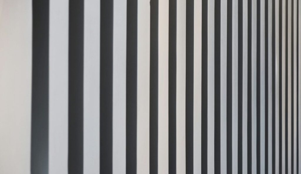
Op-art revivals looked edgy on Instagram feeds, especially in stark black-and-white palettes. These pieces promised to be conversation starters, bold, graphic, and modern. But they rarely played well with others. Most rooms aren’t designed to handle high-contrast illusions without becoming visually exhausting. Even in stylish homes, these designs often clashed with soft furnishings or clunky furniture layouts, making the room feel more like a showroom than a sanctuary.
People expected these prints to add edge. What they got was visual noise. They don’t layer well with textures or colour, and they dominate spaces in an overwhelming way. Most homeowners realised too late that this style is better suited for art galleries or album covers. In everyday interiors, the effect leans chaotic and mood-disruptive. Unless you’re curating an all-out retro vibe, this art choice just doesn’t have staying power.
6. Colour-Blocked Diamond Grids
These diamond grids resembled a nod to mid-century modern, with mustard, navy, and rust arranged in a structured pattern. Designers liked the retro reference, and shoppers liked the “organised but artsy” feel. For a while, it felt like a safe way to inject colour and structure into bare walls. These prints also paired well with mass-market furniture, which made them popular but also led to them blending into other living rooms.
But that safety is exactly the problem. The grid is so rigid that it leaves no room for interpretation. It doesn’t tell a story. Instead, it sits there like graphic wallpaper that forgot to be bold. People expected nostalgia; instead, they got repetition. In 2026, the vibe is all about imperfect charm, handmade layers, and warmth; this design misses all three. What once felt intentional now feels like design by the numbers.
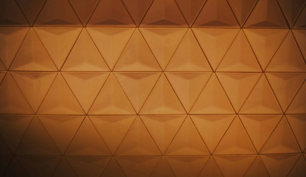
7. Triangles in a Row (Especially Pastel)
Nothing says “trying to be trendy in 2017” like rows of identical pastel triangles printed on canvas. These were everywhere, bedrooms, nurseries, even powder rooms. They felt minimal, lighthearted, and easy to pair with other decor. But time wasn’t kind to them. What felt whimsical at first now feels overly safe and painfully flat, especially when paired with matchy-matchy wall decals and staged shelfies.
Now, they look like something pulled from an office calendar or a marketing brochure. The problem isn’t triangles; it’s how they’re used. Repeating a simple shape without variation or texture can feel lazy. People wanted something calming and contemporary, but this print lacks the personality that makes art meaningful. In 2024 and beyond, “simple” needs to also feel intentional, not default, not disposable, and definitely not mass-produced to this degree.
8. Watercolour Meets Geometry Mashups
Combining organic watercolour blobs with sharp geometric overlays was supposed to strike a balance between softness and structure. These prints had a moody yet modern aesthetic that made them feel “artsy” without being risky. But they aged like an awkward trend, confused and forgettable. You’d find them in staged apartments, online decor kits, or starter homes that never quite found their personality beyond Pinterest boards.
These pieces don’t hold emotional weight or tell a cohesive story. They were design-by-committee: one part paint, one part vector lines, zero soul. And because they were easy to mass-produce, they showed up everywhere. The end result? A print that feels like filler, better suited for staging a rental unit than living in a real home. The moment’s over, and this style isn’t coming back. Even resale sites can’t seem to move them anymore.