8 Color Accents That Might Overwhelm Your Space and Cause Regret
Designing with color is one of the quickest ways to change how a room feels, but here’s the thing. Not every bold or stylish shade translates well once it hits four walls and real-world lighting. Some accents look exciting in a photo or on a tiny swatch, then overwhelm your space, flatten your furniture, or turn the whole room into something you want to repaint within weeks. The goal isn’t to avoid color. It’s to understand which choices tend to backfire so you can use color in ways that feel balanced, personal, and easy to live with long term.
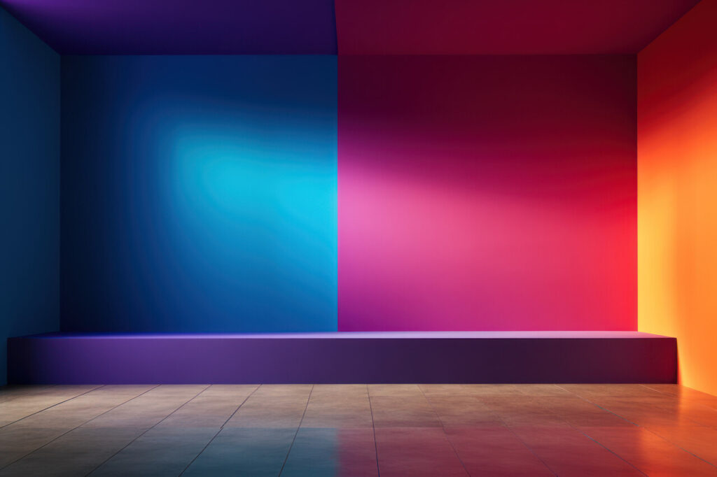
1. Ultra Bright Primary Colors On Large Walls
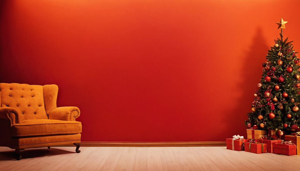
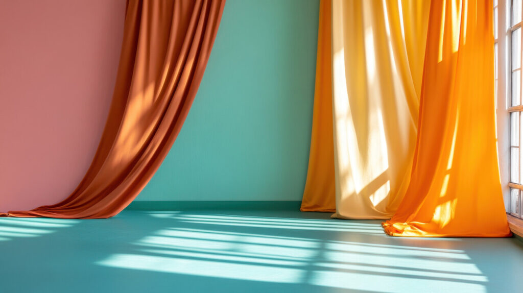
High-energy colors look exciting on a paint chip, but covering a full room in fire engine red or school bus yellow is a shock to the system. Strong primaries have a high visual “volume,” which means your eye never really gets to rest. In living rooms and bedrooms that are meant for unwinding, that kind of stimulation quickly becomes tiring. These pigments also tend to bounce light around in strange ways, so skin tones and furniture colors can look off. Strong reds and oranges are known to raise perceived temperature and even heart rate for some people, which might be fun in a bar but not ideal at home.
2. Deep Jewel Tones In Small Or Poorly Lit Rooms
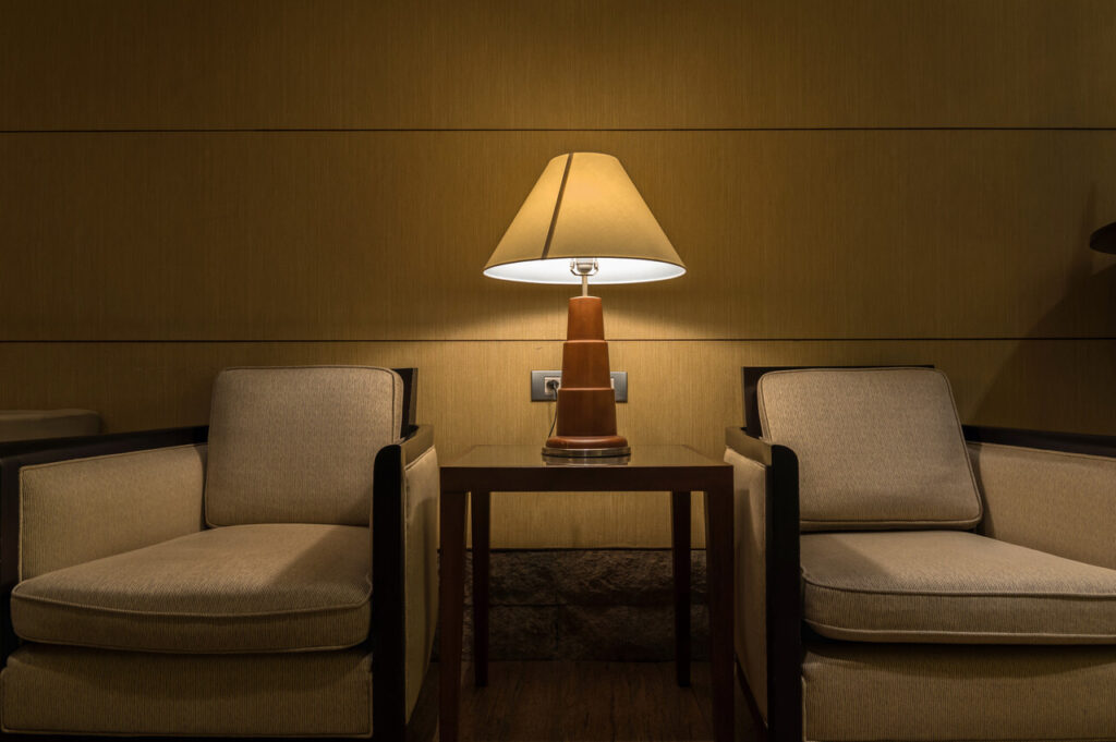
Dark navy, emerald and aubergine can be beautiful, but they are unforgiving in the wrong setting. In small rooms or spaces with limited natural light, these shades absorb rather than reflect light, so the walls visually close in. Corners blur, ceilings feel lower and the whole room can start to resemble a box. That might work for a deliberate cocoon, like a snug TV den, but feels heavy in multipurpose rooms or small apartments where every square foot counts. Artificial light does not always solve the problem, because many bulbs skew cool or warm and change the color in ways you might not like.
3. High Contrast Accent Walls Without Context
Accent walls became popular as a fast way to make a room “interesting,” but dropping a single bold color behind the sofa or bed without planning the rest of the scheme often backfires. A lone dark or bright wall can chop up the room, making it feel shorter or oddly proportioned. If adjacent walls, trim, furniture, and textiles do not repeat or relate to that color, it reads as random rather than intentional. The eye jumps straight to the accent and then has nowhere else to go, which actually makes the rest of the room feel unfinished. There is also the question of the focal point. If the accent wall does not align with where you naturally look, such as behind a television, fireplace or headboard, it can fight with other features.
4. Over-saturated colors On Ceilings, Trims, Or Floors
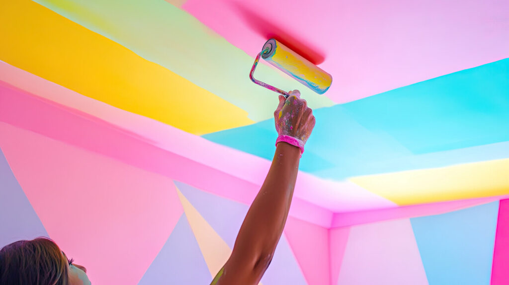
Painting ceilings, trim or even floors in bold hues can work in editorial photos, but daily life is less controlled. A vivid ceiling reflects color onto faces and surfaces below, which can distort how everything looks, from your skin to your furniture. Strong trim colors draw a grid around the room, emphasizing every doorway and window instead of letting the architecture recede. On floors, dark or bright paint highlights dust, scratches, and wear patterns, so they often look tired sooner than a more forgiving shade. These areas are also larger than people realize, so once you commit, the color presence is huge. Changing it is not trivial. Window and door casings require careful cutting in, and floors need sanding or multiple coats to switch out.
5. Mismatched Color Accents Across Rooms With No Cohesive Palette

It is common to treat each room in a home like a separate project, especially when decorating over time. The result can be a patchwork of unrelated accent colors that fight each other as you move from space to space. A bright teal living room, a blush pink bedroom, and a mustard hallway might each feel fun on their own, but together they create visual whiplash. That lack of continuity can make the home feel smaller and more chaotic, because your eye never gets a calm, repeated thread to follow. It also complicates furnishing. Rugs, art, and larger pieces that work well in one room may look out of place just a few steps away.
6. Colors That Clash With Fixed Elements Like Floors And Cabinets
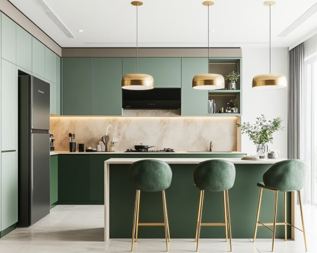
Paint is often chosen last minute, yet it has to live alongside surfaces that are expensive and difficult to change, such as flooring, countertops, tile and built-in cabinetry. Every material has undertones. Oak floors might lean yellow or pink, marble might be cool grey or warm beige, and tiles may have specks of cream or rust. If you ignore these and choose a trendy wall color in isolation, you can end up with combinations that subtly fight each other. A cool grey next to warm honey oak, for example, can make the wood look orange and the grey look flat. Once all of that is installed, the easiest element to fix is paint, which means repainting comes sooner than planned.
7. Glossy Or High Sheen Finishes On Bold Colors
Finish matters almost as much as hue. High gloss and semi-gloss sheens reflect a lot of light, which exaggerates both the depth of a strong color and any imperfections in the surface. On doors and trim that might be manageable, but on full walls, it can create relentless glare and highlight every roller lap, patch, and nail bump. Bold colors in glossy finishes can also read as plastic or overly formal, which clashes with casual furniture or textured textiles. Cleaning is another factor. While gloss resists stains, touch-ups are tricky because even small repairs can flash and remain visible from certain angles.
8. Following Trend-Driven Color Palettes Without Thinking Long Term
Every year, paint companies and trend reports push new “it” shades. It is tempting to jump on these palettes because they feel current and are easy to find in stores and social feeds. The risk is that what looks fresh right now may start to feel dated as soon as the next wave arrives. We have seen this cycle with grey everything, then greige, then specific greens and terracotta tones. If you paint large areas in a color chosen mainly because it is trending, rather than because it suits your light, furnishings and personal taste, you may tire of it quickly. Repainting whole rooms is not just about buying new paint. It means moving furniture, prepping surfaces and living with disruption.