7 Gallery Walls That Make Open Houses Feel Like Art Galleries From Hell
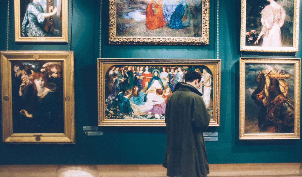
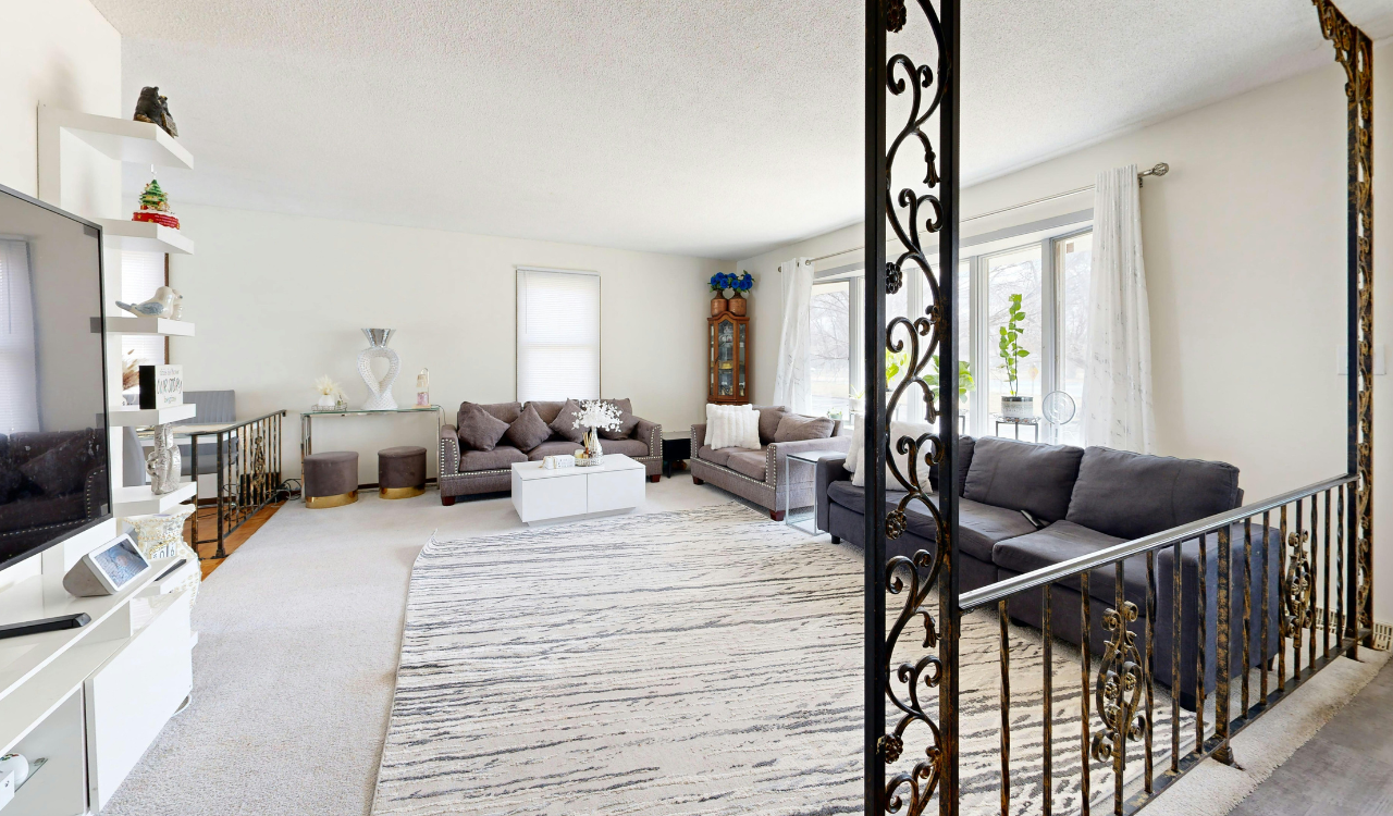
A gallery wall is supposed to be a carefully chosen way to show off your personality, but in the high-stakes world of real estate, it can rapidly turn into a visual nightmare. Designers say that a well-designed arrangement can give character to a room, but a display that is too busy or badly arranged might make the room feel smaller and take buyers’ attention away from the home’s architectural features.
When a gallery wall doesn’t work, it stops being a design element and starts to look like a messy museum of death. The point of an open house is to help people picture their own life in the space, but these walls are so congested and closed in that it’s almost hard to do so.
Realtors say that a startling gallery wall is one of the main things that makes purchasers feel uneasy as soon as they walk into a room. Experts argue that the brain looks for symmetry and balance. When those things are missing, the “art gallery from hell” effect kicks in. Professional flippers say they often spend thousands of dollars fixing drywall merely to get rid of these annoying displays before a property goes online.
This article talks about seven unique gallery wall disasters that may make a beautiful home feel confusing and stressful, making guests want to leave.
1. The Cluttered Floor to Ceiling Maximalist Mess
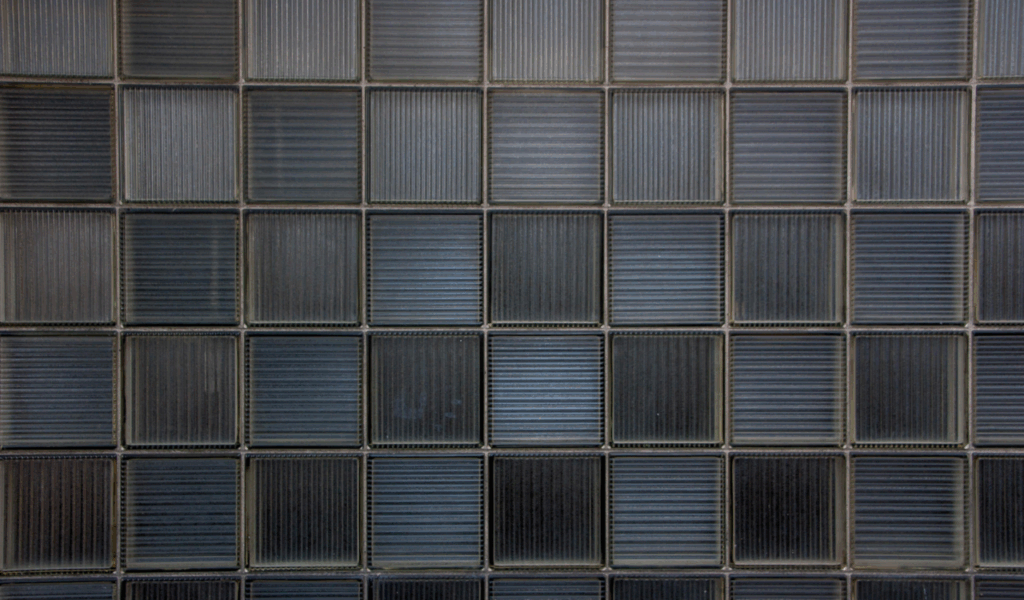
A lot of people think that every square inch of a wall should be covered in frames because of the maximalist style. But experts say this is a formula for catastrophe. When art goes all the way from the baseboards to the crown molding with no space in between, it makes the room appear like it’s too small and the ceilings feel much lower than they really are.
Experts argue that this “wall of noise” keeps the eye from resting, which makes guests feel overwhelmed by their senses. Instead of admiring the art, customers worry about the harm that is buried behind hundreds of nails.
Realtors say that a floor-to-ceiling clutter is a big red flag since it shows that the homeowner doesn’t take care of their home. Organizers say that white space is just as significant as the art itself since it lets people enjoy each item on its own.
Professional flippers say that these hefty displays often mask structural weaknesses or moisture stains, which makes smart purchasers suspicious of the seller’s motives. The space loses its peacefulness and becomes a messy obstacle course that lowers the home’s genuine market value when the wall feels like it’s closing in on you.
2. The Misaligned Grid of Visual Vertigo
A grid of frames where every component is off by a few millimeters is quite unnerving. Designers say that a grid needs to be very precise; without it, the whole wall seems like a mistake in architecture.
Experts claim that even a small tilt or uneven spacing can make visitors feel like they are experiencing “visual vertigo,” which makes the room seem unstable or badly built. When buyers see that the seller didn’t pay attention to the details, they can think that other important areas of the home were also not cared for.
Contractors say that the key to a precise grid is using a laser level and the same hardware every time. Most homeowners, on the other hand, just guess. Professional flippers say that they usually always replace these crooked grids with a single, huge piece of art to make the room’s geometry easier to understand.
Realtors say that buyers will spend more time staring at the unequal gaps than they will looking at the house’s real attractions. Designers say that if you can’t commit to exact math, you should stay away from the grid layout altogether so that your open house doesn’t feel like a funhouse.
3. The Family Photo Shrine Overload
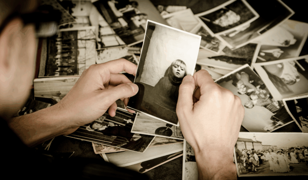
Personal images are great for a family home, but having a whole wall of them showing private family events is a big no-no for an open house. Realtors say that “de-personalizing” is the first rule of staging. This is because purchasers need to be able to see themselves living in the property, not your vacation to the mountains.
When guests see a huge shrine of personal history, they sometimes feel like they are intruding on someone else’s life. This emotional barrier keeps people from connecting with the property, which is the main purpose of any successful showing.
Experts argue that big pictures of people can be very distracting since our brains are wired to look at faces. This implies that instead of looking at the magnificent built-in bookshelves or the hardwood flooring, the buyer’s mind is on a stranger’s wedding day.
Designers say that instead of these personal galleries, you should use neutral, abstract, or botanical prints that set a mood without telling a story. If you want to get a serious offer, the “shrine wall” has to go. Organizers say it’s okay to keep a few modest, framed images on a side table if you need to.
4. The Mismatched Frame and Style Frenzy
Mixing frames can look good, but if the materials, colors, or subjects don’t have anything in common, the outcome is an ugly mess. Designers say that an eclectic wall needs a unifying factor, like a consistent color scheme or a certain subject, to be successful. The wall seems like a bunch of old clothes from a thrift store instead than a carefully chosen art show without this. Experts argue that this lack of unity makes a room look cheap and messy, which can make the whole house seem less valuable.
Professional flippers say that a “frenzy wall” is generally the result of homeowners trying to fit all of their frames into one room. Realtors say that this messy look makes a house feel smaller and less fancy. If you wish to blend styles, designers say you should at least keep the frames in the same color family, such all black or all natural wood. This gives the impression of “planned variety” instead of random mess. People start to wonder what else in the house was an afterthought when the art on the wall looks like a mistake.
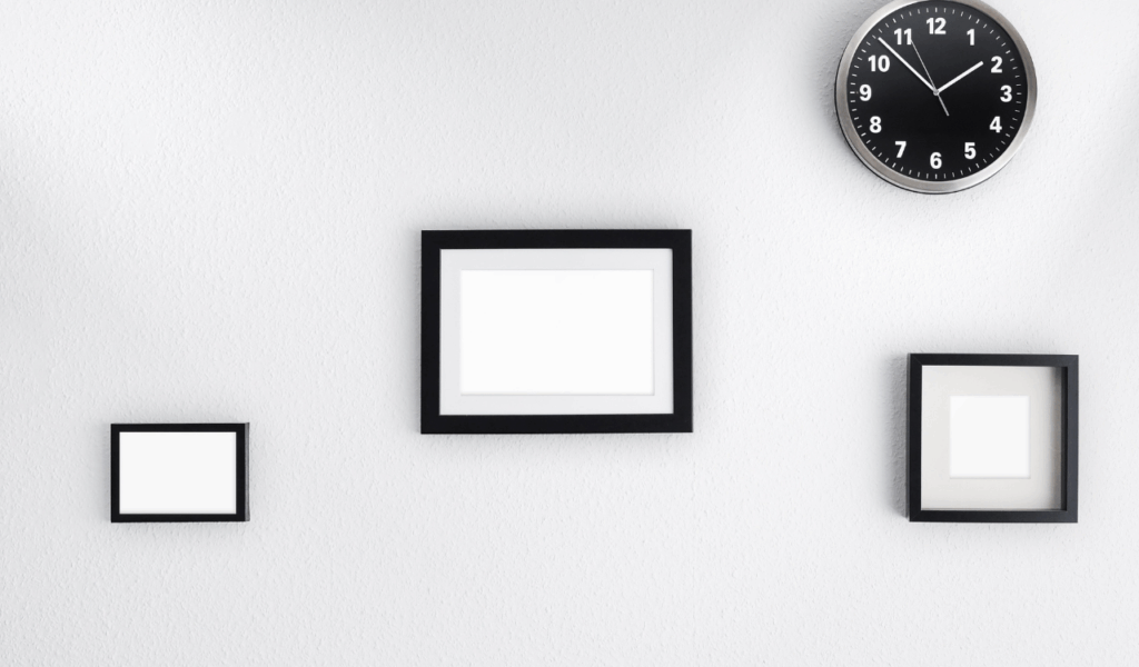
5. The Tiny Art on a Massive Wall Syndrome

When it comes to interior design, size is essential. Hanging little frames on a big, open wall is a classic mistake that makes the space appear awkward and “lost.” Designers say that little pieces of art should be put together or on smaller walls so they don’t get lost in the area around them. A big wall with only a few little objects on it makes the room feel empty in a bad way. Experts believe this makes the house feel cold, unwelcoming, and inadequately furnished, as if the owner ran out of money or ideas.
Realtors say that correct scale is one of the most crucial parts of good staging. Professional flippers say that they typically utilize big, cheap canvases to fill in these gaps and make the space feel magnificent. To make sure that the art covers enough of the wall to feel intentional and anchored, designers suggest the “rule of thirds.”
When art is too little for the space it’s in, it looks like a quick fix instead than a lasting design choice. This absence of visual weight can make a place that is otherwise quite lovely feel empty and incomplete to a potential buyer.
6. The Creepy Portrait and Dark Art Gallery
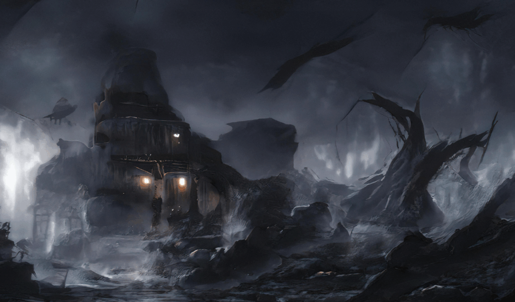
Art is personal, but some topics are just not good for an open house. Designers say that dark, moody, or aggressively “creepy” photographs can make a room feel weighty even after the guest has left. Experts suggest that art with bright eyes, skeletal shapes, or dark, muddy hues might make people feel like they have to “fight or flight.” You don’t want this negative psychological link during a showing because it makes the house feel haunted or uninviting instead of pleasant and safe.
Realtors say that neutral and positive art is always the best choice for a rapid sale. Professional flippers say they stay away from any work that could be seen as controversial or upsetting to most people. Even if you love Gothic or surrealist art, designers say you should put it away while your house is on the market. The idea is to make a “blank canvas” with a touch of elegance, not a creepy museum. When you get rid of dark or creepy things, the home’s natural light and good qualities can show through without being covered up by a “gallery from hell.”
7. The Unevenly Spaced “Random Acts of Art”
A gallery wall needs a definite design, but some people try to make it look “random,” which merely makes it look like a bunch of accidents. Experts claim that if the space between frames is between two and ten inches, the wall loses its rhythm and becomes a source of stress for the eyes. Designers say that the human eye instinctively looks for patterns. When those patterns are broken for no obvious creative reason, the brain sees it as a jumble. The room feels messy and badly planned because there isn’t any structure.
Before putting up the first nail, organizers say that a good gallery wall starts with a paper template on the floor to check the spacing. Professional flippers say that they regularly uncover walls with dozens of holes that don’t need to be there since owners keep shifting frames around to “fix” the spacing.
Realtors say that these “random acts of art” make it look like the homeowner doesn’t know what they want to do with the space or is unsure of what they want to do. Designers say that frames should be spaced two to three inches apart to make the look tight and professional. Anything else could make the room look like a chaotic eruption of frames that breaks the flow.