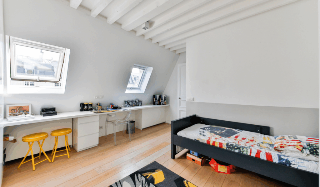
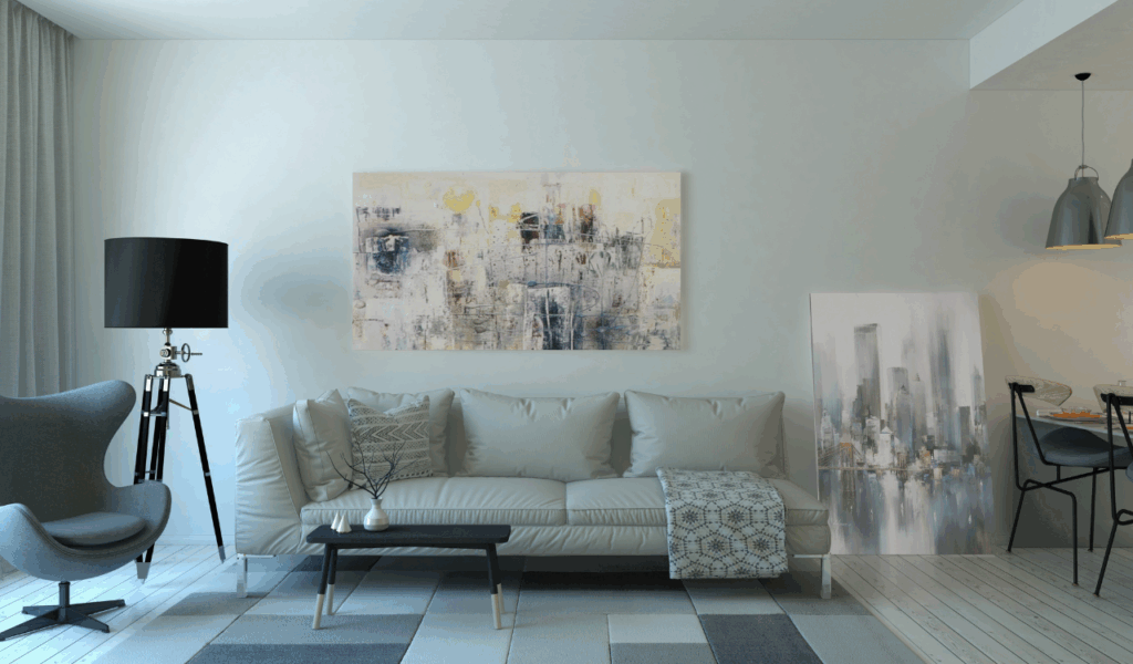
6 Pattern Mixing Mistakes Even “Pros” Make That Ruin Your Space
Mixing patterns can add flair to a room right away, but even experienced decorators can sometimes get the scale, balance, or location wrong. To make a space feel vibrant instead than chaotic, you need to choose prints that work well together in terms of tone, proportion, and visual weight. If you don’t pay attention to these principles, the end result can look messy or unconnected. Knowing what the most typical mistakes are can help you mix stripes, florals, geometrics, and textures with confidence while keeping your room comfortable and coherent.
1. Using Patterns With No Shared Color Palette
Different prints can work together without fighting if they all use the same color palette. If patterns don’t have any colors in common, the eye has nothing to hold on to and the environment can feel out of place. Even palettes that are highly different need at least one color that is used more than once to connect everything together. Picking two or three major colors and making sure all the patterns fit within that range creates harmony while still allowing for originality. Instead than trying to match everything perfectly, try to get tones that work well together and make things flow across textiles, carpets, and accent pieces.
2. Ignoring Scale and Proportion

Patterns become more powerful as they change, but one of the quickest ways to fill a room is to ignore scale. When all the prints are the same size, nothing sticks out, and the effect becomes too busy. When you mix big patterns with medium and little ones, you get rhythm and depth. A big floral or bold geometric can be the base, while medium prints support it and little patterns fill in the gaps. Also, think about the size of the room, since big pictures in small rooms might make them feel claustrophobic.
3. Mixing Too Many Pattern Types at Once
Diversity is good, but applying too many unrelated patterns makes things look messy instead of stylish. Mixing stripes, flowers, animal patterns, checks, and geometrics without thinking about it can make things look messy. If you only use two or three types of patterns, each one can add its own style without taking over the others. Using the same pattern on multiple items, such echoing a stripe in cushions or throws, helps keep things consistent. Thoughtful repetition makes sure that diversity feels planned instead of random.
4. Forgetting About Texture as a Pattern
People often forget about texture while they are planning, even though it gives movement and depth like a pattern. Woven fabrics, knits, and embossed finishes are examples of materials that add subtle diversity that can either soothe or enhance bold prints. If you don’t pay attention to textures, the space may rely too much on visual patterns, which might make it feel cluttered. Mixing smooth and rough surfaces makes powerful patterns softer and brings balance. When you think about texture as part of the pattern mix, the room feels more layered and less chaotic.
5. Choosing Patterns That Clash in Style
Colors can match, but patterns can still clash if their design styles don’t match. For instance, putting a sharp modern geometric with an extravagant old flower might make things tense instead of contrasting. Knowing the main idea of your area can help you choose patterns that go well together instead of clashing. Making ensuring that the motifs go with the room’s furniture and architecture keeps everything consistent. If you’re not sure, blend prints that have a similar mood or design style to keep everything together.
6. Overloading Small Spaces With Busy Prints
Patterns can help small spaces, but too many busy ones might make the space look smaller. When prints are thick and have a lot of contrast, they tend to pull the eye inside. This can make walls feel closer and furniture feel heavier. Don’t avoid patterns altogether; instead, pick simpler or more open designs that let air flow. A bold feature design with softer supporting prints makes the area feel warm and welcoming. When you balance negative space with pattern, the place feels alive without being too much.