6 Grocery Store Displays That Feel Manipulative
Grocery stores are meticulously planned places where products are rarely put in the wrong spot. People who set up displays sometimes don’t realize that they affect how shoppers move, what they notice, and how much they spend. Many layouts are common in stores, however some displays seem deceptive because they stimulate impulsive buying, make prices seem higher than they are, or make people buy things they don’t need. These tricks aren’t against the law, but they might make people feel like they’ve been tricked once they figure out what’s going on. Here are six common grocery shop displays that often make people feel uneasy and why they do.
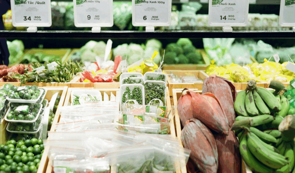
1. Endcap Displays Packed With Non-Essentials
Endcap displays are at the ends of aisles where people naturally slow-down, which makes them a great place for products that need to get people’s attention. Instead of necessities, these displays usually have snacks, sweets, or seasonal products. The way it is placed makes it seem important, even if it doesn’t cost much or is more expensive than other products in the aisle. Bright signs and big price tags make people want to buy things on the spot. Shoppers can subsequently realize they bought things they didn’t need just because they were in their way.
2. Checkout Lane Candy and Snacks
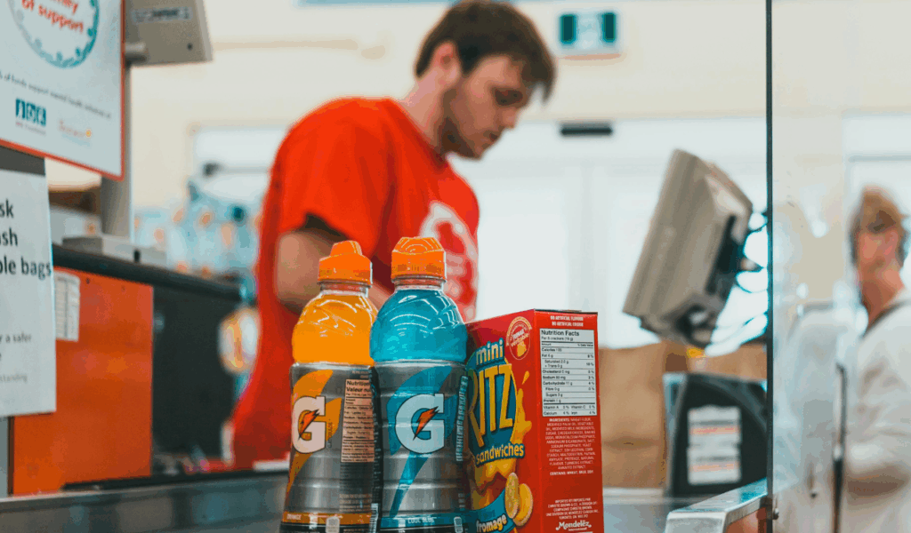
Checkout lanes are meant to make the most of the time people spend waiting and making decisions. Adults and kids may both see candy bars, sugary snacks, and small drinks at eye level. Shoppers are less likely to think about their purchases by the time they get to the register, which makes them more likely to buy things on impulse. These things are usually not the best deal and are often less healthy than other options in the store. Many customers feel like they are being tricked when they realize that these displays are aimed toward fatigued shoppers and kids when they can’t help but stop.
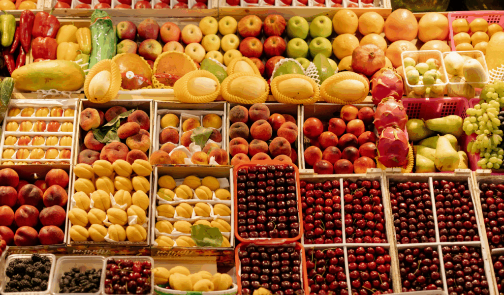
3. Bulk Displays Without Clear Unit Pricing
Even if the prices say otherwise, big bulk displays can make items look like great buys. When things are stacked high in bins or on pallets, it makes people feel that they need to buy them right now and that they are getting a good deal. If there aren’t clear unit prices, customers could think the item is cheaper than it really is. Later comparisons often show that similar items are cheaper on ordinary shelves. This strategy depends on having a lot of visuals instead of being clear. Customers often feel tricked when they find out that the display changed their mind instead of giving them true value.
4. Seasonal Displays Placed at Store Entrances
Seasonal displays near the entrance are meant to establish the mood for buying right away. These displays typically push themed things that buyers weren’t planning to buy, whether they’re related to holidays, events, or trends. The early exposure gives customers an idea before they look at their lists. Because of limited-time framing, products are often priced higher than they should be. A lot of people feel like they’re being influenced when they see how these displays draw attention away from what they really need and make them feel like they have to buy something right now just because of where and when they are.
5. Price Comparison Displays Using Premium Anchors
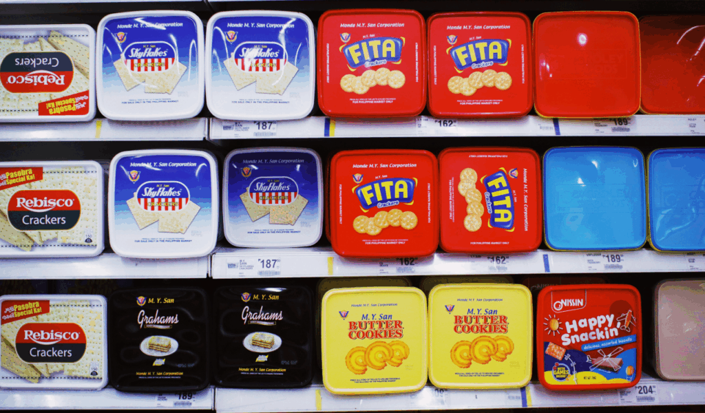
Some displays put modestly priced items next to much more expensive ones to make the medium option seem like a good deal. This pricing anchor method changes how people see things without changing their true value. People could choose the mid-priced item because they think it’s the best choice, even though there are cheaper options available. The presentation subtly impacts how the comparison works. Customers often feel tricked when they realize the layout was meant to guide their decisions instead of giving them all the options fairly.
6. Multi-Buy Promotion Displays
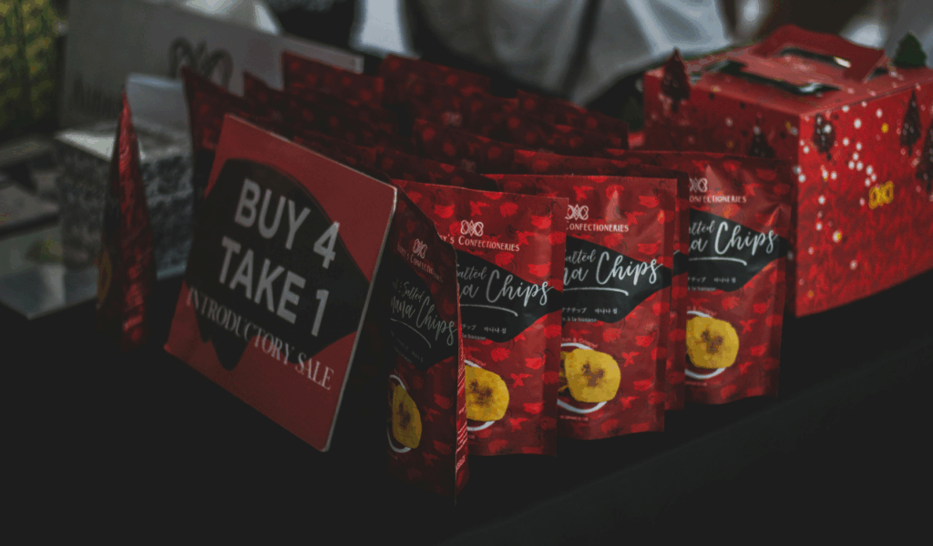
Multi-buy displays push deals that make people think they’re getting a better deal by buying more than one unit. This typically leads to people buying too much. Even though the price per unit is the same as buying one item, these displays make it seem like you’re saving money. People who shop may feel like they have to buy more than they need to prevent missing out. This strategy makes the basket bigger while making it look like it’s worth more. Customers often feel tricked when they find out later that the campaign didn’t really save them money and instead made them buy things they didn’t need.