10 Decor Styles Called Timeless — Until They Start Feeling Dated
Every decor style has its peak, and many are ageless because they feel secure, comfortable, and appealing. Even the most cherished looks can become repetitious or visually tired when tastes, materials, and lifestyles change. Design trends reflect society, technology, and how people live in their places, not that these styles were awful. Once warm and inviting, it can become heavy or themed. Knowing why styles age helps homeowners upgrade appropriately without starting over. Recognizing a space’s age lets you make tiny changes that feel modern and honor it. Ten traditional décor styles and why they may seem antiquated are covered in this guide.
1. Shabby Chic
Shabby chic’s pastel colors, faded furnishings, and vintage-inspired elements gave it a warm, romantic, and comfortable feel. It felt lived-in and welcoming in smaller homes with its mellow hue. However, excessive distressing and delicate detailing can make settings feel staged over time. Every surface seeming purposely weathered can look contrived rather than appealing. Pale pinks, whites, and ornamental curves might lack contrast, making spaces look blurry. Contemporary tastes like natural-aging materials. If not balanced, shabby chic may turn nostalgic into stale, making interiors feel stuck in a single age.
2. All-Gray Minimalism
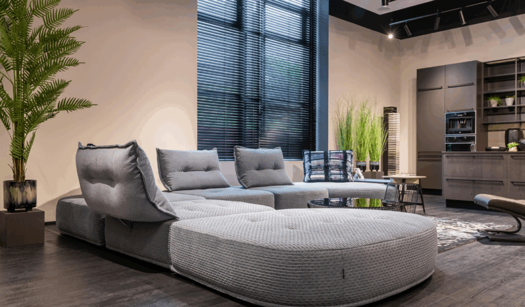
All-gray rooms were popular for their clean, neutral look and modern, versatile feel. In modern homes, gray walls, floors, and furniture were safer than beige. Overuse has diminished its impact. Rooms might feel flat, cold, and emotionally distant when every surface is chilled. Gray areas are hard to warm with natural light, especially in smaller or darker rooms. All-gray palettes might feel cold as design emphasizes warmth and texture. The current trend of minimalism embraces layers, neutrals, and earth tones that are soothing. Interiors that are gray-on-gray may give the impression of being showrooms that lack diversity.
3. Tuscan-Style Kitchens
Tuscan kitchens were previously luxurious and elegant, with dark timbers, intricate cabinetry, heavy textures, and warm earthy colors. In large, inviting homes, they felt rich and substantial. Time has made their visual weight a negative. Dark finishes often overwhelm kitchens, making them feel smaller and less useful. Complex elements clutter and require more care, clashing with modern minimalism. Overly themed kitchens may look restricting as multipurpose hubs. Modern kitchens emphasize light, adaptability, and clean lines. Full-scale Tuscan versions can feel antiquated and removed from current living, while moderate versions function.
4. Chevron Overload
People liked using chevron designs on walls, floors, and fabrics because they added movement and visual interest. When used wisely, zigzags added vitality and drew the eye. Too much chevron on rugs, pillows, walls, and other decor items produced problems. The strong directional pattern quickly takes over a space, making it hard to relax visually. This level of intensity could become too much instead of stylish. Heavy chevron use seems stiff and predictable as design trends move toward more natural shapes and softer patterns. Today, bright patterns are better as accents than as centerpieces for the whole room.
5. Farmhouse Word Art
Farmhouse word art with sayings about family, food, and life gave homes personality. At first, these things appeared intimate and comforting in everyday situations. When they were made in large numbers and reproduced, their meaning disappeared. When you say the same thing over and over in different homes, it loses its significance. Too much use can also make sections feel like they were made with a theme in mind. Modern interiors use materials, textures, and important objects to express stories visually rather than literally. It seems like using a lot of word art is more of a trend than a classic design option, although one well-chosen sign can work.
6. Industrial Everything
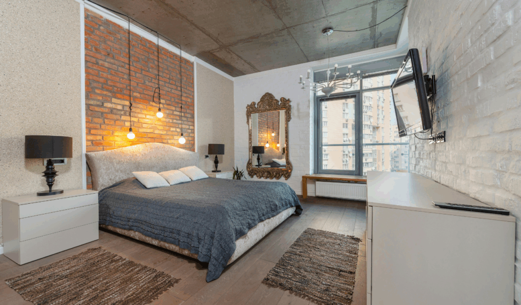
Warehouses and factories inspired industrial style with exposed brick, metal fixtures, and structural elements. It seemed raw, urban, and refreshingly honest when adopted in residences. However, totally industrial interiors can become harsh and uncomfortable, especially in home settings meant for relaxation. Heavy metal, dark colors, and exposed pieces can produce echoing, frigid environments. Pure industrial style feels unfinished as consumers value home comfort and softness more. Industrial elements are mixed with natural materials and warm textiles in modern rooms. Industrial rooms without balance might feel cold and unfeeling.
7. Overlayered Boho
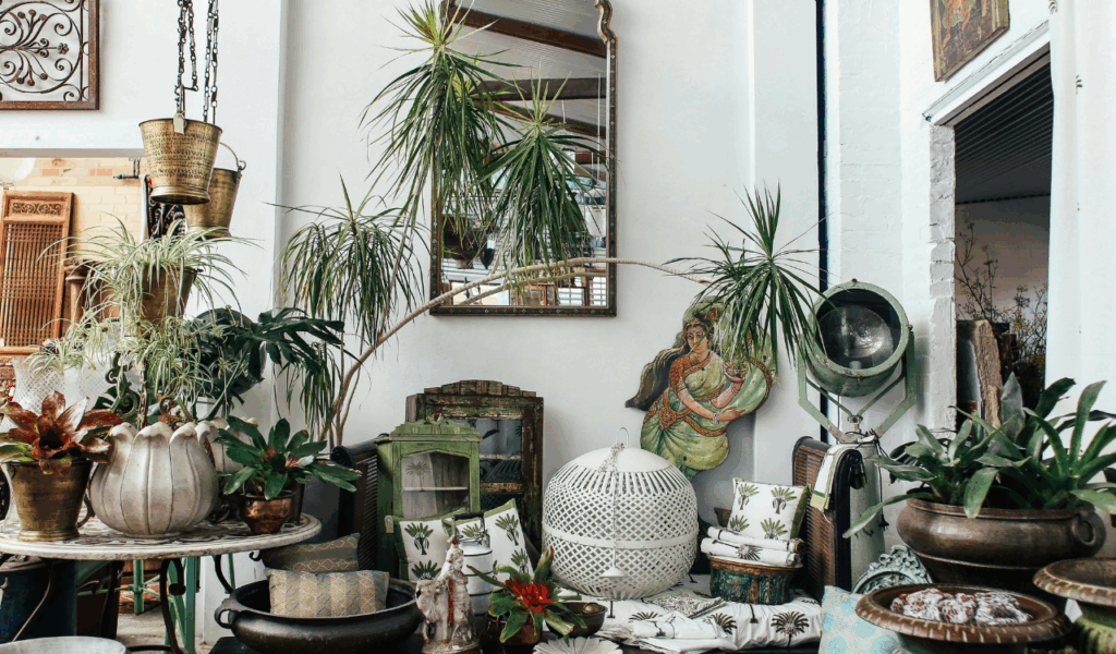
Bohemian décor used linens, worldwide patterns, plants, and collected artifacts to celebrate creativity. Carefully chosen, everything seemed lively and personal. Some rooms got cluttered with layers, textures, and colors as the trend expanded. Boho rooms can be chaotic without discipline. After some time has passed, dust, maintenance, and visual noise become challenges that need to be addressed. The most recent design trends favor edited warmth with fewer, more vital aspects, as opposed to layering. Components of bohemian style that are simplified are effective, whereas interpretations that are complex are outmoded and visually tedious.
8. Matching Furniture Sets
Creating a beautiful, coordinated environment with matching furniture sets was previously easy. Buying from one collection assured color, finish, and scale uniformity. Over time, this homogeneity has become impersonal and predictable. Perfectly matched rooms might look like hotel suites. Contrasting materials, eras, and finishes give modern design depth and personality. Carefully chosen mismatches give flair and adaptability to changing tastes. While convenient, fully coordinated sets typically indicate an antiquated style that values sameness above thoughtful composition and lived-in attractiveness.
9. Bold Accent Walls
Bold accent walls gave excitement to a room without making it too busy, making it easy to try out different colors. Deep reds, bright blues, and bright greens were the most popular colors of the time. Over time, bold walls may feel far away, especially in settings with neutral colors. It may seem like you didn’t mean to make a sudden contrast. Even with darker colors, color trends today focus on palettes that work well together and flow through a room. More and more, designers are choosing subtle changes, textured surfaces, and tonal differences over one great wall since they are easier to integrate and last longer.
10. Ultra-Glossy Finishes
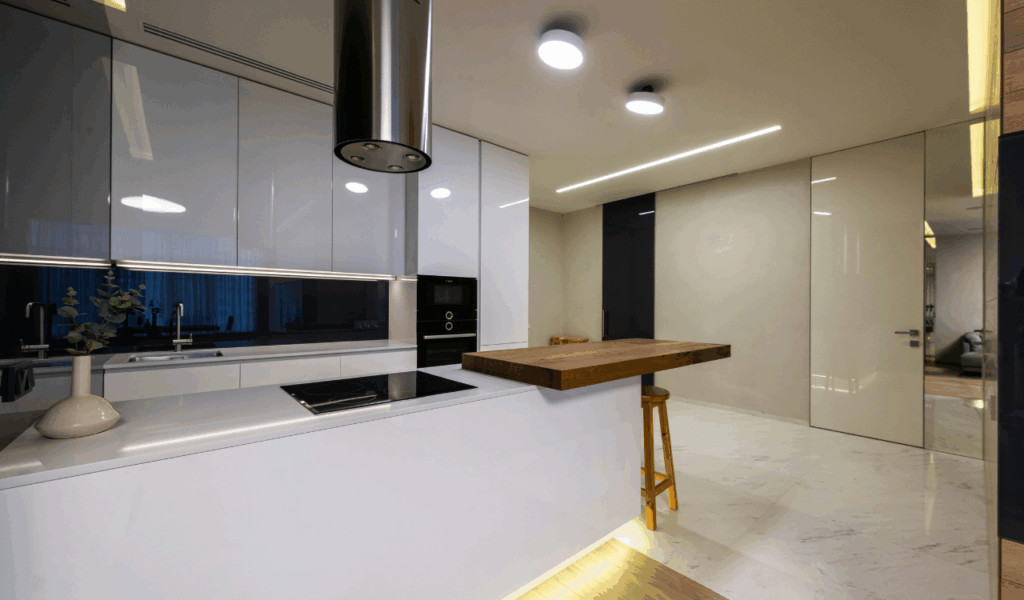
In the past, modern luxury was distinguished by high-gloss coatings that reflected light and made kitchens and living rooms look sleek and dramatic. They are gorgeous, but their practical flaws have made them less appealing. Because of fingerprints, scratches, and dust, glossy surfaces need to be cleaned all the time. Over time, the work needed to keep this up may not be worth the visual gain. Matte and softly textured materials are easier to work with because design trends are moving toward comfort and touch. Many people who own homes nowadays like warm and welcoming spaces, although very shiny interiors could seem overly formal.