10 Paint Colors to Sell Your Home Faster
Selling a home often comes down to how quickly buyers can picture themselves living in it, and paint color plays a bigger role in that than most people expect. The right shades make rooms feel brighter, larger, and more polished, even before any staging begins. What this really means is that choosing smart, market-friendly colors is one of the simplest updates with the biggest payoff. These tones aren’t about personal taste. They’re about creating broad appeal and giving every room an inviting, move-in-ready feel that helps your home stand out the moment someone steps inside.
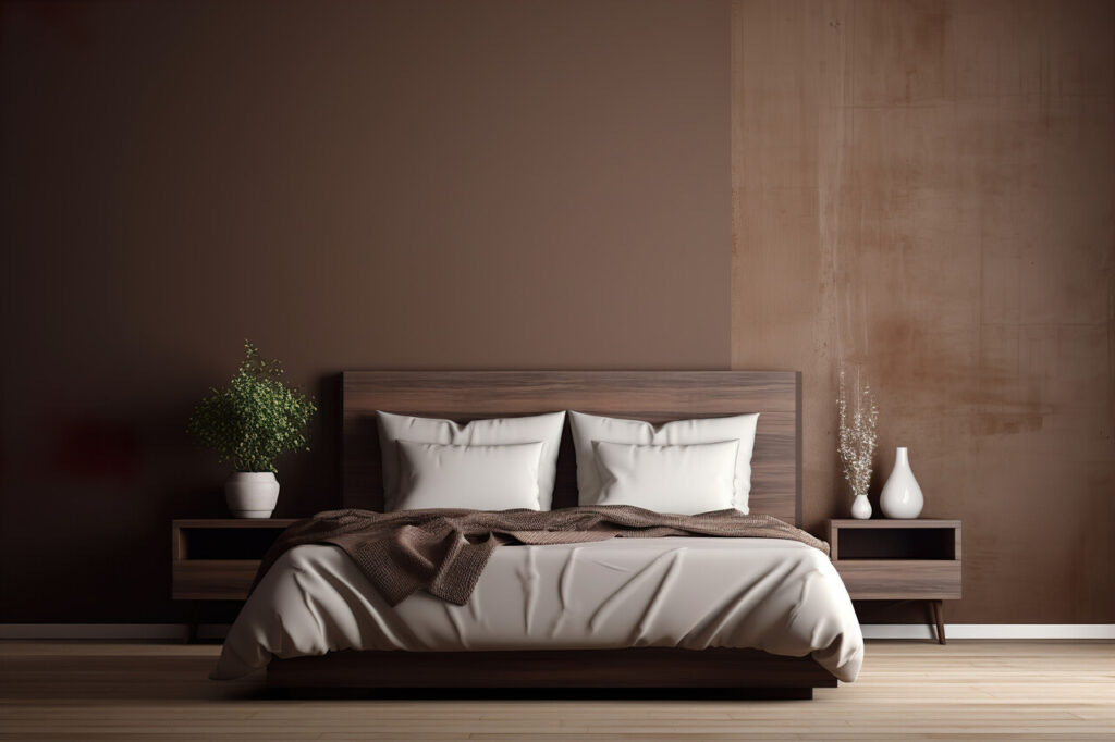
1. Soft Warm White And Off White
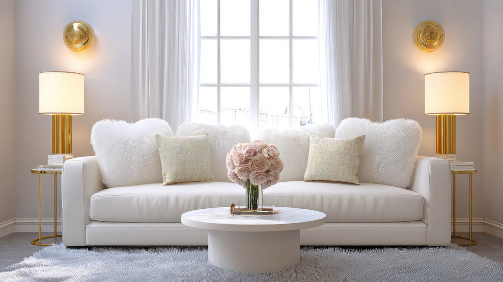
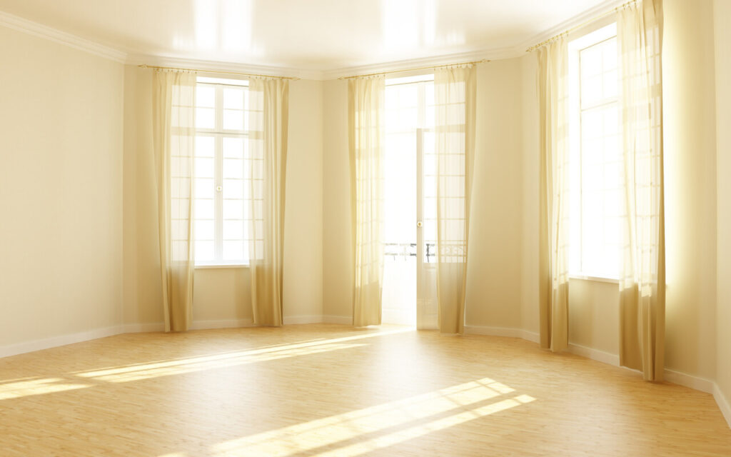
If there is one paint family that consistently helps homes sell faster, it is soft, warm white. These are not stark, chalky whites, but gentle off-whites with a hint of cream or beige that feel clean without looking cold. They bounce natural light around, which makes rooms appear larger and more open in listing photos and in person. Warm whites also serve as a blank canvas, allowing buyers to envision their own furniture and art easily. They work in almost every room, from living areas to hallways, and pair well with both light wood and darker floors, which reduces the need for multiple colors throughout the house.
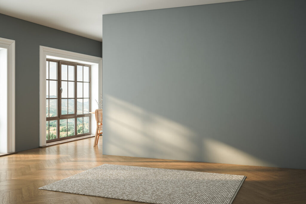
2. Soft Greige As A Flexible Main Neutral
Greige, the blend of gray and beige, has become a go-to choice for sellers because it bridges the gap between cool and warm decorating styles. It reads modern and fresh to buyers who like gray, yet still feels cozy enough for those who prefer traditional spaces. On walls, soft greige minimizes visual distractions and ties together mixed finishes, such as white trim, wood furniture, and black accents. It photographs well, avoiding the blue cast that some cooler grays pick up. Because it works in living rooms, bedrooms, and open floor plans, using one well-chosen greige can simplify the entire color scheme of a home that is going on the market.
3. Light Beige Or Tan For Comfortable Living Spaces

Light beige and tan shades quietly suggest warmth and comfort, which is exactly what you want buyers to feel in the main living areas. These colors have enough pigment to hide scuffs and wall imperfections better than pure white, but they still count as neutral in the eyes of most buyers. In family rooms and dens, beige softens the edges of large furniture pieces and televisions, helping the space feel more inviting rather than stark. In older homes, it can bridge the look of existing wood trim and flooring with more modern furnishings. Because beige does not dictate a specific style, it appeals broadly, from first-time buyers to downsizers.
4. Pale Blue And Blue Gray For Calm Bedrooms And Baths
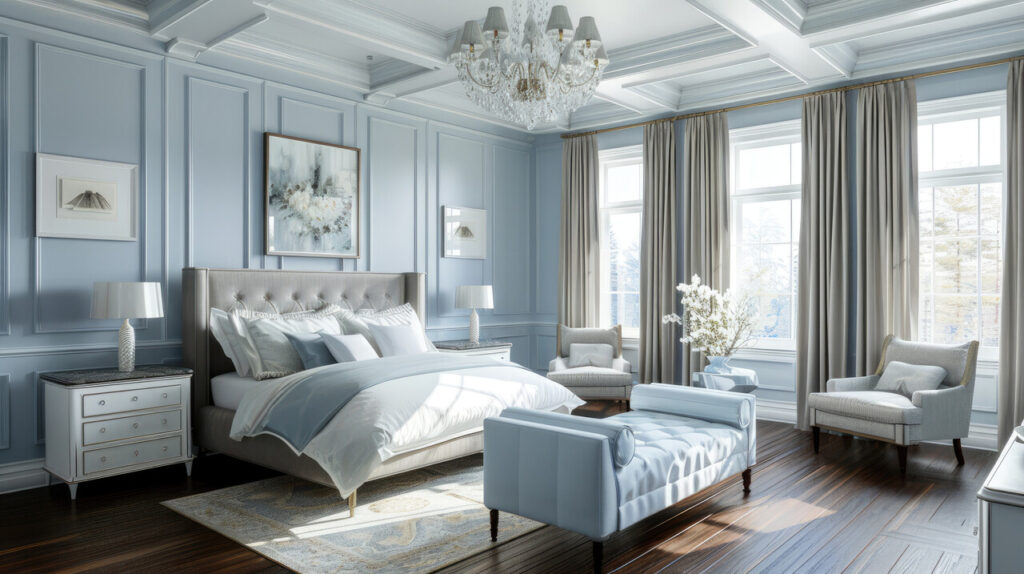
Soft blues and blue-gray tones perform especially well in bedrooms and bathrooms because they signal calm and cleanliness. Studies of buyer preferences often show that light blue bathrooms feel more spa-like and can even correlate with slightly higher sale prices. In bedrooms, a pale blue or blue-gray wall color suggests restful sleep and a retreat from daily stress, which is a strong emotional selling point. These colors pair easily with white trim and neutral carpets, and they work with both coastal and urban decor styles. Used selectively in private spaces, they add character without scaring off buyers who want mostly neutral walls elsewhere.
5. Sage And Soft Green For A Fresh, Natural Feel
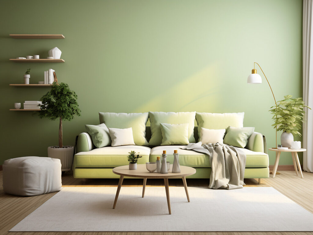
Muted greens like sage and soft olive give a subtle connection to nature that many buyers find appealing, especially in kitchens, breakfast nooks, and entryways. These shades are gentle enough to act as near neutrals, but they still introduce personality compared to plain white. In a kitchen, sage walls or even a single accent wall can complement stone counters and wood cabinets, creating a calm, earthy feel that photographs well. In smaller spaces, such as mudrooms or half baths, soft green adds interest without feeling dark or heavy. The connection to outdoor landscapes can be particularly attractive in regions where people value gardens, parks, and views.
6. Light Taupe Or Clay Beige For Subtle Sophistication
Light taupe and clay beige sit a notch deeper than standard beige and are useful when you want a more tailored look without going bold. These shades carry a hint of gray or brown, which adds visual depth and can make trim work and doors stand out more crisply. They are effective in dining rooms, hallways, and stairwells, where a slightly richer wall color can make the architecture feel more defined. Taupe also coordinates well with both warm metals, such as brass, and cooler finishes like brushed nickel, which is helpful in mixed finish homes. For buyers, these colors read as upscale but still easy to live with.
7. Classic Navy Blue As A Controlled Accent
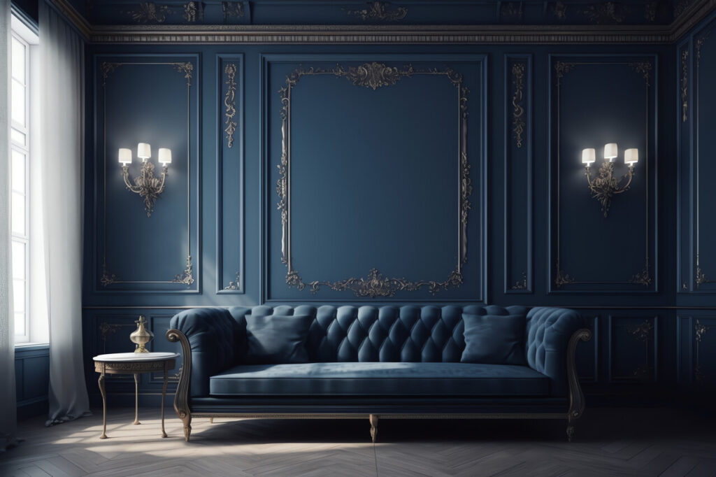
While most real estate advice emphasizes light neutrals, navy blue is a notable exception when used in the right way. A deep navy on a single bedroom wall, a home office, or a small powder room can add a sense of sophistication and depth that stands out in listing photos. It works well with white trim, light bedding, and natural wood, creating a crisp contrast that looks intentional. Because navy is a classic color in fashion and design, it rarely feels trendy in a negative way. The key is moderation. Keeping the surrounding elements light and simple prevents the room from feeling dark, while still giving buyers a memorable feature.
8. Dark Olive Green For Modern, Earthy Accents
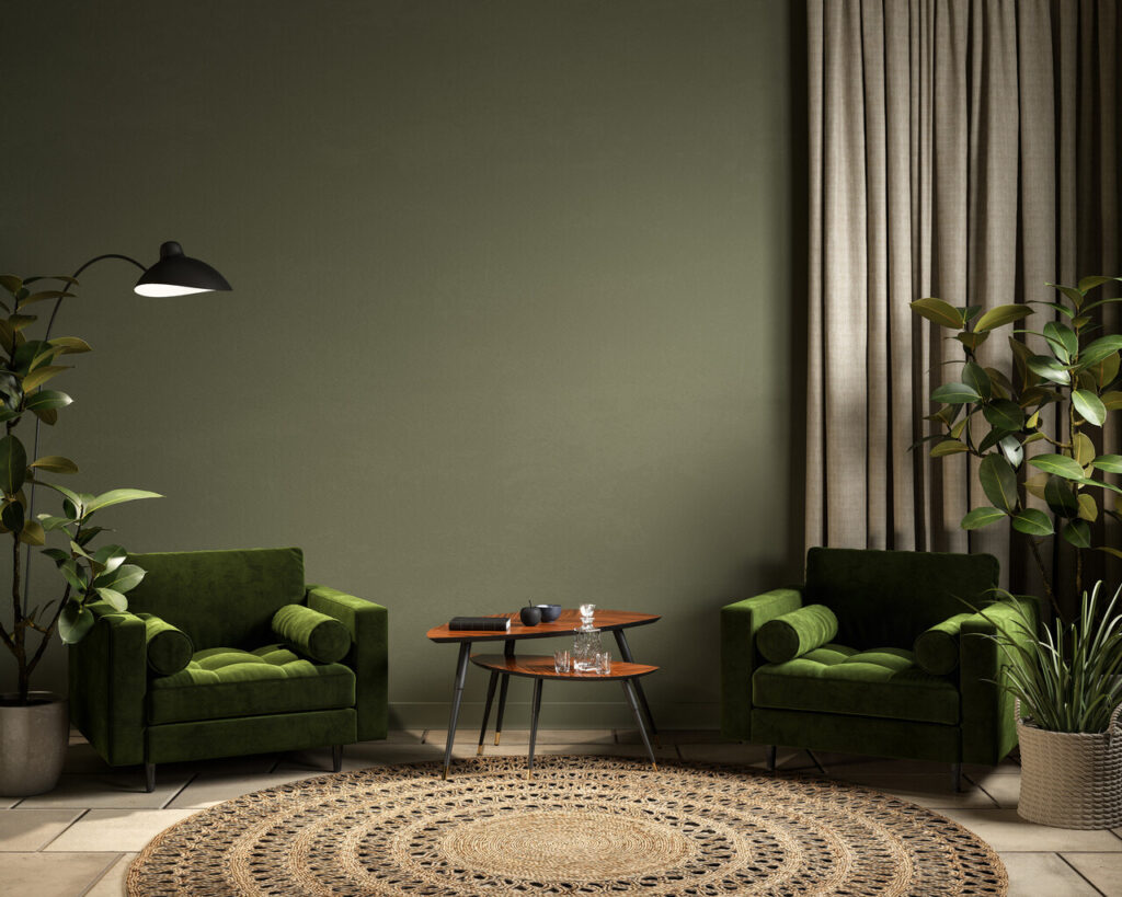
Dark olive green, especially on accent walls or cabinetry, taps into the current interest in earthy, grounded interiors. In kitchens, an olive on lower cabinets or an island paired with light counters and walls can give a custom, high-end impression without requiring a full renovation. In living rooms or studies, an olive feature wall adds depth and warmth, making the space feel more intimate. This color works particularly well in homes with plenty of natural light and wood elements. When used thoughtfully and not across every room, it suggests a modern, curated style that buyers who follow design trends often appreciate.
9. Charcoal Gray To Add Depth Without Harshness
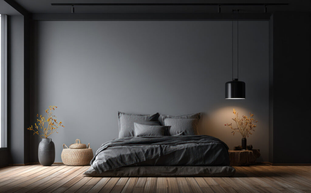
Charcoal gray is a deeper neutral that can give a sense of structure and polish when used in moderation. On a single living room wall, around a fireplace, or in a home office, it adds contrast that highlights lighter furniture and trim. Charcoal can also work for interior doors, which can make the overall home feel more finished in photos and walkthroughs. The advantage over pure black is that charcoal retains softness and does not show dust or fingerprints as easily. In the context of selling, it should be used as an accent rather than the main color, so the home still feels bright and open overall.
10. Soft Creamy White For Trim, Ceilings, And Details
Even when wall colors vary, consistent trim and ceiling paint help a house feel cohesive, which matters a lot to buyers walking room to room. Soft creamy white is an ideal choice because it is bright enough to frame the walls cleanly but warm enough to avoid looking stark under different lighting conditions. Using the same creamy white on baseboards, window frames, doors, and ceilings creates a sense of flow and makes architectural details pop. It also pairs well with the full range of recommended wall colors, from greige and beige to blues and greens. For sellers, this consistency is an efficient way to pull a whole house together visually.